Category Archives: Lectures and Workshops

Tomorrow: Data Visualization II Workshop!

Hi folks!

Tomorrow’s Digital Praxis Workshop will be Data Visualization II!

I’m kind of freaking out about it.

This one will really take it to the next level, with an under-the-hood look at creating interactive visualizations using d3.

Interactive designer Sarah Groff-Palermo will demonstrate, explain and walk users through exercises in d3, a JavaScript-based interactive programming framework, and its associated technologies and libraries.

Attendees of the workshop are strongly encouraged to bring their own laptop computers and should have, or create, a github account prior to the session. Note: Sarah works on a Mac – but the workshop will also be accessible and beneficial to users of other operating systems (including the room’s library-provided desktop computers).

Looking forward to seeing the Praxis students there (Mina Rees Library, Concourse level, Room C196.02) tomorrow after the class!

Thanks,
Micki

Info Visualization Workshop

It was standing room only in Micki’s info viz workshop on Thursday. In order to make the demo more interesting, she used a dataset about the class attendees. We all entered our names, school, department & year in a shared online doc which became the basis for parts of the demo. We saw how to take text and clean it up for entry into Excel using a text edit tool, Text Wrangler. Tabs! Tabs are the answer. Data separated by tabs will go into individual cells in Excel, making it easier to manipulate once in there. Tabs>commas, apparently.

Once the data was in Excel, we saw some basic functions like using the data filter function, making a pivot table, an area graph and a stacked area graph.

After Excel we moved on to Gephi. Unfortunately none of the participants could get Gephi on our computers, so we just watched Micki do a demo. Using our class participant data, she showed us the steps to get the data in and how to do some basic things to get a good looking visualization, and how to play around with different algorithms and options. This was a pretty small dataset with few connections, so to illustrate some of the more complex things Gephi can do, Micki showed us examples from her own work. For me, this was the best part. I think Liam linked to it earlier, but I highly recommend you look at the force-directed graphs section on Quantifying Kissinger.

Stephen brought up the ‘so what?’ factor with regard to Lev Manovich’s visualizations. I thought Micki’s provided a good counterpoint to that, as she explained how certain visualizations made patterns or connections clear—things that might not have been revealed in another type of analysis.

Overall this was a very informative and useful workshop. It gave me courage to go home and play with my data in Gephi in ways that I didn’t feel able to before, and I hope it encouraged others to get started on their own projects.


Stitching on the Old to the New: Tracking Change through Maps

I recently attended a workshop on Map Warper at NYPL that dealt with ‘georectifying’, an often arduous and tedious post-digitizing processing of maps, that the NYPL Map Division has managed to turn into a fun and engaged activity by opting to crowdsource it. Funded by the NEH, the Map Warper is a tool suite, used by library staff but also open to the public, to align (or “rectify”) historical maps to today’s digital maps, adding valuable geographic context to old maps. Importantly, all work done is in the public domain. In NYPL’s words,

“Tile by tile, we’re stitching old atlas sheets into historical layers, that researchers can explore with pan-and-zoom functionality, comparing yesterday’s cityscape with today’s. Along with other tools — such as one for tracing building footprints and transcribing address and material information found on the maps — we are laying the groundwork for dynamic geospatial discovery of other library collections: manuscripts and archives, historical newspapers, photography, A/V, ephemera (e.g. menus) etc.”

Given our discussions these past weeks, it seems to me that the points of departure are numerous. I’m reminded of Sarah’s post on mapping the urban setting of fictional characters, when I think about how this tool can help recreate the urban setting of historical characters/personages in today’s context. All one needs is a time period and location, if the Map Division has a corresponding map, lo, and behold! you can see the past and present streetscapes simultaneously.  From an urban planning perspective, it is fascinating to see how the cityscape wears the passage of time and explore possible lessons for urban design. I expect it also will help planners visualize and chart the imperceptible movement of real estate, the steady shift of the cityscape over the underlying landscape, which is only possible with tools such as this.

warper-labs

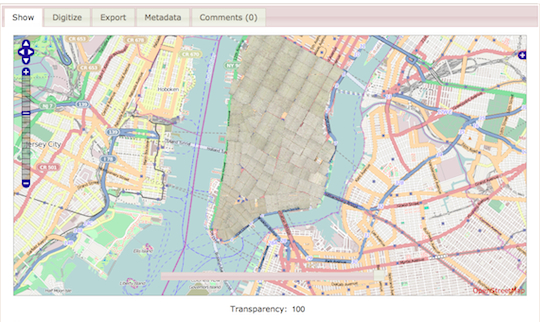
Source: Map Warper, NYPL Labs

“The above image shows a warped map sheet from an 1857 William Perris Real Estate Atlas depicting a section of Manhattan to the southwest of Union Square (see it in the context of the Warper). By stitching this to its sibling sheets from the atlas, we can build a complete 1857 historical layer of Manhattan, observing changes in the street layout and conjuring the ghostly footprints of old buildings. This is just step 1 in a larger integration effort, in which we can pull together archival records, newspapers, photography and other literary and historical documents that are associated with places on the map.”

Link – http://maps.nypl.org/warper/

For those of you interested, there is also a helpful tutorial video on their website to get you started on the project, and helpful Map Division staff are available for tech support.

Twitter Workshop Overview/Sept. 30th

Hi –
In class last week I suggested that we might want to share overviews from the workshops here since not all of us can make the Thursday evening DH workshops.

I suggest we keep these reports broad in scope and brief in text. Here’s my overview of the twitter workshop last week.

The workshop format was pretty informal. Approximately 12 students sat at computer lab portals in the subbasement library while we perused the twitter-sphere.
*(Make a note) Some of these labs are only accessed through the library, not the main elevators.

  • The teaching fellows (is ‘fellows’ the masculine use of the word?) flipped through various accounts demonstrating how twitter can increase your profile on the web.
  • For example: If you have a common name, your name may be associated with several people on the search engines, including criminals. To mitigate this, think of distinguishing yourself by adding a middle initial to your name and tweeting often to raise your visibility. Go to google. Search your name. See what comes up.
  • We noticed that Micki Kaufman got a big burst of twitter attention by way of a recent sharing of information and images. Congrats.
  • Suddenly one can become a “Twitter Star” as in the case of many prominent professors who have written books and have a great number of followers. In these cases a great many more people may be following you, than you are following.
  • Check out platforms like Hootsuite if you want to schedule your tweets ahead of time, put all your social platforms in one place, and measure your social media results
  • I’m attaching a twitter quick tips sheet here. It was for an event a year ago, but if you substitute #DHpraxis14 as the hashtag, and our classmates twitter handles (their accounts) to your tweets, you can use this good and simple guide to make some practical twitter sense.

Good Luck!
And, FYI – you do not need to be a twitter fan to have a small amount of success. I don’t really “love” twitter, but I “do” it, simply because its part of the digital world in which we live.

TWeet_Sheet

A Process Model for Design

I think that the chapter, “The Internet and It’s Users” by Charlie Edwards provides a valuable approach to Digital Humanities by considering the degree and quality of “user” engagement. The notion of a user in partnership with a coder/builder to create/design an object/system/application is crucial in the success of any digital project. However, when Edwards asks, “If we were to propose a design for DH, then, where might we look for a model?” she seems to suggest that there is one design that may apply to the entire panorama of DH projects. It only takes a quick glance at the sample projects on the CUNY Digital Humanities Resource Guide to realize that these projects all have different goals and therefore require different designs.

What does Edwards mean, then, by referring to a single a model of DH design? Perhaps what she wants is a template or a model for the process of design. She suggests elsewhere in the piece that the Open Source community offers a template for how that process should work. She emphasizes, rightly, that users have to feel that their voices have been heard in order to invest in what the builders are creating. The open source community of volunteer user/developers does a good job of fostering that environment.

However, perhaps paradoxically, corporate software development offers another worthwhile template or at least a vision of what is required for builders and users to work together productively. This vision is hard won over many years in the corporate world with thousands of projects (both successes and failures). Successful corporate software design has a number of crucial elements. First, corporations expect that business units specialize both via their expertise and through the work that they are asked to produce. In this light, the Marketing Department consists of individuals highly trained and experienced in marketing. They are not expected to know anything about programming or databases, which remain the purview of the IT department. A successful project requires a high degree of collaboration between the two groups, with a mutual respect for their diverse expertise. Most importantly, though, if the ultimate corporate users of the system are not given (or do not take) “ownership” of the final result, the project will likely fail. After all, it is the users who have defined the business problem that needs to be solved. Since they own the problem, they must also own the solution. Further, they must convey to the coders the day-to-day context in which the software will be used so that the design reflects all of the required use cases that might occur.

I think this corporate model could work in the Digital Humanities world. Like the Marketing Department, not every Humanities scholar wants to learn how to code. They would rather remain devoted to their research. However, if scholars abdicate the building of tools to the few members of their profession who do want to play with bits and bytes, they risk being left behind. Humanists can still participate in the Digital Humanities, in fact, by forming partnerships with coders (who may not be humanists at all) in the same way that corporate marketers partner with their IT departments. By recognizing the possibility that digital tools can enhance their academic work, Humanities scholars would provide the leadership necessary to instantiate a DH design process that gives them exactly what they want.