Tag Archives: mapping

Fashion Index Weekly Update

During the class discussion, we had an issue of staid version vs. dynamic version of our website. Since we are running out of time, we may not be able to cover database. So we ended up continuing the static one. We need to navigate data between mapping. As well as, we have to navigate tags based on time, space-csv scripts.

At this point, feedback loop is critical, which refers to increase more users engagement such as tagging more maps and bringing more images related to #sprezzatura. Anyway, we will stick around #sprezzatura instead #nyfw (New York Fashion Week).

In our website, there is a theory section, we may fill up with 500-1000 essays written by fashion studies related scholars. We expect that those essay will be a strong part of the user stories.

The developer, Tessa’s plan is to explore more new tags, implement retroactive geographical filters, populate tags from NY (few images, which will be trend-bases). Definitely, cleansing the datasets, which are not totally related to #sprezzatura, is very important. The images should be credible. We can easily find several irrelevant images in relation to the hash tags, which we are mainly looking for. We will set our own parameter to avoid the random images. Also, Tessa is going to work on geocoding, the main function is searching addresses based on on  zip codes, longitude, and latitude. The data came from Python script. Geo-specific data, “reversing geocoding” convert zip codes to longitude and latitude.

We made slight changes on our website. For our introduction page, we displayed datasets of images, which will be shuffled around in black and white. Then, we added dataset section.

Renzo made questionnaires in order to get feedbacks and they are composed of multiple choices and short sentences.

According to Dave Rioden from NYPL, we should focus on the interaction or engagement with users. We are planning to set up a server that will archive game data. DH and Fashion Studies students will test out the game.


playfashion


Lastly, we got 24 follower on our Instagram account. Undergraduate fashion school students and a fashion blogger followed us. We should facilitate  more chances of interaction and communication.


Fashion Index weekly update

All of our tem members have been working so hard during the break. We have also faced certain restrictions.

#Sprezzatura tag search was not working well with the NYC latitude and longitude data that we were looking for. We decided to choose a more fashion-themed tag that already pulled images from NYC. We made an alternative plan to focus on the tag #NYFW (New York Fashion Week). This would be our MVP (Minimum Viable Products).

excel files

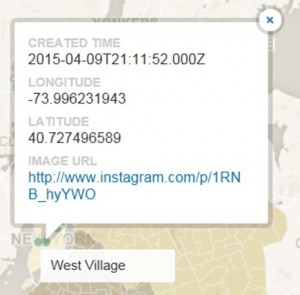
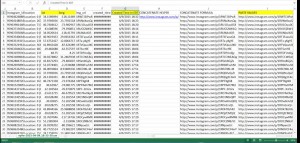
Tessa highlighted the fields that will be relevant for CartoDB including Latitude/ Longitude and created time. She adjusted for NY time zone. She also included the image URL.

Minn updated Carto DB. He posted the images based on NYC open data. First, he custom designed the 5 boroughs of map on Mapbox then exported into CartoDB. Later on,  he filled 5 boroughs of New York with polygons. Lastly, he placed pins on specific areas.

map


latlong


instagram


Fashion Index Weekly Update

Spring break just has started. This break sounds so industrious.

Our current goal is to explore Domain Expert. After solving this matter, we will integrate our final data set. The final data sets can be Lev’s collection of Instagram images or collection of our own images via apigee.

We made some changes related to technologies. We will not implement Django and MySQL.  We decided to focus on the bootstrap version of the site and gather content to make it look well-structured.

As Luke and Amanda addressed the copyright and creative common, we will also concern the copyright of other people’s images from Instagram. Tessa suggested that we would better include certain statement such as “All images contained herein are for academic purposes only.”

Currently, Renzo and  Minn developed HTML and CSS files for the website. They already made initial sketches and clarified the concept of art. Using Bootstraps is the foundation of their work. They began creating the site in HTML and generated a basic image gallery, front page, credit page, acknowledgement, and embed Google maps to stimulate the eventual mapping of images, which will be arranged by CartoDB.  Under these circumstance, the Bootstrap plays a critical role to shape our websites and scales with screens on mobile devices or smaller monitors.

crew_Page_1


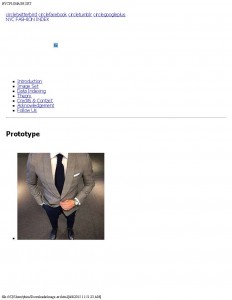
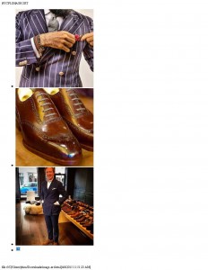
image-set_Page_1 image-set_Page_4 image-set_Page_5 image-set_Page_8

After making the basic version of the site in HTML, they reached a point where they needed to figure out CSS to make the visuals more refined and integrate better fonts. Minn conducted CSS research.

During the break, our workloads are divided based on our basic roles.

  • Project Manager- shaping the final paper, collect reference, some literature reviews, track and compile the other member’s works, reviewing tutorials, posting some images on instagram (hopefully more followers)
  • Development- exploring API (Apigee). Planning to collect 50-100 images with #sprezzatura and geodata  from Instagram.
  • Outreach- After getting the images, Renzo will work on mapping via Cartodb.
  • Designer- Focus on aesthetic designs, enhancing the visual of the site.


Fashion Index Weekly Update

Our group’s current goal is to locate a domain expert. In this point, we need to decide whether we keep our site in Bootsrap or tansfer tp a Django framework. We considered creating a separate page on the site showing only a map, and points on the map indicating where a photo was taken. Below or on the same page would be options to organize the map by the five borough.

The developer (Tessa) is researching API access and possibly subscribing to a service that can send us instagram photos with tag data.

The outreach (Renzo) installed Python.

The project manager (You Gene) installed MySQL. Currently, I am figuring out what is cmd and how to open the command-line Interface. Black-white screen has to show up.

We divided our roles to make our technology work out. This time each role is fluid compared to the previous works.

Designer [Minn]- Bootstrap site, exploring apigee.

Outreach [Renzo]- Mapping via Apigee, cartodb.

Developer [Tessa]- continuing Python work, attending django workshop

Project Manager [You Gene]- researching roaming experts, exploring mysql.


Fashion Index Weekly Update

Screenshot_2015-03-10-16-54-23-1

Currently, Instagram carries more than a million images of #sprezzatura.  We should start learning API and MySQL for data mining. To solve the technology parts, we visited Digital fellows at the media lab. My SQL  fundamentally interact with data and establish the connection between the server. One of the digital fellows Even said we need to set up the local copy of My SQL. He also suggested to learn API Python. I will look over Python Library as well.

The developer, Tessa approached Shelley Bernstein at the Brooklyn Museum, but we could not access her. Anyway, her tagging project was very useful.

Limitation: Instagram API does not offer geospatial information. In this stage, we should find third party applications for the mapping.

For coding, we need text wrangler which functions as text editor, program scripts, and code translator. The outreach, Renzo is using Filezilla for coding. Also, Renzo and Minn (Designer) started working on mapping. They installed the program called R and GGmap. Those two programs interact with google map and import images from google map. Also they provide information of longitude and latitude based on the google map.


@jojokarlin’s Memory Trip pre-pitch

I am massively intimidated by the awesome pitches people are composing so concisely! I feel like Little Red in Into the Woods— scared, well ExcITED AND scared. I offer a rather hasty outline of what my pitch might be on Tuesday…

Memory is tricky stuff. In these digital times, it is a tradable commodity. How many gigs is your phone?

I want to create a memory map of my grandmother’s memory (loosely based on the map of a road trip) and in the process model a platform that others could use to assemble their own memory map with elderly relations who are not particularly digitally inclined. (My grandmother buys disposable wind up cameras).

1. Memory Map—  I am interested in modeling, in a map of sorts, my soon to be 97-year-old grandmother’s remarkable (largely pre-digital) memory. The Dodge ad from the Super Bowl somewhat made my argument for tying my grandmother’s memories to a road trip. She’s been driving a long time and her life almost spans the history of the automobile industry in America. Not only is the road trip a tradition I have with her, time in the car tends to be fairly meditative. The metaphor is useful — roads more and less traveled in life take us down paths we maybe remember– and the project becomes more memory tourism than memorial monument. (I don’t want to build a museum or a family archive — it’s not about ossifying the “true” facts of my grandmother’s life. I want the map to be an interactive spatialization of the way memory from all her years live in her today.

2. Platform for others to use– I have been thinking it should be done in Neatline with some fancy plugins. I would love to make something that doesn’t require elaborate tools for data collection (I’ve done initial interviews and video with my iphone). Ideally, once built, the memory map could be available to people wanting a way to digitally document the way older generations go about remembering.

IMG_1375

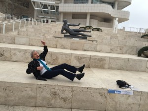
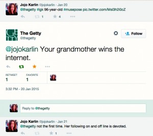
I offer a photo of my grandmother at the Getty Museum — I bit their social media bait and had her pose and tweeted it. Naturally @theGettymuseum responded:

Screen Shot 2015-02-08 at 7.05.35 PM

I would like to help my grandmother continue to win the internet.


Mapping the Icelandic Outlaw Sagas

Greetings, fellow digitalists,

*warning: long read*

I am so impressed with everyone’s projects! I feel like I blinked on this blog, and all of a sudden everything started happening! I’ve tried to go back and comment on all your work so far–let me know if I’ve missed anything. Once again, truly grateful for your inspiring work.

Now that it’s my turn: I’d like to share a project that I’ve been working on for the past year or so. I’ll break it down into two blog posts–one where I discuss the first part, and the other that requests your assistance for the part I’m still working on.

A year ago, I received funding from Columbia Libraries Digital Centers Internship Program to work in their Digital Social Sciences Center on a digital project of my own choosing. I’ve always gravitated towards the medieval North Atlantic, particularly with anything dark, brooding, and scattered with thorns and eths (these fabulous letters didn’t make it from Old English and Old Norse into our modern alphabet: Þ, þ are thorn, and Ð, ð are eth). Driven by my research interests in the spatiality of imaginative reading environments and their potential lived analogues, I set out to create a map of the Icelandic outlaw sagas that could account for their geospatial and narrative dimensions.

Since you all have been so wonderfully transparent in your documentation of your process, to do so discursively for a moment: the neat little sentence that ends the above paragraph has been almost a year in the making! The process of creating this digital project was messy, and it was a constant quest to revise, clarify, research, and streamline. You can read more about this process here and here and here, to see the gear shifts, epic flubs, and general messiness this project entails.

But, to keep with this theme of documentation as a means of controlling data’s chaotic properties, I’ve decided to thematically break down this blog post into elements of the project’s documentation. Since we’ve already had some excellent posts on Gephi and data visualization, I’ll only briefly cover that part of my project towards the end–look for more details on that part two in another blog post, like I mention above.

As a final, brief preface: some of these sections have been borrowed from my actual codebook that I submitted in completion of this project this past summer, and some parts are from an article draft I’m writing on this topic–but the bulk of what you’ll read below are my class-specific thoughts on data work and my process. You’ll see the section in header font, and the explanation below. Ready?

Introduction to the Dataset

The intention of this project was to collect data on place name in literature in order to visualize and analyze it from a geographic as well as literary perspective. I digitized and encoded three of the Icelandic Sagas, or Íslendingasögur, related to outlaws from the thirteenth and fourteenth centuries, titled Grettis saga (Grettir’s Saga), Gísla saga Súrssonar (Gisli’s Saga), and Hardar Saga og Hölmverja (The Saga of Hord and the People of Holm). I then collected geospatial data through internet sources (rather than fieldwork, although this would be a valuable future component) at the Data Service of the Digital Social Sciences Center of Columbia Libraries, during the timeframe of September 17th, 2013, to June 14th, 2014. Additionally, as part of my documentation of this data set, I had to record all of the hardware, software, and Javascript libraries I used–this, along with the mention of the date, will allow my research to be reproduced and verified.

Data Sources

Part of the reason I wanted to work with medieval texts is their open-source status; stories from the Íslendingasögur are not under copyright in their original Old Norse or in most 18th and 19th century translations and many are available online. However, since this project’s time span was only a year, I didn’t want to spend time laboriously translating Old Norse when the place names I was extracting from the sagas would be almost identical in translation. With this in mind, I used the most recent and definitive English translations of the sagas to encode place name mentions, and cross-referenced place names with the original Old Norse when searching for their geospatial data (The Complete Sagas of Icelanders, including 49 Tales. ed. Viðar Hreinsson. Reykjavík: Leifur Eiríksson Pub., 1997).

Universe

When I encountered this section of my documentation (not as a data scientist, but as a student of literature), it took me a while to consider what it meant. I’ll be using the concept of “data’s universe,” or the scope of the data sample, as the fulcrum for many of the theoretical questions that have accompanied this project, so prepare yourself to dive into some discipline-specific prose!

On the one hand, the universe of the data is the literary world of the Icelandic Sagas, a body of literature from the 13th and 14th centuries in medieval Iceland. Over the centuries, they have been transmuted from manuscript form, to transcription, to translation in print, and finally to digital documents—the latter of which has been used in this project as sole textual reference. Given the manifold nature of their material textual presence—and indeed, the manuscript variations and variety of textual editions of each saga—we cannot pinpoint the literary universe to a particular stage of materiality, since to privilege one form would exclude another. Seemingly, my data universe would be the imaginative and conceptual world of the sagas as seen in their status as literary works.
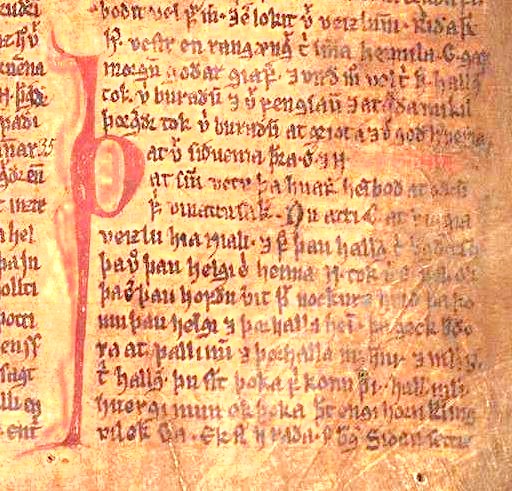
A manuscript image from Njáls saga in the Möðruvallabók (AM 132 folio 13r) circa 1350, via Wikipedia

However, this does not account for the geospatial element of this project, or the potential real connections between lived experience in the geographic spaces that the sagas depict. Shouldn’t the data universe accommodate Iceland’s geography, too? The act of treating literary spaces geographically, however, is a little fraught: in this project, I had to negotiate specifically the idea that mapping the sagas is at all possible, from a literary perspective. In the latter half of the twentieth century, scholars considered the sagas as primarily literary texts, full of suspicious monsters and other non-veracities, and from this perspective could not possibly be historical. Thus, the idea of mapping the sagas would have been irrelevant according to this logic, since seemingly factual inconsistencies undermined the historical, and thus geographic, possibilities of the sagas at every interpretive turn.

However, interdisciplinary efforts have been increasingly challenging this dismissive assumption. Everything from studies on pollen that confirm the environmental difficulties described in the sagas, to computational studies that suggest the social patterns represented in the Icelandic sagas are in fact remarkably similar quantitatively to genuine relationships suggest that the sagas are concerned with the environment and geography that surrounded their literary production.

But even if we can create a map of these sagas, how can we counter the critiques of mapping that it promotes an artificial “flattening” of place, removing the complexity of ideas by stripping them down to geospatial points? Our course text, Hypercities, speaks to this challenge by proposing the creation of “deep maps” that account for temporal, cultural, and emotional dimensions that inform the production of space. I wanted to preserve the idea of the “deep map” in my geospatial project on the Icelandic Sagas, so in a classic etymological DH move (shout out to our founding father Busa, as ever), I attempted to find out more about where the idea of “deep mapping” might have predated Hypercities, which only came out this year yet represents a far earlier concept.

I traced the term “deep mapping” back to William Least Heat-Moon, who coined the phrase in the title of his book, PrairyErth (A Deep Map) to indicate the “detailed describing of place that can only occur in narrative” (Mendelson, Donna. 1999. “‘Transparent Overlay Maps’: Layers of Place Knowledge in Human Geography and Ecocriticism.” Interdisciplinary Literary Studies 1:1. p. 81). According to this definition, “deep maps” occur primarily in narrative, creating depictions on places that may be mapped on a geographic grid that can never truly account for the density of experience that occurs in these sites. Heat-Moon’s use of the phrase, however, does not preclude earlier representations of the concept; the use of narratives that explore particular geographies is as old as the technology of writing. In fact, according to Heat-Moon’s conception of deep mapping, we might consider the medieval Icelandic sagas a deep map in their detailed portrayal of places, landscape, and the environment in post-settlement Iceland. Often occurring around the locus of a regional few farmsteads, the Sagas describe minute aspects of daily Icelandic life, including staking claim to beached whales as driftage rights, traveling to Althing (now Thingvellir) for annual law symposiums, and traversing valleys on horseback to seek out supernatural foes for battle. Adhering to a narrative form not seen again until the rise of the novel in the 18th century, the Íslendingasögur are a unique medieval exempla for Heat-Moon’s concept of deep mapping and the resulting geographic complexity that results from narrative. Thus, a ‘deep map’ may not only include a narrative, such as in the sagas’ plots, but potentially also a geographic map for the superimposition of knowledge upon it–allowing these layers of meaning to build and generate new meaning.

To tighten the data universe a little more: specifically within the sagas, I have chosen the outlaw-themed sagas for their shared thematic investment in place names and geography. Given that much of the center of Iceland today consists of glaciers and wasteland, outlaws had precious few options for survival once pushed to the margins of their society. Thus, geographic aspects of place name seem to be just as essential to the narrative of sagas as their more literary qualities—such as how they are used in sentences, or what place names are used to obscure or reveal.

Map of Iceland, by Isaac de La Peyrère, Amsterdam, 1715. via Cornell University Library, Icelandica Collection

In many ways, the question of “universe” for my data is the crux of my research question itself: how do we account for the different intersections of universes—both imaginative and literary, as well as geographic and historical—within our unit of analysis?

Unit of Analysis

If we dissect the element that allows geospatial and literary forms to interact, we arrive at place name. Place names are a natural place for this site of tension between literary and geographic place, since they exist in the one shared medium of these two modes of representation: language. In their linguistic as well as geographic connotations, place names function as the main site of connection between geographic and narrative depictions of space, and it is upon this argument that this project uses place name as its unit of analysis.

Methodology

Alright, now that we’re out of the figurative woods, on to the data itself. Here are the steps I used to create a geospatial map with metadata for these saga place names.

Data Collection, Place Names:

The print text was scanned and digitized using ABBYY FineReader 11.0, which performs Optical Character Recognition to ensure PDFs are readable (or “optional character recognition, as I like to say) and converted to an XML file. I then used the flexible coding format of the XML to hand-encode place name mentions using TEI protocol and a custom schema. In the XML file, names were cleaned from OCR and standardized according to Anglicized spellings to ensure searchability across the data, and for look-up in search engines such as Google–this saved a step in data clean-up once I’d transformed the XML into a CSV.
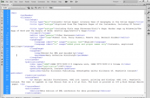
 

KinniburghXML

Here’s the TEI header of the XML document–note that it’s nested tags, just like HTML.

Data Extraction / Cleanup

In order to extract data, the XML document was saved as a CSV. Literally, “File > “Save As.” This is a huge benefit of using flexible mark-up like XML, as opposed to annotation software that can be difficult to extract data from, such as NVivo, which I wrote about here on Columbia University Library’s blog in a description of my methodology. In the original raw, uncleaned file, columns represented encoding variables, and rows represented the encoded text. I cleaned the data to eliminate column redundancies and extraneous blank spaces, as well as to preserve the following variables: place name, chapter and saga of place name, type of place name usage, and place name presence in poetry, prose, or speech. I also re-checked my spelling here, too–next time, no hand-encoding!


KinniburghCSV

Here’s the CSV file after I cleaned it up (it was a mess at first!)
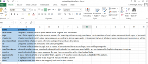
KinniburghCSVKey

I saved individual CSVs, but also kept related info in an Excel document. One sheet, featured here, was a key to all the variables of my columns, so anyone could decipher my data.

Resulting Metadata:

Once extracted, I geocoded place names using the open-source soft- ware Quantitative Geographic Information Systems (QGIS), which is remarkable similar to ArcGIS except FREE, and was able to accommodate some of those special Icelandic characters I discussed earlier. The resulting geospatial file is called a shapefile, and QGIS allows you to link the shapefile (containing your geospatial data) with a CSV (which contains your metadata). This feature allowed me to link my geocoded points to their corresponding metadata (the CSV file that I’d created earlier, which had place name, its respective saga, all that good stuff) with a unique ID number.

Data Visualization, or THE BIG REVEAL   

While QGIS is a powerful and very accessible software, it’s not the most user-friendly. It takes a little time to learn, and I certainly did not expect everyone who might want to see my data would also want to learn new software! To that end, I used the JavaScript library Leaflet to create an interactive map online. You can check it out here–notice there’s a sidebar that lets you filter information on what type of geographic feature the place name comprises, and pop-ups appear when you click on a place name so you can see how many times it occurs within the three outlaw sagas. Here’s one for country mentions, too.
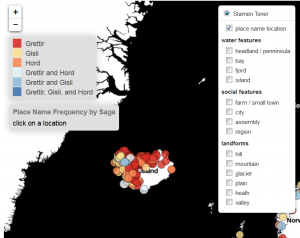
 

KinniburghLeaflet

Click on this image to get to the link and interact with the map.

Takeaways

As the process of this documentation highlights, I feel that working with data is most labor-intensive when it comes to positioning the argument you want your data to make. Of course, actually creating the data by encoding texts and geocoding takes a while too, but so much of the labor in data sets in the humanities is intellectual and theoretical. I think this is a huge strength in bringing humanities scholars towards digital methodologies: the techniques that we use to contextualize very complex systems like literature, fashion, history, motherhood, Taylor Swift (trying to get some class shout-outs in here!) all have a LOT to add to the treatment of data in this digital age.

Thank you for taking the time to read this–and please be sure to let me know if you have any questions, or if I can help you in mapping in any way!

In the meantime, stay tuned for another brief blog post, where I’ll solicit your help for the next stage of this project: visualizing the imaginative components of place name as a corollary to this geographic map.
Data Mining Project, Tessa & Min, Part II

To follow up on Min’s post about retrieving data from social media platforms using Apigee, I wanted to report back about the next step in our process–preparing the data for visualization.

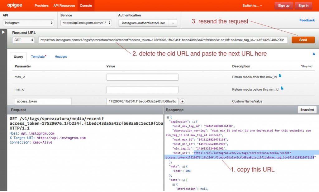
We decided to dig in with Instagram and see what we could do with the data returned for images tagged with the word sprezzatura. Using the method described in Min’s post we were able to export data by converting JSON to CSV. However Apigee returns paginated results for Instagram, so we were dealing with individual data dumps for 20 images when the total number of images with this tag is over 60,000. By copying and pasting the “next_url” into the Request URL field on Apigee’s console we were able to move sequentially through the sets of data:

next url

We decided to repeat this process only ten times, since the 3,000 times it would have taken to capture the whole data set seemed excessive…

When we opened the CSV files in Excel we encountered another problem. The format of the data is dictated by the number of tags, comments, likes, etc., meaning that compiling the individual data dumps into one useful Excel file was tricky.

We compiled just the header information to try to make sense of it:

Screen Shot 2014-11-18 at 1.10.01 AM

The 5th row indicates a data dump that contained a video. As a result additional columns were added to account for the video data. At first we thought that cleaning up the data from the 10 data dumps would just be a matter of adjusting for extra columns and moving the matching columns into alignment, but as we dug deeper into our data we realized that that wouldn’t work:

Screen Shot 2014-11-18 at 1.05.30 AM

As you can see, some of the data dumps go from reporting tags to a column for “type” followed by location data, while others go directly into reporting comment data. The same data is available in each data dump, but inexplicably they are not all returned in the same order.

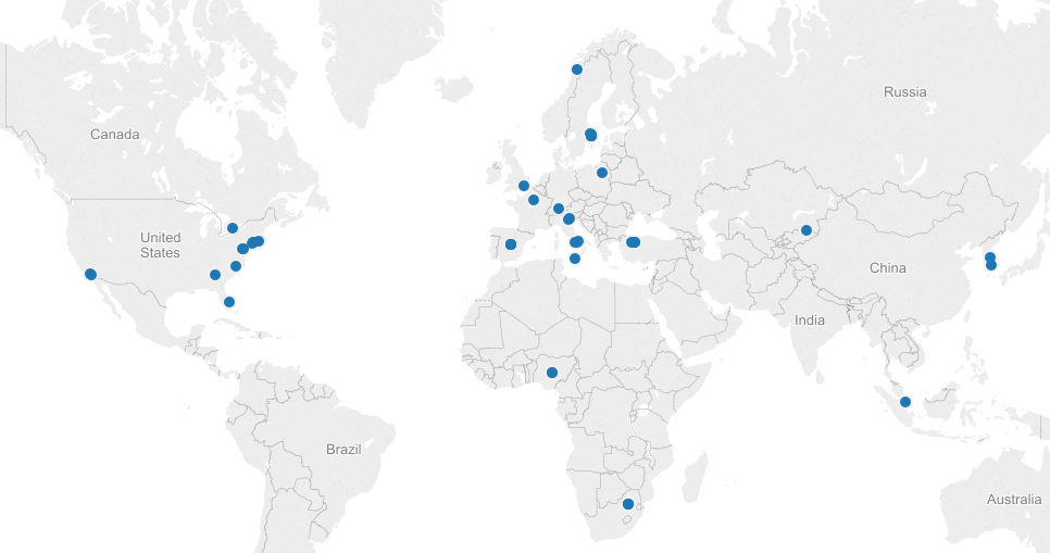
We looked into a few options for merging Excel spreadsheets based on column headers, but either the programs weren’t Mac-friendly or the merge seemed to do more harm than good. We decided to move ahead with cleaning up the data in a more or less manual way with good old fashioned copying and pasting. We wanted to look at location data on these images (perhaps #sprezzatura is still most commonly used in Italy or maybe it’s been specifically appropriated by the fashion community in NYC?), so we decided to harvest the data for latitude and longitude. We did this by filtering the columns for latitude in each data dump to return the images that had this data (only about 1/3 of the images had geotagging turned on). We also gathered the username, the link to the image, and the time the image was posted.

We made a quick map in Tableau, just to see our data realized:

Screen Shot 2014-11-18 at 1.27.34 AM

Next steps are to make a more meaningful visualization around this topic. We’d be interested to try ImagePlot to analyze the images themselves, but we haven’t explored a batch download of Instagram photos yet.

Idea for a Dataset/Project Proposal

I know this post is coming a bit late but I was so inspired by Hypercities that I had to go ahead and write about it. I have been anxiously awaiting our discussion of mapping all semester, and have not been disappointed. I was particularly inspired by the project gathering the tweets occurring during the Egyptian revolution and with Yoh Kawano’s attempt to use GIS to empower Japanese people to acquire knowledge of the radiation in a given area in the wake of the Fukushima disaster. It was a bit of a revelation to me to see scholars taking on projects that will really help people outside of academia, and that have such personal relevance for them.

Reading this also gave me an idea of what I would like to do in DH—possibly for my dataset project or my large project proposal. I would really like to harvest (?) locational data about the tweets sent last August in Texas during a few of the hearings, and protests, related to House Bill 60, as well as Wendy Davis’s filibuster. These bills which came up for debate in the Texas House and the Senate at this time aimed to severely restrict Texas women’s access to abortion and other reproductive care. These measures (which I believe have now been partially put into effect) disproportionately affect the many Hispanic women living in South Texas, where virtually no clinics were able to remain open, and working class women, who cannot afford to take off several days or more to travel the long distance now necessary to get reproductive care. In a state that takes eight hours to drive across width-wise and probably more to drive across length-wise, there are only seven abortion clinics left—all of which are located in Texas’s few and widely scattered urban areas.

As you can see, geography has played a big part in which women have been affected by these laws. However, geography also played a role in whose voices have been heard in the protests, and whose have been silenced. There is a wide perception that Austin is the only area of Texas with a significant liberal population, and that the rest of Texas is hyper-conservative. While this may be true to a large extent, I believe there are pockets of people all over Texas who strongly opposed those measures, and whose voices were marginalized and trivialized when Rick Perry said the protesters did not represent “real” Texans. Though indeed many protesters present were from Austin, there was substantial opposition to the measures on Twitter as well—a medium which, while it certainly is not accessible to all Texans, provided a relatively efficient and  economical alternative to in-person protesting. I think plotting on a map the frequency of use of certain hashtags popular in these events such as #standwithwendy and #comeandtakeit might give voices to these silenced people, dissipating the feelings of hoplessness and isolation that come with being a liberal person in Texas, and providing a convincing illustration of the extent to which the Republican leadership of Texas in promoting measures like these, ignores the wishes not only of liberals in Austin, but of a much wider portion of its constituency. This project was very important to me because I was actively involved at the time and feel the need to help, though I no longer live in Texas.

It seems like I will definitely have to learn about APIs, and maybe some kind of mapping software. This may be a very large project I am aiming toward, but if anyone knows what other skills I might need to get started, I would be very much obliged for your input!!!