Tag Archives: Gephi

Social Citation

Hi All,

It’s so exciting to see the progress on this blog; I know so many of us are now able to do things we couldn’t at the beginning of this class, thanks in no small part to all the great workshops. My final project is largely facilitated by the Gephi workshop. In this post I want to share my process in case it’s useful to anyone, but also, crucially, ask for your help to bring it to life. In case this gets long I’ll say now that in the final two weeks of class I hope to ask the praxisers to complete the short (and fun!) exercise of mapping your favorite authors, as well as the people who helped you discover them, in a simple text file. Now into the weeds! (ps I will be more specific when I ask this in earnest).

My goal here is to make the citation process more social, to draw the connections between impactful texts/authors and the friends, partners, mentors, teachers, scholars, family etc. that helped you discover the content. I began with a basic tab delineated text file that looked like this: Screen Shot 2014-12-03 at 7.51.01 PM

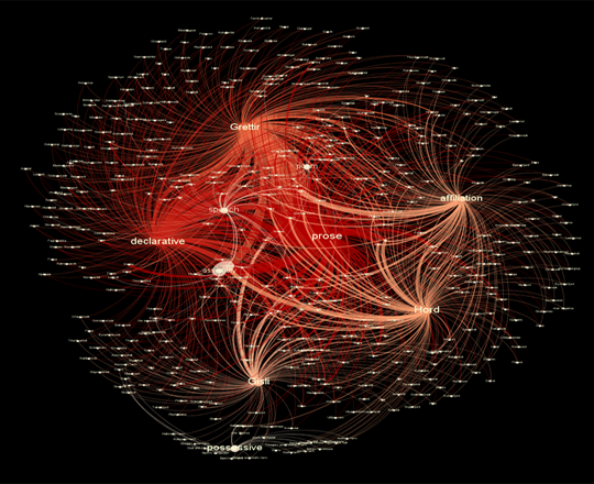
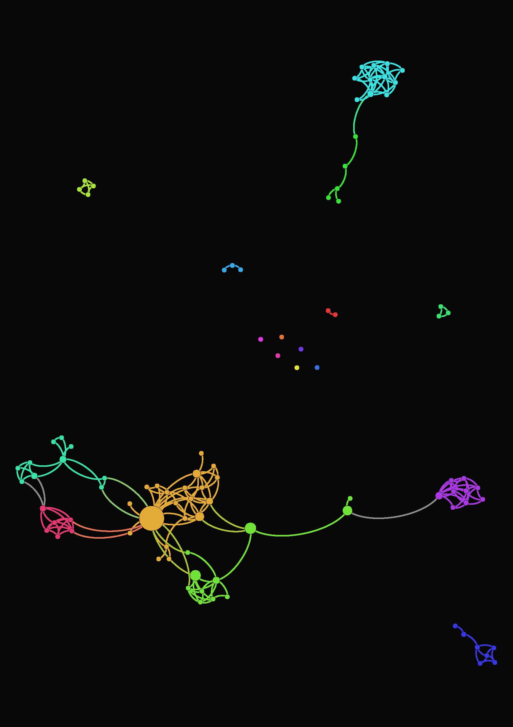
the categories here from right to left are: author, my person, relationship, location. I didn’t get too hung up on the content, just typed what came to mind for maybe 15 minutes. It took a bit of tinkering to figure out how to show this in Gephi, but eventually I got this:

Screen Shot 2014-12-03 at 7.54.12 PM

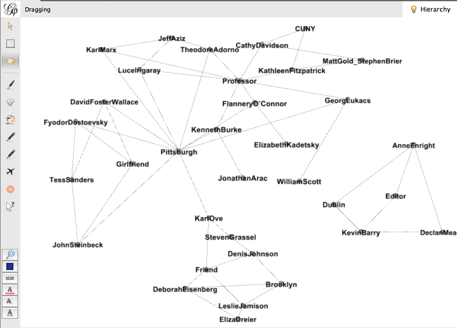
Sorry if this is hard to see, but this is a very messy graph. There are some interesting things going on – the connections are by relationship and location, and they create pockets. Declan Meade is off on his own to the right because he’s the only Dubliner and the only Editor I have. I tried to make this a little more cohesive by changing my data to look like this:Screen Shot 2014-12-03 at 7.53.55 PM

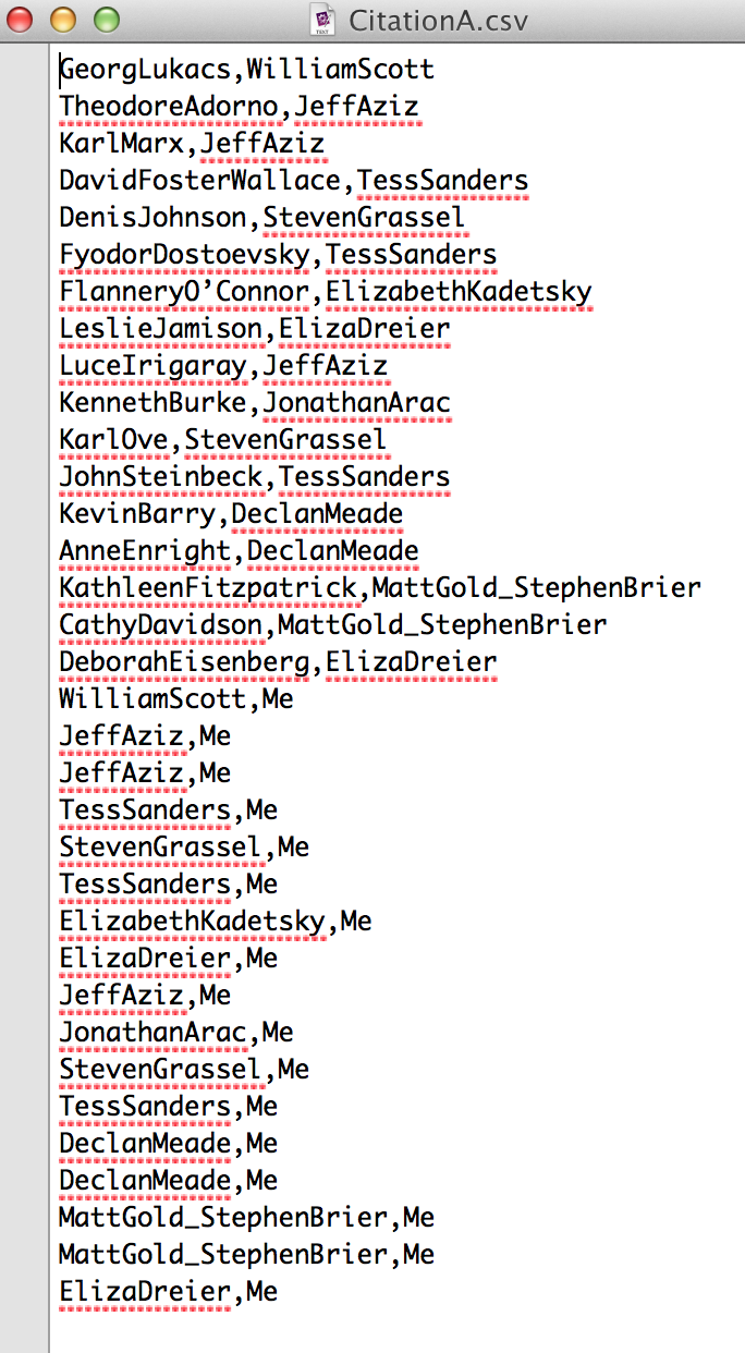
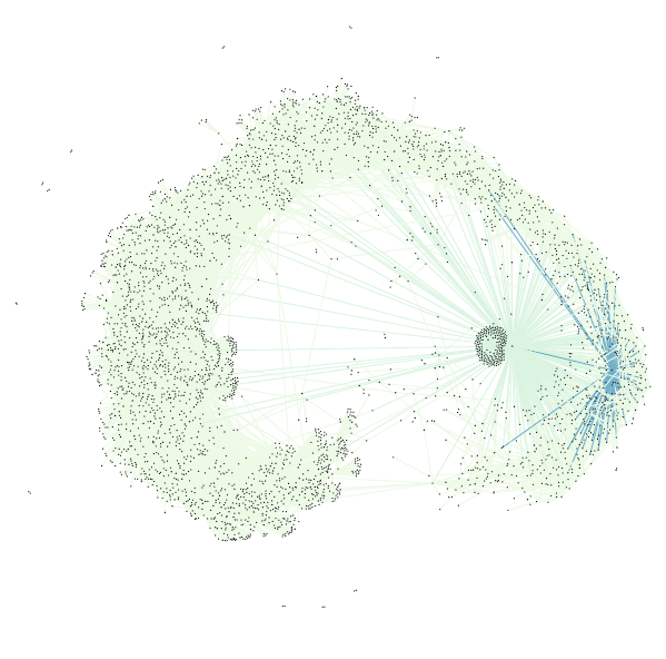
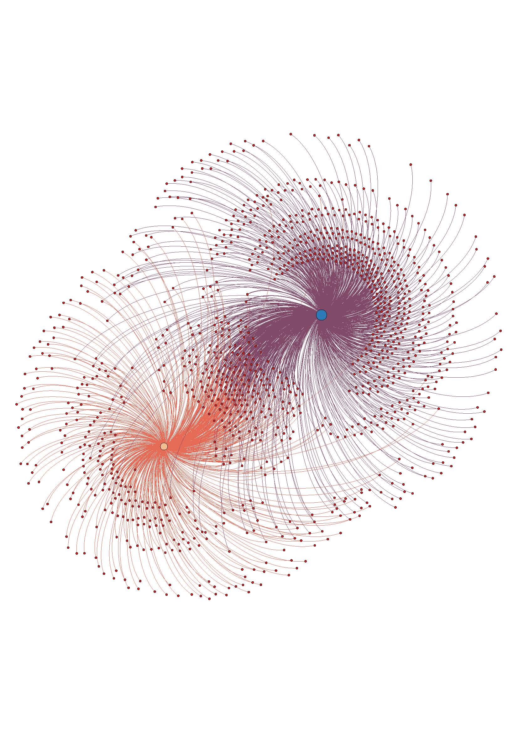
So I got rid of relationship and location, I also made it a one-to-one relationship between everything, where “Me” was connected to each of my people, and each of my people were connected to the work they’d introduced me to. Then the graph changed to this:Screen Shot 2014-12-03 at 8.17.49 PM

This sacrificed some of the nuance of place and relationship, but it gained a simplicity that I think is critical in these visualizations to make sense at a glance.

I’m not sure whether I’d like to add in relationship as a node, or maybe offer it as a hover or something. (color coordinate edges with a key linking them to relationships??) I have more playing to do, and would love feedback. But I think this project gets way more interesting when “Me” is connected to “You”. And so I wonder if folks would be willing to participate in this exercise. I think we can all safely use the three print texts assigned in this course, creating a link between everyone. I’ll finalize the model over the weekend, to have a more developed request for you, but I think the easiest thing would be for me to set up a google doc with everyone’s name on a separate page and ask you to type out the data. It’s important to the project because only YOU know these things – there’s no way to scrape this. Thanks for your consideration, and looking forward to NYPL Labs tomorrow!


Part Two, Mapping the Icelandic Outlaw Sagas Narratively

Dear digitalists,

In my last post, I shared a rather lengthy write-up of a geospatial data project I’ve been working on–I hope that some of it is helpful!

Aiming for brevity in this post (and apologies for hogging the blog), I’d like to see if anyone has feedback for part two of the mapping project I’m working on currently. To summarize the project in brief, borrowing directly from my last post: “Driven by my research interests in the spatiality of imaginative reading environments and their potential lived analogues, I set out to create a map of the Icelandic outlaw sagas that could account for their geospatial and narrative dimensions.”

While you can check out those aforementioned geospatial dimensions here, the current visualization I’ve created for those narrative dimensions seems to be lacking. Here it is, and let me describe what I have so far:

Click through for interactive Sigma map

I used metadata from my original XML document, focusing on categories for types of literary or semantic usage of place name in the sagas. I broadly coded each mention of place name in the three outlaw sagas for what “work” it seemed to be doing in the text, featuring the following categories: declarative (Grettir went to Bjarg), possessive (which included geographic features that were not necessarily a place name, but acting as one through the possessive mode, such as Grettir’s farm), affiliation (Grettir from Bjarg) and whether the place name appeared in prose, poetry, or an embedded speech. Using open-source software Gephi, this metadata was transformed into nodes and edges, then arranged in a force algorithm according to a place name weight that accounted for frequency of mentions across the sagas. I used the JavaScript library Sigma to embed the Gephi map into the browser.

While I feel that this network offers a greater degree of granularity on uses of place name, right now I feel also that it has two major weaknesses: 1) it does not interact with the geographic map, and 2) I am not sure how well it captures place name’s use within the narrative itself.

My question to you, fellow digitalists: what are ways that I could really demonstrate how place names function within a narrative? Should I account for narrative’s temporal aspect–the fact that time passes as the narrative unfolds, giving a particular shape to the experience of reading that place names might inform geographically? How could I get an overlay, of sorts, on the geospatial map itself? Should I consider topic modelling, text mining? Are there potential positive aspects of this Gephi work that might be worth exploring further?

Submitting to you, dear readers, with enormous debts of gratitude in advance for your help! And even if you don’t consider yourself a literary expert–please chime in. We all read, and that experience of how potentially geographic elements affect us as readers and create meaning through storytelling is my most essential question.

it’s “BIG” data to me: data viz part 2

image 1: the final visualization (keep reading, tho)

Preface: the files related to my data visualization exploration can be located on my figshare project page: Digital Humanities Praxis 2014: Data Visualization Fileset.

In the beginning, I thought I had broken the Internet. My original file (of all the artists at the Tate Modern) in Gephi did nothing… my computer fan just spun ’round and ’round until I had for force quit and shut down*. Distraught — remember my beautiful data columns from the last post?! — I gave myself some time away from the project to collect my thoughts, and realized that in my haste to visualize some data! I had forgotten the basics.

Instead of re-inventing the wheel by creating separate gephi import files for nodes and edges I went to Table2Net and treated the data set as related citations, as I aimed to create a network after all. To make sure this would work I created a test file of partial data using only the entries for Joseph Beuys and Claes Oldenberg. I set the uploaded file to have 2 nodes: one for ‘artist’, the other for ‘yearMade’. The Table2Map file was then imported into gephi.

Screen Shot 2014-11-12 at 9.28.37 PM

Image 2: the first viz, using a partial data set file; a test.

I tinkered with the settings in gephi a bit — altering the weight of the edges/nodes and the color. I set the visualization as Fruchterman-Reingold and voila!, image 2:

With renewed confidence I tried the “BIG” data set again. Table2Net took a little bit longer to export this time. But eventually it worked and I went through the same workflow from the Beuys/Oldenberg set. In the end, I got image 3 below (which looks absolutely crazy):

Screen Shot 2014-11-12 at 9.34.07 PM

Image 3: OOPS, too much data, but I’m not giving up.


To image 3’s credit, watching the actual PDF load is amazing: it slowly opens (at least on my computer) and layers each part of the network, which eventually end up beneath the mass amounts of labels — artist name AND year — that make up the furry looking square blob pictured here. You can see the network layering process yourself by going to the figshare file set and downloading this file.

I then knew two things: little data and “BIG” data need to be treated differently. There were approximately 69,000 rows in the “BIG” data set, and only about 600 rows in the little data set. Remember, I weighted the nodes/edges for Image 2 so that thicker lines represent more connections, hence there not being 600 connecting lines shown.

Removing labels definitely had to happen next to make the visualization legible, but I wanted to make sure that the data was still representative of its source. To accomplish this, I used the map display ForceAtlas and ran it for about 30 seconds. As time passed, the map became more and more similar to my original small data set visualization — with central zones and connectors. Though this final image varies from the original visualization (image 2), the result (image 1) is more legible about itself.

Screen Shot 2014-11-12 at 9.52.56 PM

Image 4: Running ForceAtlas on what was originally image 3.

My major take-away: it’s super easy to misrepresent data, and documentation is important — to ensure that you can replicate yourself, that others can replicate you, and to ensure that the process isn’t just steps to accomplish a task. The result should be a bonus to the material you’re working with and informative to your audience.

I’m not quite sure what I’m saying yet about the Tate Modern. I’ll get there. Until then, take a look at where I started (if you haven’t already).

*I really need a new computer.

Dataset Project: 80s Horror Movies (Part 1)

Hi All,

So this is the first part of my dataset project. During Halloween, after a couple hours of binge eating fun-sized candy bars and marathoning various scary movies, I got the idea to use horror films as a dataset for this class, given my personal and semi-scholarly interests in the genre. Obviously, this deviates from my research on early modern literature, but I am not new to using horror films as the focus of other academic research.

Movie poster of Friday the 13th (1980), courtesy of IMBD.

Movie poster of Friday the 13th (1980), courtesy of IMBD.

With that half-baked idea in mind, I set out to narrow my focus a little to get a central theme for the data that wasn’t just the genre itself. I decided to exclusively use films made in the 1980s, a decade for horror films that was especially prolific. Many of these horror films, such as They Live and The Stuff, served as thinly veiled political commentary against an increase in enthusiastic republican politics and capitalism. Wes Craven, popular horror director, explained in the horror movie documentary Nightmares in Red, White, and Blue that he “wanted to do something about Reganism…The crowd was ‘kill a commie for Christ and let’s get those commies and kill them’ something I grew up laughing at in Dr. Strange Love. Now here it was again. It returned and with this massive enthusiasm behind it.” Even as some horror movies served as seemingly progressive political narratives, the genre was also at the peak of slasher films in this decade, a subgenre that has been especially criticized for its violent misogyny, a theme that Wes Craven also participated in with movies like Last House on the Left and A Nightmare on Elm Street.

A screenshot of my dataset collected in Excel.

A screenshot of my dataset collected in Excel.

After narrowing my focus, I started collecting my dataset, using Wikipedia’s horror movie list (separated by decade) and IMBD respectively. I ended up with 610 movie entries, a small dataset but totally usable in my opinion. I catalogued the title, date, director, and country of origin for each film, hoping to utilize this information.

Now, before I continue with this project I face a couple of predicaments with where I want to take this project. I would really love to catalogue the instances of violent misogyny, as subjective as that may be, and perhaps utilize a digital tool/platform that would showcase repeat offenders by year, director, and country of origin. The problem is, there are over 600 movie entries, not all of which I’ve seen or remember intricate details of, so cataloguing those instances or themes of violent misogyny would be difficult, subjectivity aside. I suppose I could rely on synopses and critic reviews, but I’m not sure if that would provide the best results.

The other problem I’m running into is finding a graphing tool that will be able to showcase the dataset for the particular variables I’m interested in (i.e. cataloguing themes of violent misogyny by date, director, and country.) I am leaning towards Gephi since I’ve been playing around with it lately, but I’m definitely open to any other suggestions, as well.

Info Visualization Workshop

It was standing room only in Micki’s info viz workshop on Thursday. In order to make the demo more interesting, she used a dataset about the class attendees. We all entered our names, school, department & year in a shared online doc which became the basis for parts of the demo. We saw how to take text and clean it up for entry into Excel using a text edit tool, Text Wrangler. Tabs! Tabs are the answer. Data separated by tabs will go into individual cells in Excel, making it easier to manipulate once in there. Tabs>commas, apparently.

Once the data was in Excel, we saw some basic functions like using the data filter function, making a pivot table, an area graph and a stacked area graph.

After Excel we moved on to Gephi. Unfortunately none of the participants could get Gephi on our computers, so we just watched Micki do a demo. Using our class participant data, she showed us the steps to get the data in and how to do some basic things to get a good looking visualization, and how to play around with different algorithms and options. This was a pretty small dataset with few connections, so to illustrate some of the more complex things Gephi can do, Micki showed us examples from her own work. For me, this was the best part. I think Liam linked to it earlier, but I highly recommend you look at the force-directed graphs section on Quantifying Kissinger.

Stephen brought up the ‘so what?’ factor with regard to Lev Manovich’s visualizations. I thought Micki’s provided a good counterpoint to that, as she explained how certain visualizations made patterns or connections clear—things that might not have been revealed in another type of analysis.

Overall this was a very informative and useful workshop. It gave me courage to go home and play with my data in Gephi in ways that I didn’t feel able to before, and I hope it encouraged others to get started on their own projects.


Journaling Data (what else?)

“Day 1”

Challenge number one is finding a dataset I can work with. I want to do something with text. There are plenty of books available digitally, but they always seem to be in formats, such as PDF, that require a fair amount of cleaning (which I would rather not do) before they can be consumed by any of the tools.

I did find a number interesting datasets on the NYC Open Data website. Many of them are easy to download. I downloaded one small one that contains the average SAT scores for each High School. I was able to bring the dataset into R, too. It’s such a simple dataset–basically just school id plus the scores of each section of the SAT–that there isn’t much analysis one can do (mean, median, standard deviation…?). I would like to combine it with some other datasets that could enrich the data. For example, if I could get the locations of the schools, I could map the SAT data or if I could get demographic data for each school, I could correlate SAT performance to various demographic variables.

On a parallel track, I am working with Joy, who is very interested in motherhood and wants to explore datasets related to that subject. If she can find a compelling dataset, we will work together to analyze it.


“Day 2”

So it turns out that Project Gutenberg has books in TXT format that you can download. It also appears that there is a website www.zamzar.com that will convert PDF files to text files for free. Question for further thought: if the PDF is a scanned image, will converting it to text get me anywhere? I doubt it. Best way to find out is to give it a go.

I am going to download Great Expectations  from Project Gutenberg and see if I can pull it into R and, perhaps, Gephi or Antconc to see what can be done that might be interesting.

“Day 3”

Stay tuned…

Dataset Project: Who do you listen to?

The basis of my dataset is my iTunes library. I chose this because it was easily accessible, and because I was interested to see what the relationships in it would look like visualized. My 2-person household has only one computer (a rarity these days, it seems) which means that everything on it is shared, including the iTunes library. Between the two of us, we’ve amassed a pretty big collection of music in a digital format. (Our physical (non-digital) music collection is also merged but it is significantly larger than the digital one and only a portion of it is cataloged, so I didn’t want to attempt anything with it.)

I used an Apple script to extract a list of artists as a text list, which I then put into Excel. I thought about mapping artists to each other through shared members, projects, labels, producers etc, but after looking at the list of over 2000 artists (small by Lev Manovich standards!), I decided that while interesting, this would be too time consuming.

My other idea was easier to implement: mapping our musical affinities. After cleaning up duplicates, I was left with a list of around 1940 artists. Both of us then went through the list and indicated if we listened to that artist/band/project, and gave a weight to the relationship on a scale of one to five (1=meh and 5=essential). It looked like this:


Screen shot 2014-10-27 at 9.57.03 PM

Sample of the data file

Ultimately I identified 528 artists and J identified 899. An interesting note about this process, after we both went through the list, there were approximately 500 artists that neither of us acknowledged. Some of this can be chalked up to people on compilations we might not be that familiar with individually. The rest…who knows?

Once this was done I put the data into Gephi. At the end of my last post I was having trouble with this process. After some trial and error, I figured it out. It was a lot like the process I used with the .gdf files in my last post. The steps were: save the Excel file as CSV and uncheck append file extension, then open that file in TextEdit and save as UTF-8 format AND change the file extension to .csv. Gephi took this file with no problems.

The troublesome process of coding and preparing the data for analysis done, it was time for the fun stuff. As with my last visualization, I used the steps from the basic tutorial to create a ForceAtlas layout graph. Here it is without labels:

w_I_u_2

The assigned weight to each relationship is shown in the distance from our individual node, and also in the thickness of the edge (line) that attaches the nodes. It can be hard to see without zooming in closely on the image, since with so many edges it is kind of noisy.

Overall, I like the visualization. It doesn’t offer any new information, but it accurately reflects the data I had. Once I had the trouble spots in the process worked out, it went pretty smoothly.

I am not sure if ForceAtlas is the best layout for this information. I will look into other layout options and play around with them, see if it looks better or worse.

I made an image with the nodes labeled, but it become too much to look at as a static image. To this end, I want to work on using Sigma (thanks to Mary Catherine for the tip!)  to make the graph interactive, which would enable easier viewing of the relationships and the node labels, especially the weights. This may be way beyond my current skill level, but I’m going to give it a go.

ETA: the above image is a jpeg, here is a PDF to download if you want to have better zoom options w_I_u_2

Dataset Project: Testing Gephi

I found the projects on the Visual Complexity site really beautiful and interesting, and I was inspired to start playing with Gephi in anticipation of using it for my dataset project.


I’m happy I started early! I downloaded the most recent version of Gephi and went through the tutorial using the Les Miserables sample dataset with no problems. I figured since that was so easy, I’d go ahead and visualize my Facebook network, just for fun.


I used Netvizz to extract my FB data. I immediately ran into problems getting the data into a format Gephi could read. Netvizz says to ‘right click, save as’, which wasn’t actually an option. Ultimately I opened the .gdf data in the browser, cut and pasted into a an Excel file to save as a csv, and also pasted the same data into a text file and saved. The Excel csv data would load into Gephi, but the IDs and labels were all wonky, and the graph was clearly a mess with number strings as node labels. I then tried the text file, which threw up error an message and wouldn’t even open. Some amount of Googling & trial and error later, I discovered I had to change the format to UTF-8, and change the file extension from .txt to .gdf.


Once that was sorted, I had trouble displaying the data in ‘data laboratory’ view of Gephi. I eventually discovered that Macs (or maybe just my really old Mac) are not, for some reason, entirely compatible with the current version of Gephi. OK. Uninstall the current version, re-install an older version. Fortunately that solved that particular problem.


So! Eventually I was able to get the data to open properly, and the graph to start looking like it should. I used the same steps from the tutorial to create a graph of my FB network. This part was easy, as it had been with the sample dataset–just following the instructions for a really basic visualization. Beautiful.


FB_noname_viz


Feeling emboldened by my problem solving and subsequent success, I started to play with a small part of my (anticipated) dataset. Several hours (and one trip to the grocery store) later, I’ve not been able to get the data into the proper format so that 1) Gephi will take it, and 2) it will display connections correctly. I can get one or the other, but not both.


This will definitely take more research & finessing, but I’m hopeful that I will be able to get it all to work. Stay tuned for the scintillating conclusion!