The basis of my dataset is my iTunes library. I chose this because it was easily accessible, and because I was interested to see what the relationships in it would look like visualized. My 2-person household has only one computer (a rarity these days, it seems) which means that everything on it is shared, including the iTunes library. Between the two of us, we’ve amassed a pretty big collection of music in a digital format. (Our physical (non-digital) music collection is also merged but it is significantly larger than the digital one and only a portion of it is cataloged, so I didn’t want to attempt anything with it.)
I used an Apple script to extract a list of artists as a text list, which I then put into Excel. I thought about mapping artists to each other through shared members, projects, labels, producers etc, but after looking at the list of over 2000 artists (small by Lev Manovich standards!), I decided that while interesting, this would be too time consuming.
My other idea was easier to implement: mapping our musical affinities. After cleaning up duplicates, I was left with a list of around 1940 artists. Both of us then went through the list and indicated if we listened to that artist/band/project, and gave a weight to the relationship on a scale of one to five (1=meh and 5=essential). It looked like this:
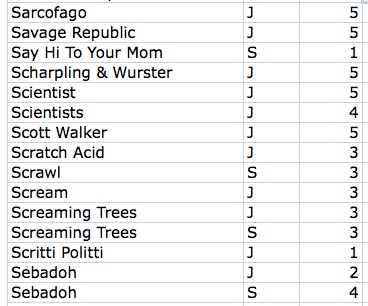
Sample of the data file
Ultimately I identified 528 artists and J identified 899. An interesting note about this process, after we both went through the list, there were approximately 500 artists that neither of us acknowledged. Some of this can be chalked up to people on compilations we might not be that familiar with individually. The rest…who knows?
Once this was done I put the data into Gephi. At the end of my last post I was having trouble with this process. After some trial and error, I figured it out. It was a lot like the process I used with the .gdf files in my last post. The steps were: save the Excel file as CSV and uncheck append file extension, then open that file in TextEdit and save as UTF-8 format AND change the file extension to .csv. Gephi took this file with no problems.
The troublesome process of coding and preparing the data for analysis done, it was time for the fun stuff. As with my last visualization, I used the steps from the basic tutorial to create a ForceAtlas layout graph. Here it is without labels:
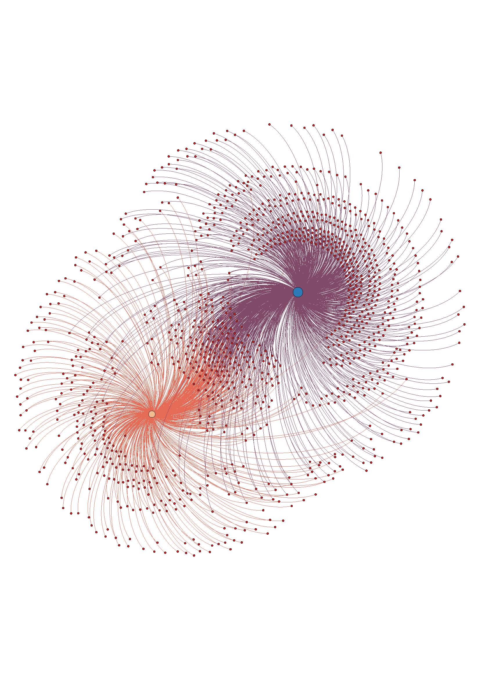
The assigned weight to each relationship is shown in the distance from our individual node, and also in the thickness of the edge (line) that attaches the nodes. It can be hard to see without zooming in closely on the image, since with so many edges it is kind of noisy.
Overall, I like the visualization. It doesn’t offer any new information, but it accurately reflects the data I had. Once I had the trouble spots in the process worked out, it went pretty smoothly.
I am not sure if ForceAtlas is the best layout for this information. I will look into other layout options and play around with them, see if it looks better or worse.
I made an image with the nodes labeled, but it become too much to look at as a static image. To this end, I want to work on using Sigma (thanks to Mary Catherine for the tip!) to make the graph interactive, which would enable easier viewing of the relationships and the node labels, especially the weights. This may be way beyond my current skill level, but I’m going to give it a go.
ETA: the above image is a jpeg, here is a PDF to download if you want to have better zoom options w_I_u_2