Tag Archives: GitHub

it’s “BIG” data to me: data viz part 2

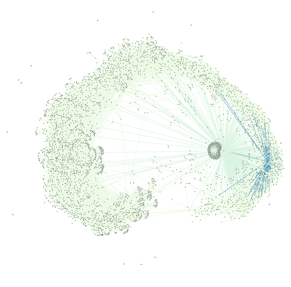
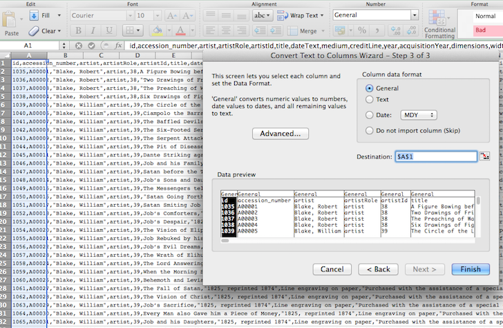
image 1: the final visualization (keep reading, tho)

Preface: the files related to my data visualization exploration can be located on my figshare project page: Digital Humanities Praxis 2014: Data Visualization Fileset.

In the beginning, I thought I had broken the Internet. My original file (of all the artists at the Tate Modern) in Gephi did nothing… my computer fan just spun ’round and ’round until I had for force quit and shut down*. Distraught — remember my beautiful data columns from the last post?! — I gave myself some time away from the project to collect my thoughts, and realized that in my haste to visualize some data! I had forgotten the basics.

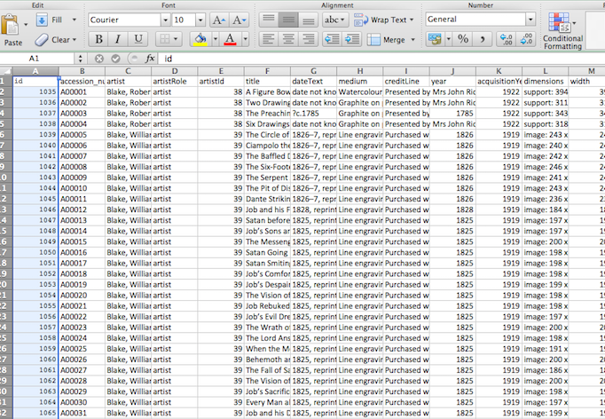
Instead of re-inventing the wheel by creating separate gephi import files for nodes and edges I went to Table2Net and treated the data set as related citations, as I aimed to create a network after all. To make sure this would work I created a test file of partial data using only the entries for Joseph Beuys and Claes Oldenberg. I set the uploaded file to have 2 nodes: one for ‘artist’, the other for ‘yearMade’. The Table2Map file was then imported into gephi.

Screen Shot 2014-11-12 at 9.28.37 PM

Image 2: the first viz, using a partial data set file; a test.

I tinkered with the settings in gephi a bit — altering the weight of the edges/nodes and the color. I set the visualization as Fruchterman-Reingold and voila!, image 2:

With renewed confidence I tried the “BIG” data set again. Table2Net took a little bit longer to export this time. But eventually it worked and I went through the same workflow from the Beuys/Oldenberg set. In the end, I got image 3 below (which looks absolutely crazy):

Screen Shot 2014-11-12 at 9.34.07 PM

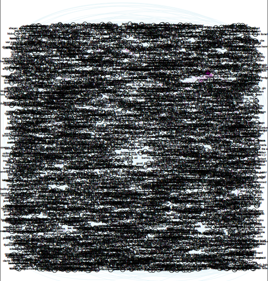
Image 3: OOPS, too much data, but I’m not giving up.


To image 3’s credit, watching the actual PDF load is amazing: it slowly opens (at least on my computer) and layers each part of the network, which eventually end up beneath the mass amounts of labels — artist name AND year — that make up the furry looking square blob pictured here. You can see the network layering process yourself by going to the figshare file set and downloading this file.

I then knew two things: little data and “BIG” data need to be treated differently. There were approximately 69,000 rows in the “BIG” data set, and only about 600 rows in the little data set. Remember, I weighted the nodes/edges for Image 2 so that thicker lines represent more connections, hence there not being 600 connecting lines shown.

Removing labels definitely had to happen next to make the visualization legible, but I wanted to make sure that the data was still representative of its source. To accomplish this, I used the map display ForceAtlas and ran it for about 30 seconds. As time passed, the map became more and more similar to my original small data set visualization — with central zones and connectors. Though this final image varies from the original visualization (image 2), the result (image 1) is more legible about itself.

Screen Shot 2014-11-12 at 9.52.56 PM

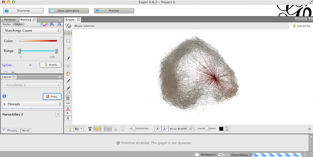
Image 4: Running ForceAtlas on what was originally image 3.

My major take-away: it’s super easy to misrepresent data, and documentation is important — to ensure that you can replicate yourself, that others can replicate you, and to ensure that the process isn’t just steps to accomplish a task. The result should be a bonus to the material you’re working with and informative to your audience.

I’m not quite sure what I’m saying yet about the Tate Modern. I’ll get there. Until then, take a look at where I started (if you haven’t already).

*I really need a new computer.

Mona Lisa Selfie: data viz part 1

Image from http://zone.tmz.com/, used with permission for noncommercial re-use (thanks Google search filters)

It took me a long time to get here, but I’ve found a data set that I feel comfortable manipulating, and it has given me an idea that I’m not entirely comfortable with executing, but am enjoying thinking about & exploring.

But before I get to that: my data set. I explored for a long time and, if you’ve read my comments, ran into a lot of trouble with RDF files. All the “cool” data I wanted to used was in RDF, and it turns out RDF is my monopoly road block: do not pass go, do not collect $200. So I kept looking, and eventually found a giant CSV file on Github of the artworks at the Tate Modern, along with another more manageable file of the artist data (name, birth date, death date). But let’s make my computer fan spin and look at that artwork file!

It has 69,202 rows and columns that go to “T” (or, 20 columns).
Using ctrl C, ctrl V, and text-to-columns, I was able to browse the data in Excel.

Screen Shot 2014-11-02 at 10.28.02 AM

seemingly jumbled CSV data, imported into Excel

Screen Shot 2014-11-02 at 10.28.14 AM

text to columns is my favorite

Screen Shot 2014-11-02 at 10.28.23 AM

manageable, labelled columns!


I spent a lot of time just browsing the data, as one might browse a museum (see what I did there?). I became intrigued by it in the first place because in my first trip to London this past July, I didn’t actually go to the Tate Modern. My travel companions had already been, and we opted for a pint at The Black Friar instead. I’m looking at data blind, and even though I am familiar with the artists and can preview the included URLs, I haven’t experienced the place or its artwork on my own. Only the data. As such, I wanted to make sure that any subsequent visualization was as accurately representative as I could manage. I started writing down connections that could possibly interest me, or that would be beneficial as a visualization, such as:

  • mapping accession method — purchased, “bequeathed”, or “presented” — against medium and/or artist
  • evaluating trends in art by looking at medium and year made compared to year acquired
  • a number of people have looked at the gender make-up of the artists, so skip that for now
  • volume of works per artist, and volume of works per medium and size

But then I started thinking about altmetrics, again — using social media to track new forms of use & citation in (academic) conversations.

Backtrack: Last week I took a jaunt to the Metropolitan Museum of Art and did a tourist a favor by taking a picture of her and her friend next to a very large photograph. We were promptly yelled at. Such a sight is common in modern-day museums, most notably of late with Beyonce and Jay Z.
What if there was a way to use art data to connect in-person museum visitors to a portable 1) image of the work and 2) information about the work? Unfortunately, the only way I can think to make this happen would be via QR code, which I hate (for no good reason). But then, do visitors really want to have a link or a saved image? The point behind visiting a museum is the experience, and this idea seems too far removed.
What if there was a way to falsify a selfie — to get the in-person experience without being yelled at by men in maroon coats? This would likely take the form of an app, and again, QR codes might need to play a role — as well as a lot of development that I don’t feel quite up for. The visitor is now interacting with the art, and the institution could then collect “used data” to track artwork popularity which could inform future acquisitions or programs.

Though this it’s a bit tangential from the data visualization project, this is my slightly uncomfortable idea developed in the process. I’d love thoughts or feedback or someone to tell me to pump the proverbial breaks. I’ll be back in a day or so with something about the visualizations I’ve dreamed up in the bullets above. My home computer really can’t handle Gephi right now.


Data Set: Topic Modeling DfR

Hello Praxisers, I’m writing today about a dataset I’ve found. I’ll be really interested to hear any thoughts on how best to proceed, or more general comments.

I queried JSTOR’s dfr.jstor.org Data for Research for citations, keywords, bigrams, trigrams and quadgrams for the full run of PMLA. JSTOR gives this data upon request for all archived content. To do this I had to request an extension of the standard 1000 docs you can request from DfR. I then submitted the query and received an email notification several hours later that the dataset was ready for download at the DfR site. Both the query and the download are managed through the “Dataset Requests” tab at the top right of the website. It was a little over a gig, and I unzipped it and began looking at the files one by one in R.

Here’s where I ran into my first problem. I basically have thousands of small documents, with citation info for one issue per file, or a list of 40 trigrams from a single issue. My next step is to figure out how to prepare these files so that I’m working with a single large dataset instead of thousands of small ones.

I googled “DfR R analysis” and found a scholar, Andrew Goldstone, who has been working on analyzing the history of literary studies with DfR sets. His GitHub  contains a lot of the code and methodology for this analysis, including a description of his use of Mallet topic modeling through an R package. Not only is the methodology available, but so is the resulting artifact, a forthcoming article in New Literary History. My strategy now is simply to try to replicate some of his processes with my own dataset.