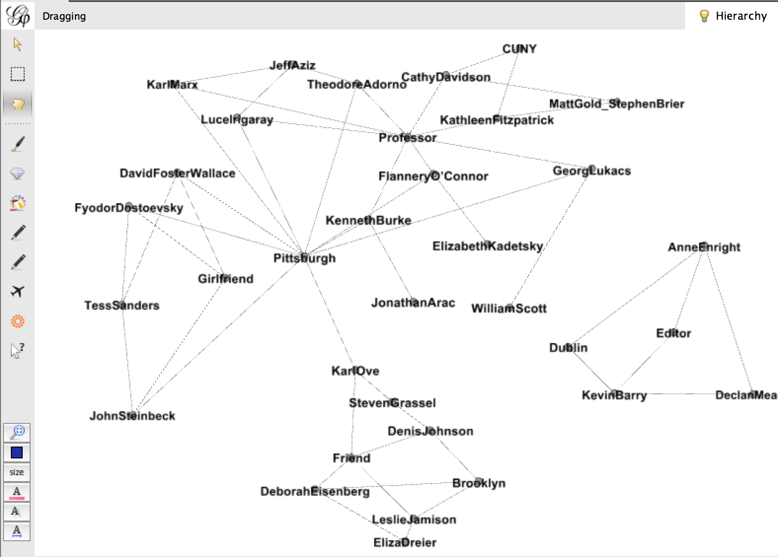
Tag Archives: DH Praxis 2014

TANDEM Project Update

PROJECT:

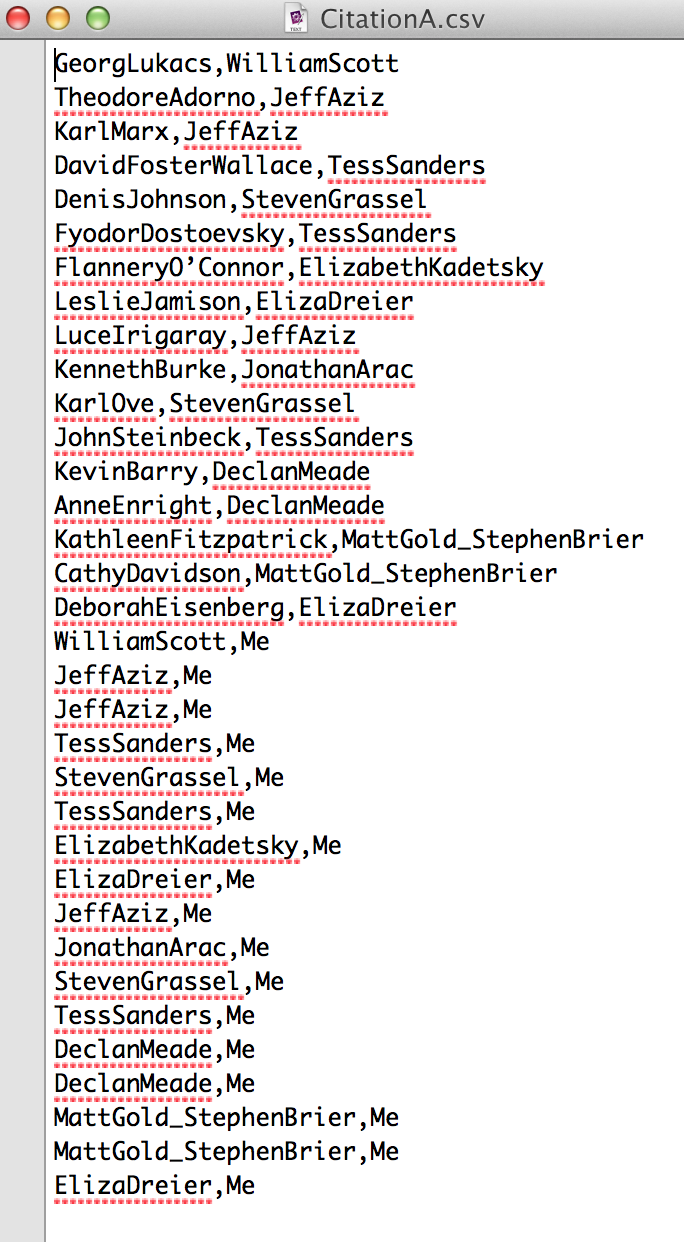
TANDEM 0.5 will be moving from it’s heavy development phase into a testing and forward-facing design phase this week. At the time of this posting, Steve and Chris are still working out the specifics of functioning unified code, but testing of the independent scripts has begun to a certain degree of success. Text and image values are easily generated via independent processes.

This week we also discussed the idea of data persistence with some depth. Simply put, would someone be able to access the data they generated at a later date via the TANDEM ui. At this iteration of the software, we agree that this is a valuable component, but not an essential feature for an MVP. That said, we are thinking about both the code needed to run it and the user-specific UI that would accompany such an application.


DEVELOPMENT:

We are working away at unifying TANDEM’s independently functioning image and text codebases. We are aligning the code in a single python script file. We vetted an idea to have two scripts, one for image and one for text, run simultaneously. The decision was made that for this first iteration of TANDEM, a single .py will suffice, and in fact may be more maintainable and more efficient.

The code merge has been slow due to python versioning issues which lead to the code producing different results on different machines.

A call is scheduled for Tuesday with Tim at Reclaimhosting to work on configuring the server to run Django. Meanwhile the developer is working through the very thorough Django tutorial and also trying to begin the defined appropriate class objects for a potential future version.


DESIGN:

Immediately following the code merge, we plan to begin implementing our user interface. A full size mockup of this is still under version control as we explore new grounds with user-specific views and the possibility of in-browser table views of the .csv data that is generated.


OUTREACH:

TANDEM continues to reach new communities. We have a lead, thanks to Sarah Cohn. The Biodiversity Library is currently crowdsourcing their seed catalog archive project, and in advanced versions, TANDEM might improve their information collection. http://blog.biodiversitylibrary.org/2015/03/help-us-improve-access-to-seed-and.html Jojo will contact them once our prototype is more stable.

Additionally, Jojo spoke with Grant Wythoff, who reasserted TANDEM’s relevance to Bill Gleason’s project at the Cotsen Library. Jojo will reach out to Professor Gleason again this week. Grant also recommended we contact Natalie Houston at University of Houston regarding her Digital Victorian project on the visuality of poetry.

Jojo also attended the DjangoGirlsNYC event at the Stack Exchange. In addition to familiarizing herself with the framework in which TANDEM will eventually operate, she made useful contact with other django developers working in NYC.

Tokyo Destruction Diary Pre-Pitch

The basic idea is to create an interactive map of Tokyo, charting instances of rapid destruction (1923 earthquake, WWII), social upheaval (protests of the 1960’s), and random acts of violence (1995 sarin gas attack, the 2008 Akihabara massacre), along with the city’s own growth and changes during the post-war years. Then I would juxtapose this historical data with trends in media related to the destruction of Tokyo and to see how media becomes a barometer for fears generated from past trauma or changes.

Though not all change and destruction in Tokyo is the result of horrific disasters or war. Tokyo is a city that almost perpetually has buildings being torn down and new ones being built up. According to a Frekonomics podcast, half of all homes in Japan are demolished after only 38 years (http://freakonomics.com/2014/02/27/why-are-japanese-homes-disposable-a-new-freakonomics-radio-podcast-3/). Death and rebirth become cyclical parts of daily life that shape Tokyo, literally and figuratively.
So why focus on Japan and Tokyo? From the 1980’s (arguably earlier) to today, we have seen Japanese pop culture become more and more present in the American cultural landscape. It informs how we perceive Japan’s history and culture (though sometimes these perceptions may be skewed) and once obscure portions of Japanese arts and media have now become common knowledge thanks to fan communities, bloggers, publishers, and other people bridging the gap between our culture and Japan’s. Through this exchange, we’ve seen the Japanese death/rebirth cycle take form in movies, tv shows, books, video games, and more. Mothra snaps Tokyo Tower in twain, only for it to be in one piece again the next time Godzilla emerges from the murky depths.

This project would act as a way to chart Japan’s history, it’s changes in media, and it would ultimately take the form of a website which would be viewed by people interested in media, history, and Japanese culture.


Lab Journal 1

Earlier in class I felt unsure about whether or not to promote my project proposal: The Tokyo Destruction Diary. To recap, my idea was to create an interactive map of Tokyo where certain points of interest were highlighted and when a user clicked on them they gave data and historical context to an actual attack or disaster that happened there (earthquakes, fire-bombings, terrorist attacks, etc). Other points would give information about popular media (comics, movies, games) that have stories tied to the destruction of Tokyo. The two categories of fictional and actual destruction would cross reference each other to give the viewer an encapsulation of Japanese media and history, and how societal fears can be expressed through popular media.


I felt genuine conflict about whether or not my project idea was worth pushing, whether it was a battle worth fighting. The final grade on my proposal for my project made me realize some of my shortcomings. Prof. Gold considered TDD a good general project idea, but found it lacking in a humanities focus and I was at a loss for figuring out the nitty-gritty about how to execute the project beyond just using a map based program like Neatline.


I have the basic idea (explore Japanese art/culture through events in history and vice versa). I have the knowledge and passion for the subject. But ultimately, I lack the technical know-how to fully realize my idea, and I would find myself relying on other people almost completely to realize certain aspects of it. Granted, part of this exercise is learning how to rely on others, but I feel like it would be irresponsible to rally the class to construct a building I didn’t have blueprints for, so to speak. Also, the information about fictional destruction would be tricky to gather in mass quantities or from databases. It would rely more on an individual knowledge of the subject matter (mostly from me). I feel like the project would need a serious re-evaluation before it could be considered good enough to pitch.


TANDEM (0.5)

Let’s build a GUI that combines the power of Google’s Tesseract OCR and FeatureExtractor.

The idea is to build an environment (web-based or standalone) where you can take your text overlayed object, toss it in, and have a save ready output file to take away with you. Generate the data you need to visualize, explore, parse apart, and build the story. There is an interesting dialogue between text and images happening in comics, children’s picture books, marketing materials, illustrated maps, illuminated manuscripts, etc. Get your data, understand the output variables in simple and easy to reference ways, and get back to finding your story.

  • Team Note: Be ready to learn. Everyone involved in this intimidating project will bleed through their role and engage in collaborative learning of each of the elements needed to complete the project. Developers must understand design, designers must understand branding, outreach/branding must understand how the thing works, and the project coordinator must understand how to get conversations rolling to hit deadlines.
  • Developer:  Bravery. Develop clean and clear code that will allow us to wrap our OCR and Image Processing Software as modules to be placed in the overall software. Working understanding of code and willingness to dedicate time to digging into what needs to be written to get this off the ground. Knowledge of Python or a single language at the very least.
  • Designer: Understand user interaction and develop aesthetically simple, intuitive interface. Understand design basics, have a working proficiency in Adobe Design programs. Also maintain brand identity in conjunction with Outreach Coordinator.
  • Outreach Coordinator: Social butterflies. We need community support. Work on creating a voice and an audience for this project. Using not only social media but having the ability to track where our message is working best. What tweets work, what outlets are giving good feedback. We need to make a communal conversation that helps us reach our goal.
  • Project Manager: Keep your hand on the pulse of the schedule, set deadlines, gather learning resources, keep open lines of communication between team members. I have so many people in mind for this and each one can potentially bring an entirely different outcome to the project. I want a project manager who wants to see this thing materialize.

Reassurance – Let’s say we build it in Python and Javascript – Here are key some pieces we can consider:

Google’s Tesseract OCR

Python-tesseract is a python wrapper for google’s Tesseract-OCR

FeatureExtractor (Let’s talk to Lev about this. It is one of his tools afterall.) –

PyJamas GUI Toolkit

Social Citation

Hi All,

It’s so exciting to see the progress on this blog; I know so many of us are now able to do things we couldn’t at the beginning of this class, thanks in no small part to all the great workshops. My final project is largely facilitated by the Gephi workshop. In this post I want to share my process in case it’s useful to anyone, but also, crucially, ask for your help to bring it to life. In case this gets long I’ll say now that in the final two weeks of class I hope to ask the praxisers to complete the short (and fun!) exercise of mapping your favorite authors, as well as the people who helped you discover them, in a simple text file. Now into the weeds! (ps I will be more specific when I ask this in earnest).

My goal here is to make the citation process more social, to draw the connections between impactful texts/authors and the friends, partners, mentors, teachers, scholars, family etc. that helped you discover the content. I began with a basic tab delineated text file that looked like this: Screen Shot 2014-12-03 at 7.51.01 PM

the categories here from right to left are: author, my person, relationship, location. I didn’t get too hung up on the content, just typed what came to mind for maybe 15 minutes. It took a bit of tinkering to figure out how to show this in Gephi, but eventually I got this:

Screen Shot 2014-12-03 at 7.54.12 PM

Sorry if this is hard to see, but this is a very messy graph. There are some interesting things going on – the connections are by relationship and location, and they create pockets. Declan Meade is off on his own to the right because he’s the only Dubliner and the only Editor I have. I tried to make this a little more cohesive by changing my data to look like this:Screen Shot 2014-12-03 at 7.53.55 PM

So I got rid of relationship and location, I also made it a one-to-one relationship between everything, where “Me” was connected to each of my people, and each of my people were connected to the work they’d introduced me to. Then the graph changed to this:Screen Shot 2014-12-03 at 8.17.49 PM

This sacrificed some of the nuance of place and relationship, but it gained a simplicity that I think is critical in these visualizations to make sense at a glance.

I’m not sure whether I’d like to add in relationship as a node, or maybe offer it as a hover or something. (color coordinate edges with a key linking them to relationships??) I have more playing to do, and would love feedback. But I think this project gets way more interesting when “Me” is connected to “You”. And so I wonder if folks would be willing to participate in this exercise. I think we can all safely use the three print texts assigned in this course, creating a link between everyone. I’ll finalize the model over the weekend, to have a more developed request for you, but I think the easiest thing would be for me to set up a google doc with everyone’s name on a separate page and ask you to type out the data. It’s important to the project because only YOU know these things – there’s no way to scrape this. Thanks for your consideration, and looking forward to NYPL Labs tomorrow!


Hyper Focus – What To Do When Everything and Everyone Are Important All The Time?

Is there an answer to “what to do when everything and everyone are important all the time?” Truth be told, the brain will do what the brain has been designed to– reduce the information into manageable segments. Some stuff will stick. Some won’t.

Laura Klein’s YouTube presentation posted on the CUNY commons for the DH Praxis class offered insight into the use of maps and graphs throughout history. Her demonstrations focused on the powerful influencing capabilities of data visualization.

I simultaneously skipped around watching Lev Manovich present live at MoMA in between pauses to Klein’s video last night. Manovich suggested that digital photography is the new art form now employed by billions of people. He described it as “new, young, and sexy.”

Meanwhile, I spent the past weekend at the 2nd annual conference for the New York Academy of Medicine. The NYAM festival was celebrating the 500th birthday of the anatomist Andreas Vesalius. Early anatomical drawings, it could be argued, were also maps of sorts, charting the human body as early as the 1500s. Dr. Brandy Schillace gave a talk titled “Naissance Macabre: Birth, Death, and Female Anatomy.”

The highlights of Dr. Schillace’s presentation were renderings focused on the pregnant form. The renderings of chaste females were often poised next to potted plants symbolizing the container quality of the pregnant woman. As Laura Klein suggested in her video, the symbolism indicated makes suggestions about how to best view the role of mother in Western culture. She is a vessel.

The afternoon at NYAM concluded with a presentation featuring ProofX 3D anatomical printing, which fashioned a heart valve over the next four hours. The demo-guy gave me his card. Armed with two lectures, several books, and some practical experience I suddenly felt empowered enough to log onto GitHub.

I plugged in a recent article on “Mothers Who Do It All.” Since I haven’t gotten into the programming end yet, I opted for the word cloud. Initially punching in 256 words from the article. I reduced them to 230 (so I could slightly control the visuals) and have uploaded the by-product here.

Word_Cloud_SmThe article cited wasn’t brilliant. It’s a rehash of the same old problem and doesn’t get to the point of possibly viewing women as intelligent procreative forces. Instead it’s a familiar subject from my days as an artist 20 years ago. How can women do it all, and make music too? (See MaMaPaLooZa). The word cloud isn’t particularly stunning either, but it represents a leap for in terms of the subject of “motherhood,” DH and how mapping might eventually lead me somewhere? (I couldn’t find anything of major consequence in my Google search).

Let me also conclude this blog by acknowledging that I recognize what a ‘soft’ subject motherhood is. To use Lev Manovich’s words, I’m not even sure it is very “sexy.” Even the word cloud looks “soft” evoking a “Hallmark Cards” visual. I know the subject doesn’t sound scientific or technical, and I’m not even sure what my angle is yet (although I have a few ideas). But as Laura Klein indicated in her presentation, while some cartographers, and data graph makers knew exactly what they were doing, others didn’t always have a clear concept at the onset.

If anyone finds any references to data, the digital humanities, and motherhood please send them my way. I’d be most interested. ~MJR