Image from http://zone.tmz.com/, used with permission for noncommercial re-use (thanks Google search filters)
It took me a long time to get here, but I’ve found a data set that I feel comfortable manipulating, and it has given me an idea that I’m not entirely comfortable with executing, but am enjoying thinking about & exploring.
But before I get to that: my data set. I explored for a long time and, if you’ve read my comments, ran into a lot of trouble with RDF files. All the “cool” data I wanted to used was in RDF, and it turns out RDF is my monopoly road block: do not pass go, do not collect $200. So I kept looking, and eventually found a giant CSV file on Github of the artworks at the Tate Modern, along with another more manageable file of the artist data (name, birth date, death date). But let’s make my computer fan spin and look at that artwork file!
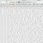
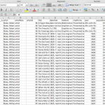
It has 69,202 rows and columns that go to “T” (or, 20 columns).
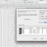
Using ctrl C, ctrl V, and text-to-columns, I was able to browse the data in Excel.
I spent a lot of time just browsing the data, as one might browse a museum (see what I did there?). I became intrigued by it in the first place because in my first trip to London this past July, I didn’t actually go to the Tate Modern. My travel companions had already been, and we opted for a pint at The Black Friar instead. I’m looking at data blind, and even though I am familiar with the artists and can preview the included URLs, I haven’t experienced the place or its artwork on my own. Only the data. As such, I wanted to make sure that any subsequent visualization was as accurately representative as I could manage. I started writing down connections that could possibly interest me, or that would be beneficial as a visualization, such as:
- mapping accession method — purchased, “bequeathed”, or “presented” — against medium and/or artist
- evaluating trends in art by looking at medium and year made compared to year acquired
- a number of people have looked at the gender make-up of the artists, so skip that for now
- volume of works per artist, and volume of works per medium and size
But then I started thinking about altmetrics, again — using social media to track new forms of use & citation in (academic) conversations.
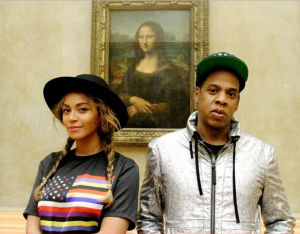
Backtrack: Last week I took a jaunt to the Metropolitan Museum of Art and did a tourist a favor by taking a picture of her and her friend next to a very large photograph. We were promptly yelled at. Such a sight is common in modern-day museums, most notably of late with Beyonce and Jay Z.
What if there was a way to use art data to connect in-person museum visitors to a portable 1) image of the work and 2) information about the work? Unfortunately, the only way I can think to make this happen would be via QR code, which I hate (for no good reason). But then, do visitors really want to have a link or a saved image? The point behind visiting a museum is the experience, and this idea seems too far removed.
What if there was a way to falsify a selfie — to get the in-person experience without being yelled at by men in maroon coats? This would likely take the form of an app, and again, QR codes might need to play a role — as well as a lot of development that I don’t feel quite up for. The visitor is now interacting with the art, and the institution could then collect “used data” to track artwork popularity which could inform future acquisitions or programs.
Though this it’s a bit tangential from the data visualization project, this is my slightly uncomfortable idea developed in the process. I’d love thoughts or feedback or someone to tell me to pump the proverbial breaks. I’ll be back in a day or so with something about the visualizations I’ve dreamed up in the bullets above. My home computer really can’t handle Gephi right now.


Hi Kelly Marie,
I enjoyed reading your blog entry as I thought I was the only one that was overwhelmed with the thought of a data set for an upcoming project. I too hate QR’s for no reason at all but think that you are on to something and it definitely could potentially correlate to the bottom line of museums. We know all too well how important the bottom line is to all public and private spaces and the opportunity to maximize utilization. I wish you the best in your endeavor. I am still in search of my data set and feel hopeful.
Cindy,
If you’re comfortable working in Excel, I highly recommend searching for data sets in github that are in CSV format. The data from government websites, links available on the Grad Center Library libguide “Finding Data”, are sometimes in CSV, too. It just depends what you’re “in to”. Happy hunting, and thanks for your comment!
Pingback: it’s “BIG” data to me: data viz part 2 | Digital Praxis Seminar Fall 2014 – Spring 2015
Just a quick note on your thinking process here: I LOVE how you looked at the data to consider how your findings might actually effect change in the museum experience. A lot of data projects are meant to show or tell a story, but using data to make an argument for a new service or experience is a really fabulous move.
I’ll stay tuned!