To follow up on Min’s post about retrieving data from social media platforms using Apigee, I wanted to report back about the next step in our process–preparing the data for visualization.
We decided to dig in with Instagram and see what we could do with the data returned for images tagged with the word sprezzatura. Using the method described in Min’s post we were able to export data by converting JSON to CSV. However Apigee returns paginated results for Instagram, so we were dealing with individual data dumps for 20 images when the total number of images with this tag is over 60,000. By copying and pasting the “next_url” into the Request URL field on Apigee’s console we were able to move sequentially through the sets of data:
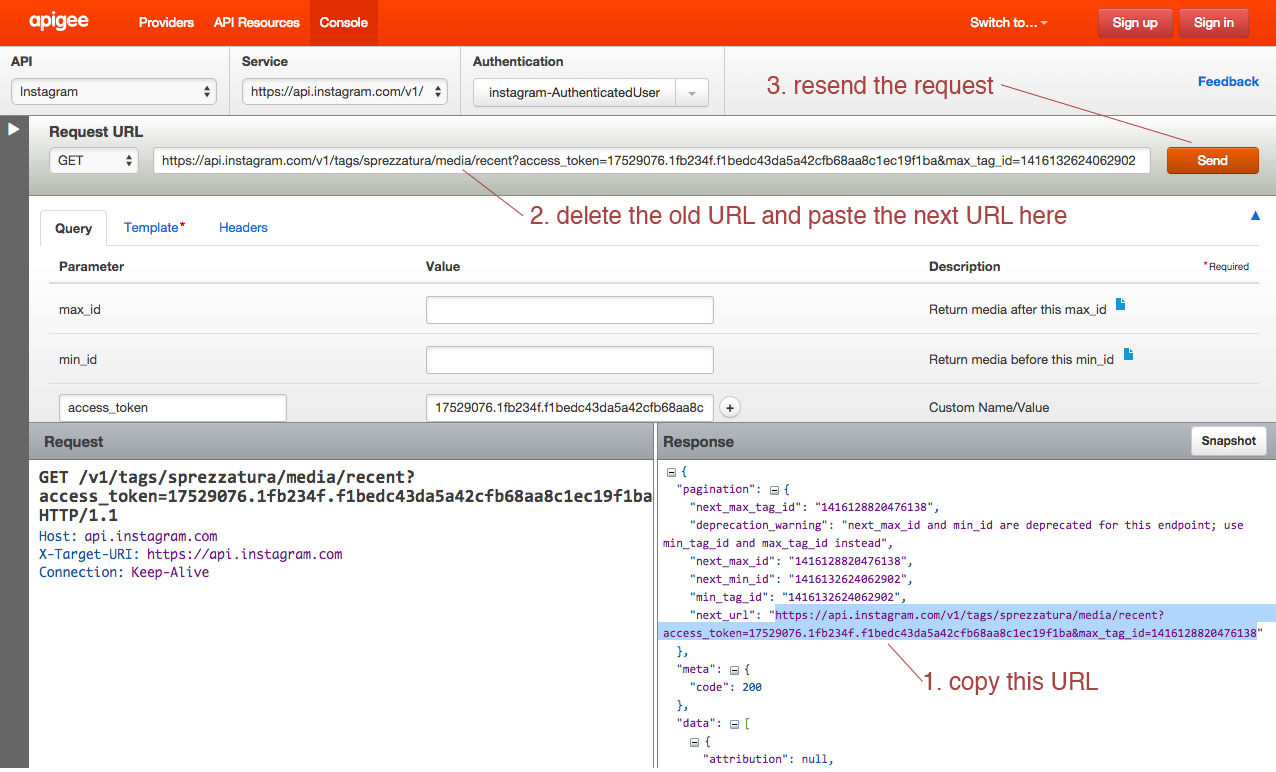
We decided to repeat this process only ten times, since the 3,000 times it would have taken to capture the whole data set seemed excessive…
When we opened the CSV files in Excel we encountered another problem. The format of the data is dictated by the number of tags, comments, likes, etc., meaning that compiling the individual data dumps into one useful Excel file was tricky.
We compiled just the header information to try to make sense of it:
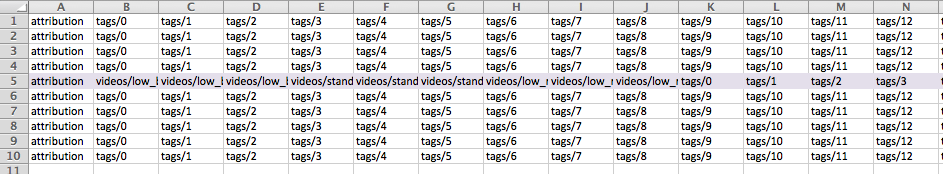
The 5th row indicates a data dump that contained a video. As a result additional columns were added to account for the video data. At first we thought that cleaning up the data from the 10 data dumps would just be a matter of adjusting for extra columns and moving the matching columns into alignment, but as we dug deeper into our data we realized that that wouldn’t work:
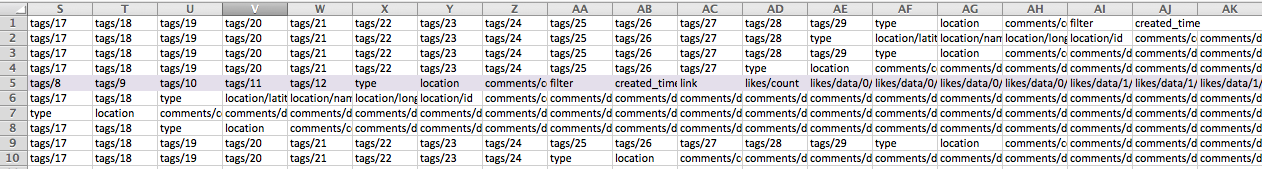
As you can see, some of the data dumps go from reporting tags to a column for “type” followed by location data, while others go directly into reporting comment data. The same data is available in each data dump, but inexplicably they are not all returned in the same order.
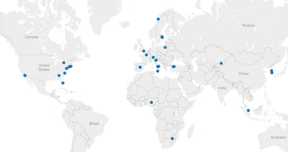
We looked into a few options for merging Excel spreadsheets based on column headers, but either the programs weren’t Mac-friendly or the merge seemed to do more harm than good. We decided to move ahead with cleaning up the data in a more or less manual way with good old fashioned copying and pasting. We wanted to look at location data on these images (perhaps #sprezzatura is still most commonly used in Italy or maybe it’s been specifically appropriated by the fashion community in NYC?), so we decided to harvest the data for latitude and longitude. We did this by filtering the columns for latitude in each data dump to return the images that had this data (only about 1/3 of the images had geotagging turned on). We also gathered the username, the link to the image, and the time the image was posted.
We made a quick map in Tableau, just to see our data realized:
Next steps are to make a more meaningful visualization around this topic. We’d be interested to try ImagePlot to analyze the images themselves, but we haven’t explored a batch download of Instagram photos yet.
Thanks for extending Min’s post. I wonder if you might have more luck working with the data before you pull it into Excel in a text file format. I think it might be pretty fast to strip out all the pagefeeds in a textfile, for example. Straightening out the columns, too, could be easier.
Apigee appears to be an amazing tool.
Tessa,
I ran into the same issue with the column headers this weekend. I was able to replicate the steps from the first post — so great, thanks again to your duo for all of that — but then the resulting CSV files had data in wildly different orders. Elissa was telling me that that’s just the way JSON does, and I spent about an hour (maybe more) looking for an Excel formula to correct the issue. Nothing was perfect or not too taxing. My files from this process had CSV data going to CM, so something like a V-LOOKUP to re-organize the columns would.be.too.much. Stephen might be on to something — I’ll try that!
As an aside, I’m now just doing this for fun. I’m considering my data visualization exercise complete (right, Matt, Stephen?). 🙂
Thanks guys! I agree–there has to be a better way. The text file idea definitely sounds promising. I’ll give it a try!
Thanks, guys, for your detailed posts! Though I decided to go with a different json converter, your post about that last week still did wonders for my morale! It was nice to see that other people are trying to work with json data, and that they found a way! Your Tableau map looks great too! I have not worked with that program yet, but it looks like it might be good for helping me plot the locations of tweets as well. Was the program easy to use?
This is just a post to say how amazing it was to see this presentation in class–and a thank you for documenting your work so clearly. I haven’t used Apigee, but it looks like a really wonderful tool–and now I’d feel empowered to use it!
I think the idea of “fashion vernaculars” is absolutely fascinating, and like Syndee pointed out in discussion, the connotative powers of these words can extend beyond the clothes that they suggest. You’ve got a really rich data set here, with some compelling questions behind it too that could always serve as another aspect of your project (when it’s not finals season!).
As a side note, I’m totally impressed with the scope of this project, and the fact you’ve not only processed data, but mapped it, and plan to do more! Rock on!