The basis of my dataset is my iTunes library. I chose this because it was easily accessible, and because I was interested to see what the relationships in it would look like visualized. My 2-person household has only one computer (a rarity these days, it seems) which means that everything on it is shared, including the iTunes library. Between the two of us, we’ve amassed a pretty big collection of music in a digital format. (Our physical (non-digital) music collection is also merged but it is significantly larger than the digital one and only a portion of it is cataloged, so I didn’t want to attempt anything with it.)
I used an Apple script to extract a list of artists as a text list, which I then put into Excel. I thought about mapping artists to each other through shared members, projects, labels, producers etc, but after looking at the list of over 2000 artists (small by Lev Manovich standards!), I decided that while interesting, this would be too time consuming.
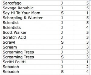
My other idea was easier to implement: mapping our musical affinities. After cleaning up duplicates, I was left with a list of around 1940 artists. Both of us then went through the list and indicated if we listened to that artist/band/project, and gave a weight to the relationship on a scale of one to five (1=meh and 5=essential). It looked like this:
Ultimately I identified 528 artists and J identified 899. An interesting note about this process, after we both went through the list, there were approximately 500 artists that neither of us acknowledged. Some of this can be chalked up to people on compilations we might not be that familiar with individually. The rest…who knows?
Once this was done I put the data into Gephi. At the end of my last post I was having trouble with this process. After some trial and error, I figured it out. It was a lot like the process I used with the .gdf files in my last post. The steps were: save the Excel file as CSV and uncheck append file extension, then open that file in TextEdit and save as UTF-8 format AND change the file extension to .csv. Gephi took this file with no problems.
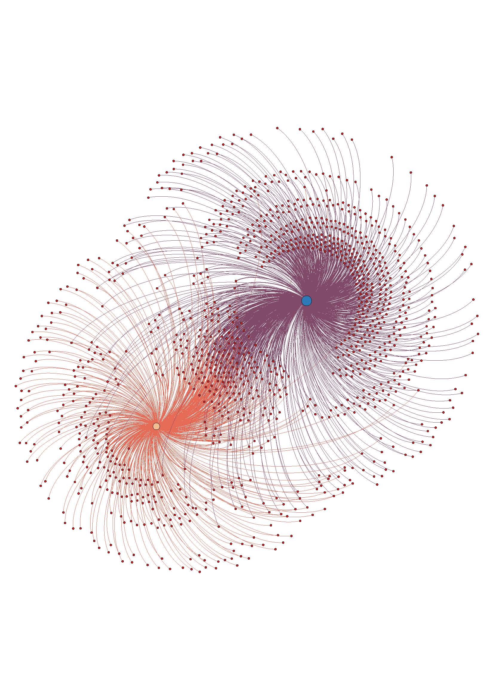
The troublesome process of coding and preparing the data for analysis done, it was time for the fun stuff. As with my last visualization, I used the steps from the basic tutorial to create a ForceAtlas layout graph. Here it is without labels:
The assigned weight to each relationship is shown in the distance from our individual node, and also in the thickness of the edge (line) that attaches the nodes. It can be hard to see without zooming in closely on the image, since with so many edges it is kind of noisy.
Overall, I like the visualization. It doesn’t offer any new information, but it accurately reflects the data I had. Once I had the trouble spots in the process worked out, it went pretty smoothly.
I am not sure if ForceAtlas is the best layout for this information. I will look into other layout options and play around with them, see if it looks better or worse.
I made an image with the nodes labeled, but it become too much to look at as a static image. To this end, I want to work on using Sigma (thanks to Mary Catherine for the tip!) to make the graph interactive, which would enable easier viewing of the relationships and the node labels, especially the weights. This may be way beyond my current skill level, but I’m going to give it a go.
ETA: the above image is a jpeg, here is a PDF to download if you want to have better zoom options w_I_u_2


Thanks so much for documenting your process, Sarah! I love the fact that you are analyzing a personal dataset and your “meh –> essential” scale is amazing. Great progress and keep at it.
I like the way you organize the data sets. Your explanations are easy to follow. Excel will be a great resource to analyze and synthesize complex datas.
Love it!
Great! I haven’t even heard of Apple script. Now will know.
This is terrific, Sarah! A few things to consider:
1. Try importing the ‘year’ field from your dataset (with the rest of the data) into Gephi, and then using the ‘merge columns’ function to turn the year column into a new, time interval column. This will time stamp the node w/a start time. The same can be done for edges, if you’re using an edge list. Then all you have to do is activate the timeline (make sure ‘Dynamic Range’ is selected in the ‘Filters’ panel), and you can see the dynamic changes in your dataset over time.
2. You may find that a quick copy from Excel and paste into TextWrangler (w UTF-8 and Unix linefeeds as the default) or using ‘Tab Delimited Text’ as the export format may be faster than the csv export from Excel.
One additional thought – you may actually find the ‘date added’ field in iTunes a more interesting and much less ‘meh’ time stamp than ‘year released’!
This is great, it is a beautiful visualization, I have struggled using gephi because the node to edge relationship is confusing to identify.
the hand placed scaleed is really wonderful, it adds a sencical aspect to this map that is not
Is there any differentiating between small changes in albums or artists? For example: an album might get re-released as a special edition with new tracks or as a remastering. This all depends on the meta-data on the disc. For example, Dark Side of the Moon was released in 1973, but it also had re-masterings in 2003 and 2011. This data could track which albums or artists gain a resurgence over time, or just track your own willingness to buy one album multiple times.
You could also start a separate tree mapping solo acts that broke off from other bands in your library (Pink Floyd splinters into Roger Waters, David Gilmour, and Syd Barret’s solo acts, NSYNC splinters to Justin Timberlake, etc), thus tracking a band’s continued expansion despite acts breaking up.
Sarah,
I really appreciated your presentation on this in class–the way you walked us through the information was fabulous.
It would be so cool to do this project within a band, for instance, to see where music influences overlapped and how that affected artistic decisions.
Lots of cool stuff. And yay doom metal!
MC