I was a bit overzealous in my first semester as a MALS student and I am taking Prof Lev Manovich’s Data Visualization class. I saw his name in the course scheduling and I had a mini heart attack. “I COULD TAKE A CLASS WITH LEV MANOVICH!!!” this was my reaction. I had to do it. What if the course was not offered another semester and this was my only chance?!?! I have been reading his work 4ever.
I am learning R but mostly it feels like I am having mini panic attacks when I cannot get the console to respond to anything I type in, then I get so excited when I make anything work I think I have conquered the world, then I got to class and all the computer science boys have made these beautiful amazing visualizations, and I am back to panic attack mode. soooo get excited! this could be your future 2!
As a side note, as we move forward I would like to have an in person R working group that involves drinking and swearing. srsly. email me.
One data set we are working with is a very rough data set of Instagram uploads for last years month of may. It has over 2 million entries so your computer has to have lots of memory or it will not even look at the data. Data in R can be numeric (12) or it can have characters like “spring time.” Sometimes R can read numbers as characters and count characters as numbers. So yeah. blarg. This particular data set only has two numerical values latitude and longitude. It also has instagram usernames, URL’s for the pic posted, #’s, Instagram Id’s, and date and time posted (but not numerically instead as a character string).
I am still struggling with the most basic logical arguments in R. Assigning data to variables and then accessing those variables and gathering information in various formats that can turn into graphs. I spent about an entire week unable to even load the data into R. That felt very dumb. gradually I realized my 7 year old macbook pro did not have the space or steam for these 2 million datas. Then I rented a clunky old dell from my library, I struggled more with uploading my data into R until I realized that directories in mac computers have / forward slashes and directories from windows machine have \ backslashes so I was literally just writing the wrong file name a million times. AHHHHH
Next thing to do; stay home from work to watch a million youtube videos because I do not want to email people about my problems with R I need to listen to them explain to me how to do things (hence my desire for an In person drinking R group). learning this language is pretty interesting in itself, I realize that lots of learning I do is all a similar kind of learning, but sometimes you really have to examine how you absorb information best when you are taken back to that awful feeling of childish bewilderment.
Right now I can only make R look at the numerical parts of the data. I am confused about how to command counting of the character data and then graphing that counted character data. For example a lot of the images probably have a #NY associated with the data. If I could count this and then associate it with the latitude and longitude I could graph it. I will figure this out.
I am instructed to be creative, but I feel like a bit of a moose fumbling around in this R language, it is difficult to be creative when I am still trying to type sensical strings of commands in R that don’t just bring back error messages.
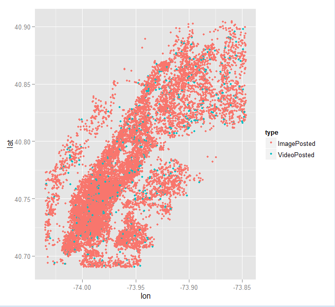
Here is a mediocre graph. I have plotted the lat long of a sampling of 20,000 Instagram uploads. the third variable I have added to my graph is the type of upload, image or video. This graph is not very creative. But Instagram uploads make the shape of Manhattan! We are our geography!
Very cool, Julia. I definitely get the swooping joy any time any command comes through with the correct outcome (as anyone who has sat near me at a workshop can attest) — but I think my tentative tiptoeing in all these intro workshops hasn’t yet gotten me on solid enough footing to make any decided progress. I feel like I know a lot of not enoughs. From my precarious digital stance, your moose-ness looks pretty neat. I look forward to seeing where you take it!
-Jojo
Julia,
I understand the swooping joy followed by the impulse to swear when working with data, though I am not far enough with mine to be visualizing yet, so kudos! The song “Bad Romance” came on when I was working on my project yesterday, and I am sure it was not a coincidence. Your graph looks super cool!
R is definitely one of the most opaque technologies I have ever worked with. I wonder if it’s because it is based on 1970’s technology.
Julia,
Love your style here! The density of that map is so interesting…we really are everted, huh? And thanks for sharing what it means to truly work with some big data! That word is often thrown around, but holy cow…
Your post, and the comments empathizing, definitely makes me think there’s room to do a data visualization project that charts the emotional states of learning new technologies. Wouldn’t that be FASCINATING!? I think there tends to be a lot of drop-off in even basic technologies, depending on audience, because people get frustrated so easily–just look at the Zotero help boards, or any other documentation space!
Knowing how people react affectively over the course of learning basic proficiency in software–perhaps with a self-rating questionnaire, help me out psychology folks!–and then visualizing this information as a time lapse could offer some real insights into why certain platforms work, and others remain niche. How much frustration are users willing to tolerate in order to use a software? Do early rewards necessarily indicate users will go on to obtain proficiency?
Thanks, Julia–this might be a spring project, born from the comments section…let me know if anyone else might be interested! 🙂
And good luck with both R and drinking!