I like to cook—enough that I don’t eat at restaurants or get take-out all that much—and I tend to think about dishes and ingredients and recipes or ad hoc non-recipes often. Usually it’s a form of meditation: on my ride home from school, I’ll space out and start rummaging through our fridge or cupboards, trying different combinations until something clicks. This is typically how dinners start—a sort of mental Tetris or something.
And yet I’m not sure I’ve ever stopped to consider ingredient or dish etymology or terms of art, really, or how food terms relate to cultures more widely. Flavors and inflections, yes–but not what the words themselves tell us. Maybe that’s because cooking and eating seem to me so rooted in the sensory.
So it was interesting, recently, to check out the NYPL’s What’s On the Menu? project, in which the NYPL Rare Books folks are digitizing, transcribing, and sharing the data from their 45,000-deep collection of historical menus. The collection dates back to the 1840s, and claims to be one of the world’s most extensive.
It’s a beautiful, high-functioning digital archive: awesome search functionality, hi-res images, relational data across the board.

Also, the NYPL staff provide weekly .CSV data dumps of the piles and piles of menus they’re wading through, which is where I started with this project. The freely-available spreadsheets are broken out into Dish, Menu, Menu Item, and Menu Page sheets. I stuck with Dish.
As the project architects note, menus aren’t the easiest things to parse: for one thing, they were handwritten for a long time—a problem anyone who’s worked or researched in an archive can identify with—and their data aren’t structured in any uniform way. For help with that effort, NYPL encourages to folks to get involved and help clean the data up.
As I cruised through different weekly .CSV sheets—many of which run to hundreds of thousands of lines—I noticed a variety of trends: certain dishes dropped off of menus completely, others showed up at certain times and remained constant presences, others came and went, etc. I began to wonder about the relationship between the language of restaurant food and the language of our culture at large: which drives the other? Can we observe anything about popular terminology by comparing menus with other cultural measurements?
From the 400-plus thousand lines of a recent spreadsheet, I identified a handful of dishes to examine: consommé, mulligatawny, kippered, mutton, chow mein, and lasagna. Though there was a metric ton of data to mess around with, I wanted to start with a manageable amount and look at change over time over the course of the archive’s holdings. The first four terms appealed as case studies because they seem to me rather archaic; the remaining two because they are dishes typically associated, albeit in modified ways, with national cuisines not native to the US and so might have something compelling to say about the introduction of foreign foods to the New York City restaurant scene. Here I’ll report briefly about consommé and lasagna. Below is a summary of some of my findings.
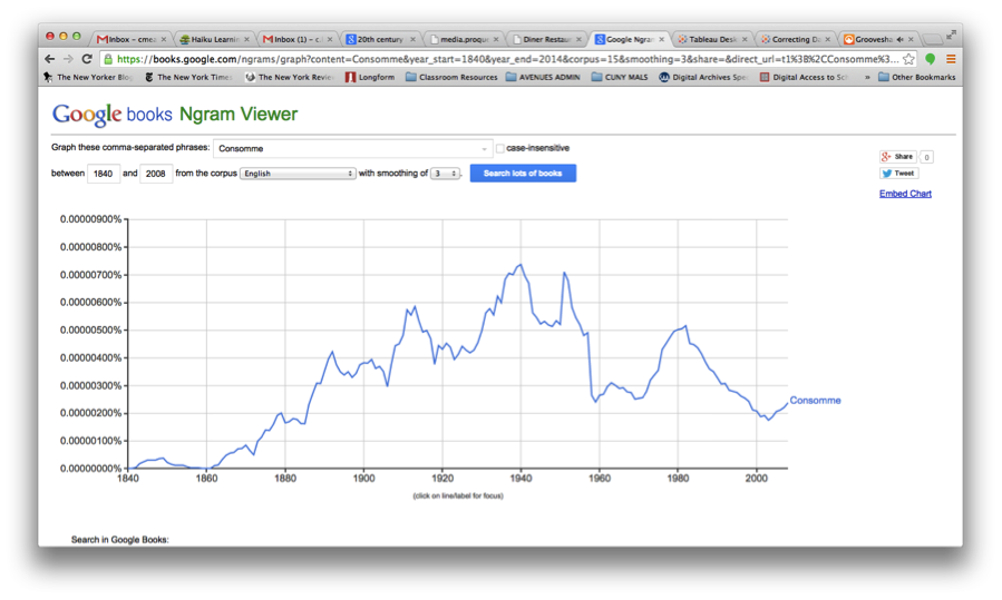
I searched on Google’s Ngram Viewer to check out the history of consommé in scanned books from the period 1840-2012 (image below). As you can see, there are definite peaks and valleys, notably the 1910s and the late 30s.
I then went back to the CSV “Dish” sheet and formatted the data to make it more manageable, pulling out all instances of consommé, which ran to over 2400, sorting by date first appeared, date last appeared, and then the number of times this dish appeared in a given year. Then I went to Tableau—with Professor Manovich’s voice tsk-tsking me all the while—and started plotting points. (I’d messed around with Gephi and Raw a bit, but found Tableau way user friendly). After some minor tinkering, I succeeded in generating the following:
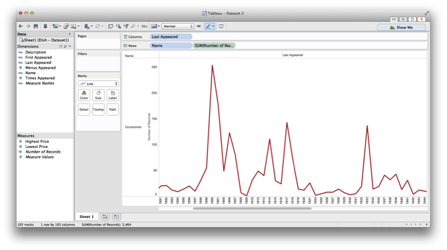
To get this, I used the “Last Appeared” date entries for each dish for column values, and number of occurrences along the rows.
There seems to be some correlation between the two—again, notably in the 1910s—with flickers of coincidence throughout. Does this get me any closer to understanding whether restaurants influence what terms get used beyond their doors? Not sure. But it’s a decent place to start.
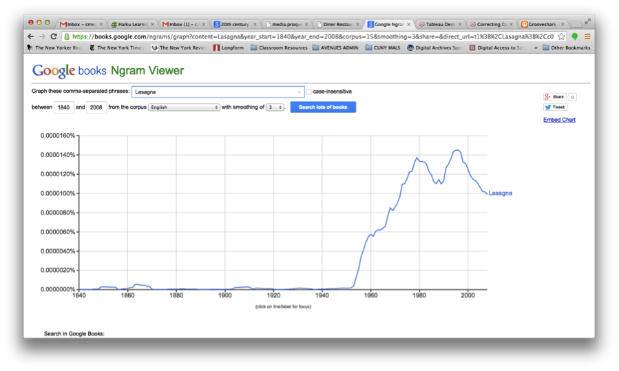
I wanted to look at lasagna because it’s delicious, half of my family tree settled as Italian immigrants in New York over the course of the last 100 years, and examining incidences of Italian-American food showing up on menus seemed like a cool way to look at how cultures interact. Here’s what Ngram had to say about lasagna for the period in question:
And here’s the Tableau-generated chart of occurrences within the NYPL menu project:
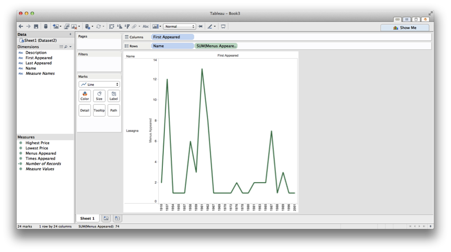
Generally speaking, there are some consistencies here, too: the early 1960s are mostly when this dish starts showing up in restaurants and in Google’s scanned books, and there are matching peaks in the late 1980s.
Since I was looking for possible connections between food language and popular language, I thought to look at the immigration numbers for Italians in the US. The chart below offers some numbers to start with—you can look at this and immediately identify major periods of emigration, the World Wars, the establishment of quotas, and so on. Many, though of course not all, Italian immigrants ended up in New York. According to the 2000 NYC census, for example, about 692,000 New Yorkers claim Italian lineage.
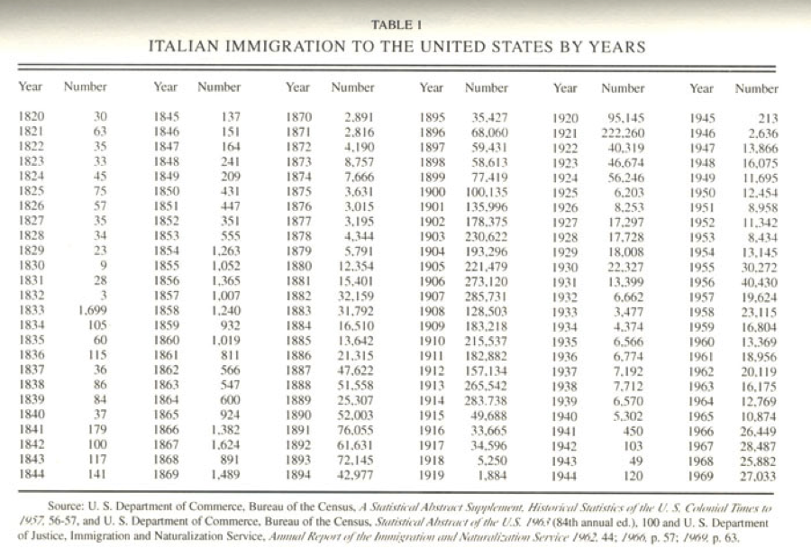
https://www.mtholyoke.edu/~molna22a/classweb/politics/Italianhistory.html
This might be a good starting point for a longer study of food and its relationship between assimilating and/or preserving culture—but I’m not sure any real links are there yet. Clearly there is a relationship between when certain people showed up in the city and how long it took for language they brought with them to enter popular speech and writing.
Both the consommé and lasagna examples point to consistencies re: when terms appeared on restaurant menus and when they appeared in other printed materials. Without a more rigorous analysis, though, it’s hard to pinpoint which form had a leading influence. I could imagine either being the case: an item appears on a menu, gain popularity through its culinary success, and spills out into society at large; alternately, a food term is written about by a certain type of influential writer, and restaurants try to piggy-back on the cultural demand for that dish or ingredient and so begin offering it more and more.
Either way, this was a reasonable way to dive in and play around with some data. Are these the flashiest data visualizations? Erm. But I’d like to work with other tools and programs to get a better handle on data visualization and helping craft stories through such depictions. If I were to repeat or reassess, I would get in touch with NYPL and request access to their API well in advance, working out problems as I went. Plus that would undoubtedly be an easier space to work in, and my computer would thank me for not regularly dropping 500 thousand-line spreadsheets onto its to-do list.
Really interesting. Especially thinking about when a dish appeared or disappeared as a marker of the cultural climate. Thanks for walking us through your process!
“I wanted to look at lasagna because it’s delicious”, such a great line.
I wonder if looking into the economics behind lasagna would yeild any explanatory information regarding the time period you’ve noticed. Moving on to the census data was a brilliant move. A lot of us, at last I think, have centered our explorations on one data set. Branching out to another source adds great quality!
I am also really inspired by the idea of finding another data set and looking for correlations! That seems like a great way to come to some real conclusions about the original data set’s influence on something else, rather than just visualizing the data itself. I am a big foodie as well, so I also love that you are working with food. I didn’t know you that NYPL’s menu project was still going on!
Christopher,
Thank you so much for sharing this! Like my fellow commenters above, I really appreciated your move to link census data and the NYPL menu project–both of those data sets seem like they have lots of bear on each other.
In defense of “non-flashy” datasets, too–I think sometimes it’s easy to focus on those types of visualizations that have the most impact, when really, not all data projects need to incorporate the rainbow of nodes and edges. Some of the most powerful data projects I’ve seen are bar graphs! Especially since you’re thinking over time, it makes sense to consider the range of statistical analysis representations you could use, and sometimes, that’s good ol’ graphs. I keep thinking how all the illustrations in Graphs, Maps, and Trees were made in Powerpoint….
Perhaps an easier way to trace the development of food trends, if you wanted to do a case study and didn’t mind going a little more modern, is the cupcake boom. There’s been a lot of writing on this, but especially with the whole Crumbs situation and general market saturation, it could be interesting to look at the economic climate, social events, and store locations that could help you trace that trend in a new way. Just a thought!
Thank you for this thoughtful project, and for sharing your thought process so articulately!