I am interested in visualizing information, well… I am also interested in visual information, and visual literacy.
I swear I am creative. and visual. 🙂
I work at bronx Community College and I have been trying to engage with the campus history. Bronx Community College used to be NYU at the turn of the century, NYU constructed a Hall of Fame for great Americans. It is a stone colonnade and every few years they had this nationally published event to induct people into the hall of great americans. People from all different fields of study all great for being Americans. There was a democratic-ish nomination process that is VERY well documented and then the Hall of Fame Delegates had the final vote about who got inducted. The last person was inducted in the 1970’s right after the campus was sold to CUNY from NYU to become Bronx Community College. Here is a link to the google doc for all the data I collected about each hall of fame inductees. I created a tiny data set made of all the information we have in different pamphlets about the Hall of Fame busts.
My students have to write papers about the hall of fame and find lots of Biographies about the Hall of Fame people, and sometimes they come to the desk and they are like “which one is the coolest? I dont want a lame person.” I thought I could maybe make an infographic that gives you some sort of overview of the hall of fame and the inductees. There are quite a few busts in the hall of fame that leave the viewer wondering why this person was considered Hall of Fame worthy.
I started by separating the figures by subject.
Then I thought I could build something more complicated. This PDF. is supposed to be 2ft by 3ft thats why you have to zoom in to see stuff. I built it with layers in Indesign.
I like this size of data set because it is manageable and I think it gives some real information about this historical architectural spot. This historical landmark represents a national identity that is defined mostly before the second world war. The people who were involved with this landmark were thinking about this country in terms of the civil war. That just blows my mind. Looking at the life spans of each inductee tells a story about how people at the turn of the century were mapping out this nations history and identity. Building this visualization from this little pamphlet dataset allows me to speak very assuredly about the history of this landmark.
LOOK HERE FOR MY POSTER: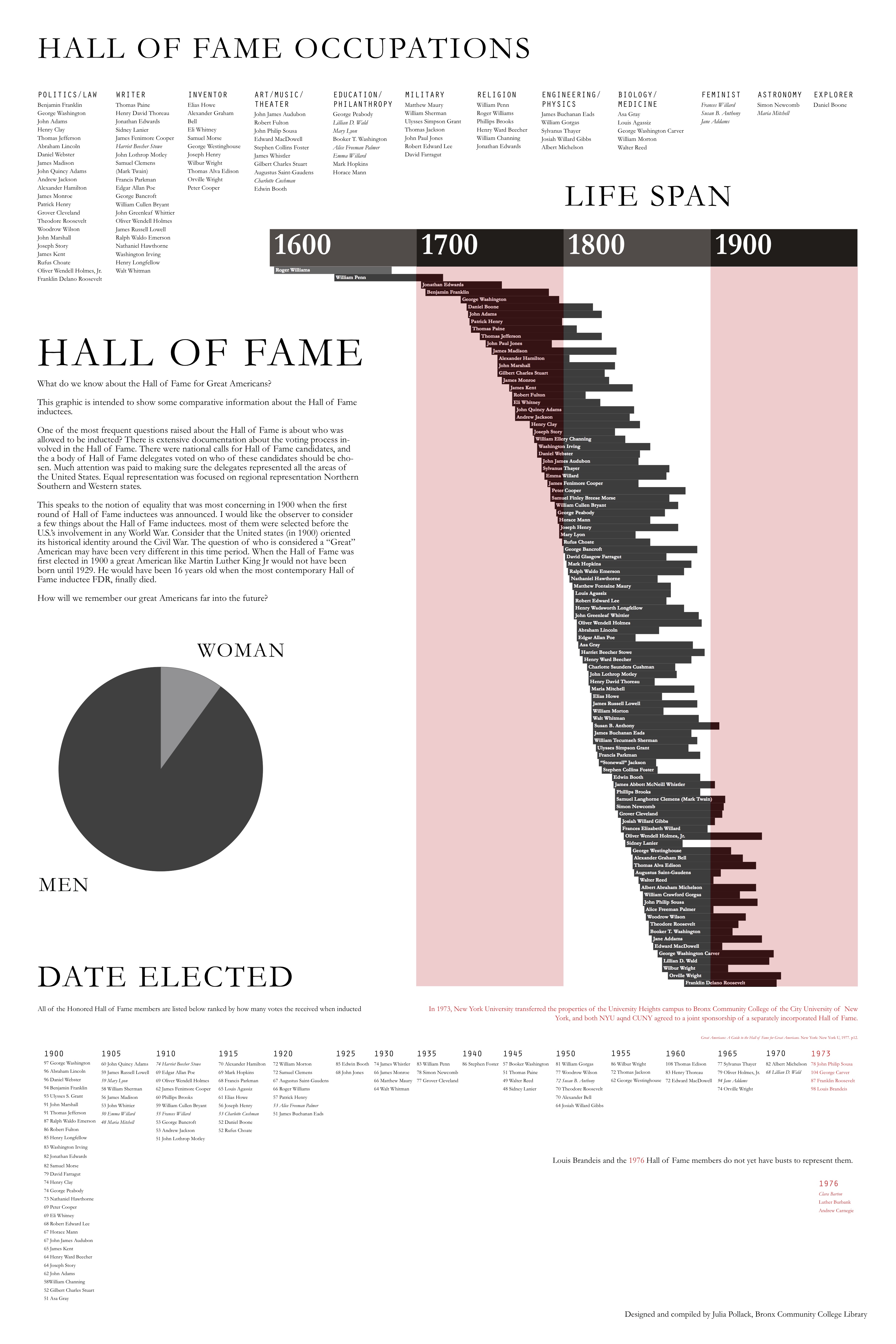
Here is the big file: poster infographicidea
This is very cool! Its a manageable amount of data that tells you something very specific and useful. I was able to increase the size of the poster on my computer and examine it closely. Great project! I’m inspired.
Julia! I love so much about this project: the fact that you worked with local data; that you had a real pedagogical imperative behind it; that you refined your data; and that you produced such a beautiful poster! I also love the fact that you’ve visually isolated the pie chart here to give prominence to the strong gender disparity in the hall of fame. Very well done.
Neat! You can put it up in class. You could do a follow up where you cross reference the data on what person the kids do a report on, and see if there is any correlation between what the kids consider to be “cool” in these historical figures.
Also, I was looking up Indesign on the web and saw it was part of the Adobe suite. Do you know if there’s a comparable free alternative?
Julia: this is really terrific work! I especially like how you are able to focus on communicating a lot of really interesting lists, etc. along with the chart of the inductees’ lifespans in such an aesthetically pleasing way. Good job!
Wow! I’ve been staring at this for quite a while. The name that stuck out to me was Louis Agassiz, who was a Swiss-born biologist that was later known for his eugenics and polygenic theories. His induction is particularly interesting now that you mention that this landmark represented a national identity that was “defined mostly before the second world war” and “the people who were involved with this landmark were thinking about this country in terms of the civil war.”
Hey, Julia! Your graphs look so pretty and communicate information so quickly and clearly! I also like the addition of the pie chart, and think it really drives home your point about how the hall of fame communicating an older idea about what it means to be American. It is also really awesome that your students are going to benefit from your graph!
Julia,
Your graph is absolutely gorgeous. I’ve been so impressed with how beautiful all these data visualizations are!
I also think it’s great that you used data to fulfill a local and a pedagogical need–sometimes, with the emphasis on big data and getting as much information as possible, we lose the granularity of community resources and smaller data that you’ve captured so well here.
I want to learn your Indesign skills! 🙂
Thanks for a beautiful presentation. Your students will be stoked.