Check this out!
Category Archives: Uncategorized
Neatline Presentation
The Neatline Presentation by David McClure was very impressive. Learning how to add pictures and drawing explanations to your map is orality and textuality bridged into one. It is amazing to be able to really express the data in a way that anyone can understand. By using Neatline, I am able to reach a larger audience for my research. It tells a story by using popups to explain your picture when you hover over the area of the map. This will be really useful in future presentations. I am hoping to use this as a way to express my dissertation one day soon.
Stay tuned for the process that Cindy and I had to go through to get to the first part of our project using Neatline.
Selena
Data Visualization at its best
After listening to the presentations of Manovich, Jones ,the NYPL, and Scheinfeldt, attending the Fellows workshops on geospatial mapping and neatline, and seeing the presentations of several classmates, I began to see the light at the end of the tunnel. It was and still is a process. I am slowly visualizing my project in mapping form.
My visualization process flowed in this order:
First, the presentations of the experts helped to solidify the process. If you do not understand command line and other languages, it is best to find someone who has the background or the software that seems the most user friendly. Second, is making your project grant worthy for the funder. Third, is really delving in and playing around with the different programs to see which one better suits your project needs. After attending the Fellow workshops with Micki, Michelle and finally David Mcluren from Neatline, the very last one I might add. This is the one that seemed to present the best visualization that I am interested in for my research.
Cindy and I are working on a Data Project for our respective research projects and we have similar interest and so we are working together to hopefully present something that will one day receive funding.
Thank you for a well-rounded approach for the less tech savvy student.
Selena
Prelinger Archive ephemera video archive
Computer graphics video: https://archive.org/details/0425_Incredible_Machine_The_00_01_07_00
Social Citation
Hi All,
It’s so exciting to see the progress on this blog; I know so many of us are now able to do things we couldn’t at the beginning of this class, thanks in no small part to all the great workshops. My final project is largely facilitated by the Gephi workshop. In this post I want to share my process in case it’s useful to anyone, but also, crucially, ask for your help to bring it to life. In case this gets long I’ll say now that in the final two weeks of class I hope to ask the praxisers to complete the short (and fun!) exercise of mapping your favorite authors, as well as the people who helped you discover them, in a simple text file. Now into the weeds! (ps I will be more specific when I ask this in earnest).
My goal here is to make the citation process more social, to draw the connections between impactful texts/authors and the friends, partners, mentors, teachers, scholars, family etc. that helped you discover the content. I began with a basic tab delineated text file that looked like this: 
the categories here from right to left are: author, my person, relationship, location. I didn’t get too hung up on the content, just typed what came to mind for maybe 15 minutes. It took a bit of tinkering to figure out how to show this in Gephi, but eventually I got this:
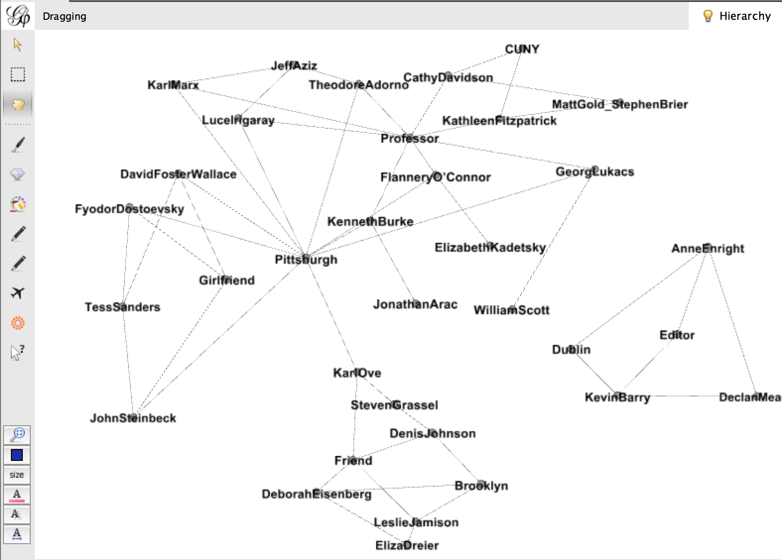
Sorry if this is hard to see, but this is a very messy graph. There are some interesting things going on – the connections are by relationship and location, and they create pockets. Declan Meade is off on his own to the right because he’s the only Dubliner and the only Editor I have. I tried to make this a little more cohesive by changing my data to look like this: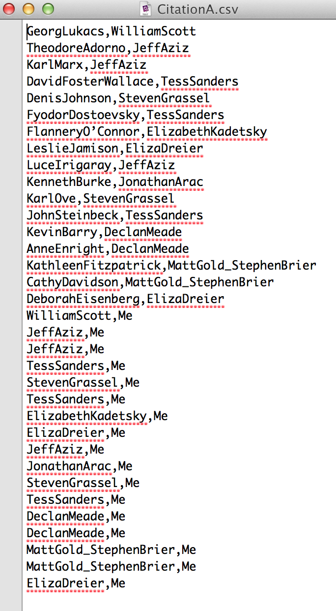
So I got rid of relationship and location, I also made it a one-to-one relationship between everything, where “Me” was connected to each of my people, and each of my people were connected to the work they’d introduced me to. Then the graph changed to this:
This sacrificed some of the nuance of place and relationship, but it gained a simplicity that I think is critical in these visualizations to make sense at a glance.
I’m not sure whether I’d like to add in relationship as a node, or maybe offer it as a hover or something. (color coordinate edges with a key linking them to relationships??) I have more playing to do, and would love feedback. But I think this project gets way more interesting when “Me” is connected to “You”. And so I wonder if folks would be willing to participate in this exercise. I think we can all safely use the three print texts assigned in this course, creating a link between everyone. I’ll finalize the model over the weekend, to have a more developed request for you, but I think the easiest thing would be for me to set up a google doc with everyone’s name on a separate page and ask you to type out the data. It’s important to the project because only YOU know these things – there’s no way to scrape this. Thanks for your consideration, and looking forward to NYPL Labs tomorrow!
Wittgenstein Source
I’ve been reading some Wittgenstein for another course, and his writing seems organized specifically for the purposes of DH — so I poked around to see what people have done. Found this remarkable website out of University of Bergen — after playing with a number of wordpress sites (for myself/roommate/sister), I found the navigation really cool. It’s also impressive in terms of archiving material. (At the library’s ProQuest presentation this week about dissertations, the idea of hard copy microfilms housed deep in a Pennsylvania mountain legible with a candle and a magnifying glass brought me back around to the zombie apocalypse mentality of outcome planning).
http://www.wittgensteinsource.org/
Just wanted to share.
-Jojo
Praxis Workshop: Neatline’s David McClure this Thurs, Dec 4
Hi all!
So excited for this week’s Digital Praxis Workshop with David McClure, lead developer of Neatline. He’ll conduct a demonstration and hands-on workshop in interactive storytelling with maps, using Neatline.
Same time/room as usual (6:30pm Thursday night, in room C196.02). Students are encouraged to bring their own laptops. Looking forward to seeing you there!
Micki
Computational Linguists & online reviews
This article was in the NYT yesterday about computational linguists studying user reviews–an interesting data set for sure!
http://www.nytimes.com/2014/11/30/business/the-art-of-the-amateur-online-review.html
The Freedom to Move
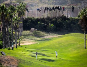
José Palazon/Reuters
African asylum seekers stuck on a razor wire fence, behind white-clad golfers teeing off on a golf course.
I started this data set project a couple of weeks ago, but it has taken me a while to post and share. I think I was looking to show something “more”- more complete, more thought out, more visually appealing, more theoretically/methodologically sound, etc. And then I realized that “more” probably won’t come if the project is sitting idly in Tableau, unseen by others. While I love the idea of collaborating, I’m still getting used to the idea of sharing incomplete things in the process. My lack of technological savvy also had me guarded for a while. Luckily, seeing everyone’s impressive progress and feedback to others have given me more courage to just share what I’ve done already.
In my income and inequality class, a great class filled with data, Professor Milanovic led me to a study on travel freedom, The Henley and Partners Visa Restrictions Index. I haven’t had the chance to do additional research on this for-profit organization, which I would conduct if I were to pursue this further. The survey received a substantial amount of media attention and Wikipedia based its “Visa requirements for United States citizens” page on this survey. I mention the media and wiki attention to this survey to not verify its reliability but to show the survey’s influence. In Prof. Milanovic’s class, we were looking at migration as a means of addressing global inequality (the income inequality between countries) but there are travel restrictions in many areas of the world that would benefit the most economically from migration. To make this connection clearer, I matched the country’s travel freedom ranking with its 2013 GDP, provided by the World Bank. Several other organizations, such as the UN, IMF, CIA, track GDP, but I decided to go with the World Bank’s numbers.
The visa restrictions indez was in a pdf with multiple columns, which required some text cleaning after pasting into a text editor, Notepad++. I had to learn about regular expressions in order to do this efficiently. Pretty simple, I had to replace SPACE with TAB, but I also had to keep in mind of multi-word nations like Central African Republic or United States. It wasn’t a clean find and replace at the end, so I had to clean up some things manually. But overall, a great tip I picked up at Micki’s data visualization class.
I then saved the file as a csv. I created another column to insert GDP data from the World Bank’s data repository, which is a great source of information. I downloaded a spreadsheet that included the GDP for each country for every year since 1980. I was interested in the latest, 2013 data. Inserting this information required some more manual work. I’m sure I could have used an Excel function, but after spending some time looking for that function, my impatience got the best of me and I decided to do it the not-so-quick and dirty way. I copied and pasted after I put the countries in alphabetic order. For the most part the naming conventions were the same, so it didn’t take very long. If I were to do this again, I would definitely figure out how to do this correctly, but I was didn’t want to lose my momentum.
So my data looks like this:
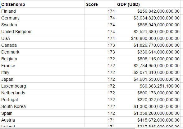
After combining the cleaning the Henley and Partners Visa Restriction Index data and World Bank 2013 GDP data
I decided to use Tableau to visualize this data. I wanted to highlight the geographical aspect of this data, as we are talking about visa and travel freedom. I thought it would be interesting to see where the clusters of countries with the highest travel freedom are in comparison to countries with the lowest travel freedom. I didn’t know how to show GDP simultaneously besides showing up in the bubble when you hover over the countries. Here is a snapshot of the map. You can go here for the “interactive” version, where you will see the GDP information.

You will notice that the countries with high GDP has the least amount of travel restrictions. The countries with the lowest GDP, the countries whose citizens would benefit the most from migration by taking available jobs and escaping political corruption in their home countries, have the least amount of travel freedom. So one would come to the conclusion that the current system of immigration is counterproductive in addressing global inequality.
The field of economics, as one would expect, is extremely data-heavy. Our professor would leave his Stata codes at the bottom of his slides in case we wanted to recreate them. As a non-economics major, the hard numbers/algorithms stuff made me a little nervous, but I was also excited in seeing these types of sociological patterns. Visualizing these patterns are important because of its potential to raise awareness and political activism. Letting them stay hidden in industry publications or esoteric economic conferences won’t do much good, but publicizing and presenting them in ways that will grab people’s attention, might. The media has been really flexing its data visualization muscles recently. That being said, I was really happy to hear about the GC’s potential course crossovers with the Journalism School. It might give me a chance to keep pursuing this data project.
-Juliana
JSchool Jan Workshops
Regarding Sandeep Junnarkar’s intro to the JSchool last week:
I’ve been looking for something like those coding modules for a while and dove into the JSchool site to figure out what was available. I found the data scraping module, which has HTML/CSS and JavaScript/Jquery pre reqs. Sandeep mentioned that there’s a short scraping module in January, which is good for folks to take first. It’s more basic, no coding. Jan 8th 9AM to 3PM.
The JavaScript/JQuery module is 2 credits, and then the Scraping module (not the aforementioned) is 1.
Here’s a link to the short Jan workshops: http://www.journalism.cuny.edu/academics/january-academy/#.VHTzAjTF9yK