Author Archives: Sarah Cohn

Info Visualization Workshop

It was standing room only in Micki’s info viz workshop on Thursday. In order to make the demo more interesting, she used a dataset about the class attendees. We all entered our names, school, department & year in a shared online doc which became the basis for parts of the demo. We saw how to take text and clean it up for entry into Excel using a text edit tool, Text Wrangler. Tabs! Tabs are the answer. Data separated by tabs will go into individual cells in Excel, making it easier to manipulate once in there. Tabs>commas, apparently.

Once the data was in Excel, we saw some basic functions like using the data filter function, making a pivot table, an area graph and a stacked area graph.

After Excel we moved on to Gephi. Unfortunately none of the participants could get Gephi on our computers, so we just watched Micki do a demo. Using our class participant data, she showed us the steps to get the data in and how to do some basic things to get a good looking visualization, and how to play around with different algorithms and options. This was a pretty small dataset with few connections, so to illustrate some of the more complex things Gephi can do, Micki showed us examples from her own work. For me, this was the best part. I think Liam linked to it earlier, but I highly recommend you look at the force-directed graphs section on Quantifying Kissinger.

Stephen brought up the ‘so what?’ factor with regard to Lev Manovich’s visualizations. I thought Micki’s provided a good counterpoint to that, as she explained how certain visualizations made patterns or connections clear—things that might not have been revealed in another type of analysis.

Overall this was a very informative and useful workshop. It gave me courage to go home and play with my data in Gephi in ways that I didn’t feel able to before, and I hope it encouraged others to get started on their own projects.


Dataset Project: Who do you listen to?

The basis of my dataset is my iTunes library. I chose this because it was easily accessible, and because I was interested to see what the relationships in it would look like visualized. My 2-person household has only one computer (a rarity these days, it seems) which means that everything on it is shared, including the iTunes library. Between the two of us, we’ve amassed a pretty big collection of music in a digital format. (Our physical (non-digital) music collection is also merged but it is significantly larger than the digital one and only a portion of it is cataloged, so I didn’t want to attempt anything with it.)

I used an Apple script to extract a list of artists as a text list, which I then put into Excel. I thought about mapping artists to each other through shared members, projects, labels, producers etc, but after looking at the list of over 2000 artists (small by Lev Manovich standards!), I decided that while interesting, this would be too time consuming.

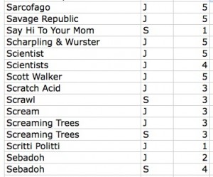
My other idea was easier to implement: mapping our musical affinities. After cleaning up duplicates, I was left with a list of around 1940 artists. Both of us then went through the list and indicated if we listened to that artist/band/project, and gave a weight to the relationship on a scale of one to five (1=meh and 5=essential). It looked like this:


Screen shot 2014-10-27 at 9.57.03 PM

Sample of the data file

Ultimately I identified 528 artists and J identified 899. An interesting note about this process, after we both went through the list, there were approximately 500 artists that neither of us acknowledged. Some of this can be chalked up to people on compilations we might not be that familiar with individually. The rest…who knows?

Once this was done I put the data into Gephi. At the end of my last post I was having trouble with this process. After some trial and error, I figured it out. It was a lot like the process I used with the .gdf files in my last post. The steps were: save the Excel file as CSV and uncheck append file extension, then open that file in TextEdit and save as UTF-8 format AND change the file extension to .csv. Gephi took this file with no problems.

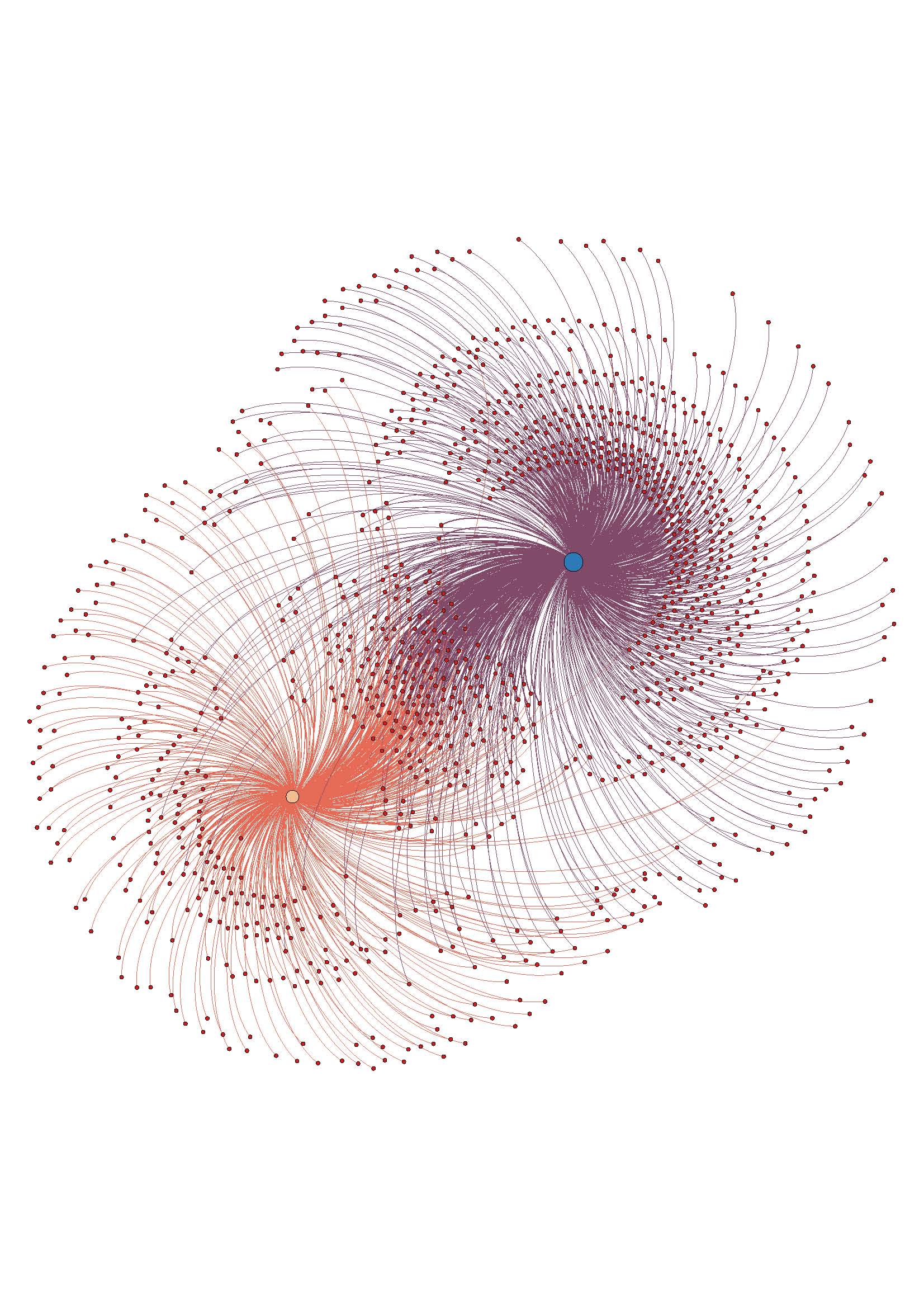
The troublesome process of coding and preparing the data for analysis done, it was time for the fun stuff. As with my last visualization, I used the steps from the basic tutorial to create a ForceAtlas layout graph. Here it is without labels:

w_I_u_2

The assigned weight to each relationship is shown in the distance from our individual node, and also in the thickness of the edge (line) that attaches the nodes. It can be hard to see without zooming in closely on the image, since with so many edges it is kind of noisy.

Overall, I like the visualization. It doesn’t offer any new information, but it accurately reflects the data I had. Once I had the trouble spots in the process worked out, it went pretty smoothly.

I am not sure if ForceAtlas is the best layout for this information. I will look into other layout options and play around with them, see if it looks better or worse.

I made an image with the nodes labeled, but it become too much to look at as a static image. To this end, I want to work on using Sigma (thanks to Mary Catherine for the tip!)  to make the graph interactive, which would enable easier viewing of the relationships and the node labels, especially the weights. This may be way beyond my current skill level, but I’m going to give it a go.

ETA: the above image is a jpeg, here is a PDF to download if you want to have better zoom options w_I_u_2

Dataset Project: Testing Gephi

I found the projects on the Visual Complexity site really beautiful and interesting, and I was inspired to start playing with Gephi in anticipation of using it for my dataset project.


I’m happy I started early! I downloaded the most recent version of Gephi and went through the tutorial using the Les Miserables sample dataset with no problems. I figured since that was so easy, I’d go ahead and visualize my Facebook network, just for fun.


I used Netvizz to extract my FB data. I immediately ran into problems getting the data into a format Gephi could read. Netvizz says to ‘right click, save as’, which wasn’t actually an option. Ultimately I opened the .gdf data in the browser, cut and pasted into a an Excel file to save as a csv, and also pasted the same data into a text file and saved. The Excel csv data would load into Gephi, but the IDs and labels were all wonky, and the graph was clearly a mess with number strings as node labels. I then tried the text file, which threw up error an message and wouldn’t even open. Some amount of Googling & trial and error later, I discovered I had to change the format to UTF-8, and change the file extension from .txt to .gdf.


Once that was sorted, I had trouble displaying the data in ‘data laboratory’ view of Gephi. I eventually discovered that Macs (or maybe just my really old Mac) are not, for some reason, entirely compatible with the current version of Gephi. OK. Uninstall the current version, re-install an older version. Fortunately that solved that particular problem.


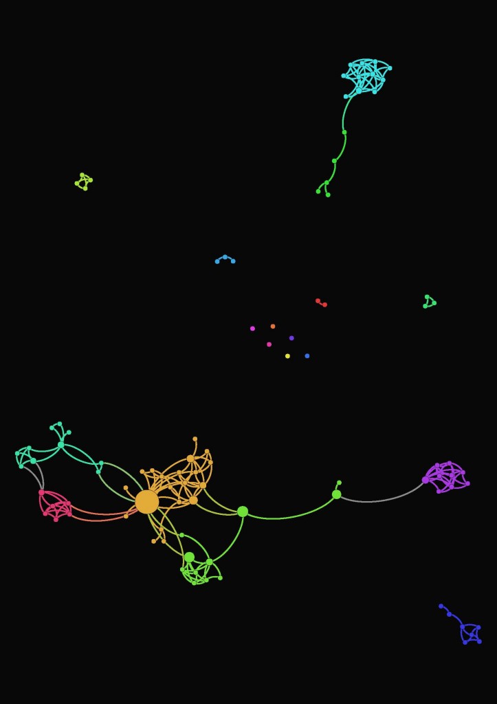
So! Eventually I was able to get the data to open properly, and the graph to start looking like it should. I used the same steps from the tutorial to create a graph of my FB network. This part was easy, as it had been with the sample dataset–just following the instructions for a really basic visualization. Beautiful.


FB_noname_viz


Feeling emboldened by my problem solving and subsequent success, I started to play with a small part of my (anticipated) dataset. Several hours (and one trip to the grocery store) later, I’ve not been able to get the data into the proper format so that 1) Gephi will take it, and 2) it will display connections correctly. I can get one or the other, but not both.


This will definitely take more research & finessing, but I’m hopeful that I will be able to get it all to work. Stay tuned for the scintillating conclusion!

Maps, Bus Tours, Subject Headings

When I started on the Maps chapter of Moretti’s book, I immediately thought of my recent search for a literary map. I am a fan of Sara Paretsky’s series of V.I. Warshawski novels, which are hard-boiled detective fiction. There are 16 books (and two short stories) and they are rooted very strongly in Chicago. Throughout the series there are descriptions of not only the places V.I. goes, but also how she gets there—the route she drives, the trains she takes. Some of the places are fictional, but many are real.

As I was planning a recent trip to Chicago, I wanted to see a map of V.I.’s places overlaid on an actual map of Chicago. I did find one, although it only has 15 points on it, chosen seemingly at random from a handful of books. It was interesting, but not nearly as thorough as I wanted it to be.

Unlike Moretti’s diagram maps, I was originally looking for a cartographic map. On p. 56, Moretti says he did not want to “superimpose” his diagrams on geographic maps because “geometry ‘signifies’ more than geography.” I started thinking about what my (imagined) V.I. Chicago map would look like as a diagram, and what it might show.

Paretsky deals explicitly with issues of class, race and gender in the series. V.I. grew up in a tough working class neighborhood and then ‘escaped’ the neighborhood by going to the private University of Chicago on scholarship. She is an abortion-rights activist, and many of her cases revolve around white collar crime. She often investigates on behalf of out of work factory and construction workers, undocumented immigrants, and prisoners. How (if at all) would these issues reveal themselves on a geometric map?

In his maps, Moretti sees the way industrialization and state formation have changed the shape of literary idylls (p.64). Would a geometric map or diagram of V.I.’s locations show or mirror Chicago’s change from a manufacturing city to a financial services city? What would the geometry of each book look like, and what would the geometry of the entire series taken as a whole look like?

ETA: The publication dates are between 1982-2013. V.I. (& presumably Chicago) age in ‘real time’, so the landscape of 1982 Chicago in the series is different from the 2013 landscape.

Thinking of literary maps where imagined and real places coexist got me to thinking about eversion and bus tours. Sex and the City location tours take you to actual locations the fictional characters visited—Magnolia Bakery, ABC Carpet & Home. A similar Girls tour is being planned, and there are plenty of others–Twilight tour anyone? The way in which people meld fiction and reality in their own lives isn’t specific to the internet/cyberspace realm.

In Macroanalysis, Matthew Jockers says that Library of Congress subject headings (LCSH) are a rich source of data to be mined. I agree! He is referring to the bibliographic metadata assigned to titles as a way to explore literary history (p. 35), but the subject headings on their own are also a source of data for librarians. Subject headings as data to be studied is near and dear to my heart—I wrote my library school thesis on LCSH and gender bias.

The LCSH scheme is the largest general indexing vocabulary in English, and has become the most widely used controlled vocabulary for subject cataloging in the United States. LCSH aims to be objective and use neutral language, but has been criticized for displaying bias on a wide variety of topics. There is a rich history of examining subject headings and their ostensible objectivity, starting with Sanford Berman in 1971. Hope Olson (who is one of my big research crushes) argues that LCSH “enunciates the authority of the dominant patriarchal, Euro-settler culture” (2000, p. 54).

At the time of my thesis (2011—not that long ago!) I wasn’t aware of the availability of computational analysis tools. At the time I did a basic textual analysis of a fairly small set of headings. Had I known about computational tools, I might have chosen a different/larger/more diverse data set to start with. What, if any, different conclusions might I have drawn from a computational approach?

As always, more questions than answers!


References

Olson, H. A. (2000). Difference, culture and change: The untapped potential of LCSH. Cataloging and Classification Quarterly, 29(1), 53-71.