Category Archives: Fall 2014

Tomorrow: Data Visualization II Workshop!

Hi folks!

Tomorrow’s Digital Praxis Workshop will be Data Visualization II!

I’m kind of freaking out about it.

This one will really take it to the next level, with an under-the-hood look at creating interactive visualizations using d3.

Interactive designer Sarah Groff-Palermo will demonstrate, explain and walk users through exercises in d3, a JavaScript-based interactive programming framework, and its associated technologies and libraries.

Attendees of the workshop are strongly encouraged to bring their own laptop computers and should have, or create, a github account prior to the session. Note: Sarah works on a Mac – but the workshop will also be accessible and beneficial to users of other operating systems (including the room’s library-provided desktop computers).

Looking forward to seeing the Praxis students there (Mina Rees Library, Concourse level, Room C196.02) tomorrow after the class!

Thanks,
Micki

Hacking Scholarship, Planned Obsolescence & the ACRL Framework

On Friday I went to a talk about the new ACRL (Association of College & Research Libraries) information literacy guidelines. The guidelines currently in place are officially titled Information Literacy Competency Standards for Higher Education and are a rubric of points, subpoints and subsubpoints that guide librarians in teaching and evaluating information literacy. The proposed new guidelines (still under review) are titled Framework for Information Literacy for Higher Education and are based on threshold concepts “which are those ideas in any discipline that are passageways or portals to enlarged understanding or ways of thinking and practicing within that discipline.” (line 26)

As they currently stand, the six threshold concepts in the new Framework are:

  1. Scholarship is a Conversation
  2. Research as Inquiry
  3. Authority is Contextual and Constructed
  4. Format as a Process
  5. Searching as Exploration
  6. Information has Value

I found the talk and the new Framework ideas really interesting, especially in conjunction with this week’s readings, which I see as closely related to the concepts in the Framework, and the direction ACRL is trying to move information literacy in higher education. I like the movement away from a checklist of skills and towards a more encompassing platform that encourages thinking both critical and creative—core components of humanities education. Given that trends in higher ed (especially assessment, accreditation and concepts like ROI) are moving toward the quantifiable, I’m sort of surprised (though pleased) at the direction ACRL is taking with this.

I am including the longer explanation from the Framework with the three areas most connected to the readings. Most of these are not fully formed thoughts, but the start of some connections. Fortunately, Fiztpatrick is very support of the blog as a way to hash out ideas! (p 70-71)

Scholarship is a Conversation

 Scholarship is a conversation refers to the idea of sustained discourse within a community of scholars or thinkers, with new insights and discoveries occurring overtime as a result of competing perspectives and interpretations. (Framework, lines 138-140)

This is right out of Fitzpatrick (maybe it actually is). She states that we need to “…understand peer review as a part of an ongoing conversation among scholars rather than a convenient method of determining “value”…” (p 49) I agree that the traditional peer review model can be really limiting in terms of scholarly conversation, and the idea that it confers value or status is something I don’t necessarily agree with. Yet I have to explain it to students in that way, because that is the model their professors know and expect their students to learn. Trying to explain the peer review model and simultaneously offer ways to question it is hard in a 50 minute class period, where peer review is only one small aspect of what I have to cover.

Daniel J. Cohen says that “Writing is writing and good is good” (Hacking, p 40), and Jo Guldi, in thinking through an alternative wiki-process for review of publications, says that an author should “produce a stronger article then at the beginning [of the process]” (Hacking, p 24). Both of these come back to what gives value to a source. Who decides what good is good? Who decides if an article is stronger after the revision process? In both of these alternative models suggested still need someone to be an arbiter of the final product.

Authority is Constructed and Contextual

 Authority of information resources depends upon the resources’ origins, the information need, and the context in which the information will be used. This authority is viewed with an attitude of informed skepticism and an openness to new perspectives, additional voices, and changes in schools of thought. (Framework, lines 224-227)

Guldi says “The web suffers from a crisis of authority” (Hacking, p 20) and also points out that only 3 types of scholarship are highly valued (editorial, peer review, book review) and that other forms of scholarship have been excluded. Fitzpatrick also argues for a more expansive view of authorship, one that values collaborative efforts more than the current model.


The idea that authority is constructed is a way for me to push a little bit on the idea that scholarly, peer reviewed sources are ‘best’ or more valued. This week (inspired by Friday’s talk), I asked two classes of first year students what conferred authority. The first answers from both classes were ‘published’, ‘researcher’, ‘has PhD’. Only student said ‘lived experience’, and no one mentioned societal status as something that conferred authority. I didn’t see any obvious lightbulbs going off (or thresholds crossed) but hopefully they’ll continue to think about it.

Format as a Process

Format is the way tangible knowledge is disseminated. The essential characteristic of format is the underlying process of information creation, production, and dissemination, rather than how the content is delivered or experienced. (Framework, lines 279-281)

This element is slightly more obscure than the others, and the title of it has actually been changed in the upcoming draft, although I didn’t write down what the new title will be. There were discussions of format in the readings, and the two that most appealed to me were David Parry and Jo Guldi’s essays. Parry says ‘Books tell us that one learns by acquiring information, something which is purchased and traded as a commodity, consumed and mastered, but the Net shows us that knowledge is actually about navigating, creating, participating.” (Hacking, p 16) Moving away from the scholarly monograph or article as primary and working to include other formats as relevant and valuable is huge. Guldi offers several suggestions as to ways that journals can reposition themselves to take advantage of the potential changes in scholarly publishing. Most students entering college now have been raised in an information environment that encourages participation and would take easily to a wider and more flexible view of what constitutes a scholarly source, and how format can inform the scholarship.

I am very much looking to hearing Kathleen Fitzpatrick this week!
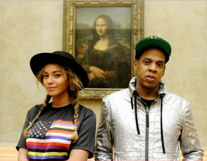
Mona Lisa Selfie: data viz part 1

Image from http://zone.tmz.com/, used with permission for noncommercial re-use (thanks Google search filters)

It took me a long time to get here, but I’ve found a data set that I feel comfortable manipulating, and it has given me an idea that I’m not entirely comfortable with executing, but am enjoying thinking about & exploring.

But before I get to that: my data set. I explored for a long time and, if you’ve read my comments, ran into a lot of trouble with RDF files. All the “cool” data I wanted to used was in RDF, and it turns out RDF is my monopoly road block: do not pass go, do not collect $200. So I kept looking, and eventually found a giant CSV file on Github of the artworks at the Tate Modern, along with another more manageable file of the artist data (name, birth date, death date). But let’s make my computer fan spin and look at that artwork file!

It has 69,202 rows and columns that go to “T” (or, 20 columns).
Using ctrl C, ctrl V, and text-to-columns, I was able to browse the data in Excel.

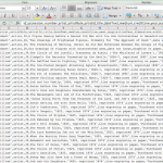
Screen Shot 2014-11-02 at 10.28.02 AM

seemingly jumbled CSV data, imported into Excel

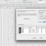
Screen Shot 2014-11-02 at 10.28.14 AM

text to columns is my favorite

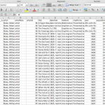
Screen Shot 2014-11-02 at 10.28.23 AM

manageable, labelled columns!


I spent a lot of time just browsing the data, as one might browse a museum (see what I did there?). I became intrigued by it in the first place because in my first trip to London this past July, I didn’t actually go to the Tate Modern. My travel companions had already been, and we opted for a pint at The Black Friar instead. I’m looking at data blind, and even though I am familiar with the artists and can preview the included URLs, I haven’t experienced the place or its artwork on my own. Only the data. As such, I wanted to make sure that any subsequent visualization was as accurately representative as I could manage. I started writing down connections that could possibly interest me, or that would be beneficial as a visualization, such as:

  • mapping accession method — purchased, “bequeathed”, or “presented” — against medium and/or artist
  • evaluating trends in art by looking at medium and year made compared to year acquired
  • a number of people have looked at the gender make-up of the artists, so skip that for now
  • volume of works per artist, and volume of works per medium and size

But then I started thinking about altmetrics, again — using social media to track new forms of use & citation in (academic) conversations.

Backtrack: Last week I took a jaunt to the Metropolitan Museum of Art and did a tourist a favor by taking a picture of her and her friend next to a very large photograph. We were promptly yelled at. Such a sight is common in modern-day museums, most notably of late with Beyonce and Jay Z.
What if there was a way to use art data to connect in-person museum visitors to a portable 1) image of the work and 2) information about the work? Unfortunately, the only way I can think to make this happen would be via QR code, which I hate (for no good reason). But then, do visitors really want to have a link or a saved image? The point behind visiting a museum is the experience, and this idea seems too far removed.
What if there was a way to falsify a selfie — to get the in-person experience without being yelled at by men in maroon coats? This would likely take the form of an app, and again, QR codes might need to play a role — as well as a lot of development that I don’t feel quite up for. The visitor is now interacting with the art, and the institution could then collect “used data” to track artwork popularity which could inform future acquisitions or programs.

Though this it’s a bit tangential from the data visualization project, this is my slightly uncomfortable idea developed in the process. I’d love thoughts or feedback or someone to tell me to pump the proverbial breaks. I’ll be back in a day or so with something about the visualizations I’ve dreamed up in the bullets above. My home computer really can’t handle Gephi right now.


Info Visualization Workshop

It was standing room only in Micki’s info viz workshop on Thursday. In order to make the demo more interesting, she used a dataset about the class attendees. We all entered our names, school, department & year in a shared online doc which became the basis for parts of the demo. We saw how to take text and clean it up for entry into Excel using a text edit tool, Text Wrangler. Tabs! Tabs are the answer. Data separated by tabs will go into individual cells in Excel, making it easier to manipulate once in there. Tabs>commas, apparently.

Once the data was in Excel, we saw some basic functions like using the data filter function, making a pivot table, an area graph and a stacked area graph.

After Excel we moved on to Gephi. Unfortunately none of the participants could get Gephi on our computers, so we just watched Micki do a demo. Using our class participant data, she showed us the steps to get the data in and how to do some basic things to get a good looking visualization, and how to play around with different algorithms and options. This was a pretty small dataset with few connections, so to illustrate some of the more complex things Gephi can do, Micki showed us examples from her own work. For me, this was the best part. I think Liam linked to it earlier, but I highly recommend you look at the force-directed graphs section on Quantifying Kissinger.

Stephen brought up the ‘so what?’ factor with regard to Lev Manovich’s visualizations. I thought Micki’s provided a good counterpoint to that, as she explained how certain visualizations made patterns or connections clear—things that might not have been revealed in another type of analysis.

Overall this was a very informative and useful workshop. It gave me courage to go home and play with my data in Gephi in ways that I didn’t feel able to before, and I hope it encouraged others to get started on their own projects.


Journaling Data (what else?)

“Day 1”

Challenge number one is finding a dataset I can work with. I want to do something with text. There are plenty of books available digitally, but they always seem to be in formats, such as PDF, that require a fair amount of cleaning (which I would rather not do) before they can be consumed by any of the tools.

I did find a number interesting datasets on the NYC Open Data website. Many of them are easy to download. I downloaded one small one that contains the average SAT scores for each High School. I was able to bring the dataset into R, too. It’s such a simple dataset–basically just school id plus the scores of each section of the SAT–that there isn’t much analysis one can do (mean, median, standard deviation…?). I would like to combine it with some other datasets that could enrich the data. For example, if I could get the locations of the schools, I could map the SAT data or if I could get demographic data for each school, I could correlate SAT performance to various demographic variables.

On a parallel track, I am working with Joy, who is very interested in motherhood and wants to explore datasets related to that subject. If she can find a compelling dataset, we will work together to analyze it.


“Day 2”

So it turns out that Project Gutenberg has books in TXT format that you can download. It also appears that there is a website www.zamzar.com that will convert PDF files to text files for free. Question for further thought: if the PDF is a scanned image, will converting it to text get me anywhere? I doubt it. Best way to find out is to give it a go.

I am going to download Great Expectations  from Project Gutenberg and see if I can pull it into R and, perhaps, Gephi or Antconc to see what can be done that might be interesting.

“Day 3”

Stay tuned…

Mapping Data: Workshop 3/3

Hi all,

Just to follow up on Mary Catherine’s post about finding data, I wanted to recap the final session of this workshop series that took place tonight.

The library guide on mapping data (by Margaret Smith) can be found here: http://libguides.gc.cuny.edu/mappingdata

As in the other two workshops, Smith emphasized thinking about who would be keeping this data and why as a part of the critical research process. It’s especially interesting given the size of these data sets and maps, meaning that the person (or corporate entity, NGO, or government agency) likely has a very specific reason for hosting this information.

She brought us through a few examples from basic mapping sites, like the NYT’s “Mapping America” which pulls on 2005-2009 Census Bureau data, to basic mapping applications like Social Explorer (the free edition has limited access, but the GC has bought full access) and the USGS and NASA mapping applications. The guide also includes a few more advanced mapping options, like ArcGIS, but the tool that seemed most useful to me, in the short-term anyway, is Google’s Fusion Tables, which allows you to merge data sets that have terms in common. The example Smith used was a data set of demographic data (her example was percentage of minority students) organized by town name (her example was towns in Connecticut) and a second set of data that defined geographic boundaries by the same set of towns. Fusion Tables then lets you map the demographic data and select various ways to visualize and customize your results.

My main takeaway from this series was that each of these tools is highly particular and unique, and you have to really dig into playing with the individual system before you’ll even know if it is the right tool for your work.

That, and also learn R.

Dataset Project: Who do you listen to?

The basis of my dataset is my iTunes library. I chose this because it was easily accessible, and because I was interested to see what the relationships in it would look like visualized. My 2-person household has only one computer (a rarity these days, it seems) which means that everything on it is shared, including the iTunes library. Between the two of us, we’ve amassed a pretty big collection of music in a digital format. (Our physical (non-digital) music collection is also merged but it is significantly larger than the digital one and only a portion of it is cataloged, so I didn’t want to attempt anything with it.)

I used an Apple script to extract a list of artists as a text list, which I then put into Excel. I thought about mapping artists to each other through shared members, projects, labels, producers etc, but after looking at the list of over 2000 artists (small by Lev Manovich standards!), I decided that while interesting, this would be too time consuming.

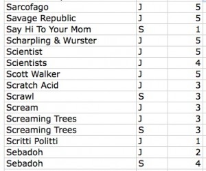
My other idea was easier to implement: mapping our musical affinities. After cleaning up duplicates, I was left with a list of around 1940 artists. Both of us then went through the list and indicated if we listened to that artist/band/project, and gave a weight to the relationship on a scale of one to five (1=meh and 5=essential). It looked like this:


Screen shot 2014-10-27 at 9.57.03 PM

Sample of the data file

Ultimately I identified 528 artists and J identified 899. An interesting note about this process, after we both went through the list, there were approximately 500 artists that neither of us acknowledged. Some of this can be chalked up to people on compilations we might not be that familiar with individually. The rest…who knows?

Once this was done I put the data into Gephi. At the end of my last post I was having trouble with this process. After some trial and error, I figured it out. It was a lot like the process I used with the .gdf files in my last post. The steps were: save the Excel file as CSV and uncheck append file extension, then open that file in TextEdit and save as UTF-8 format AND change the file extension to .csv. Gephi took this file with no problems.

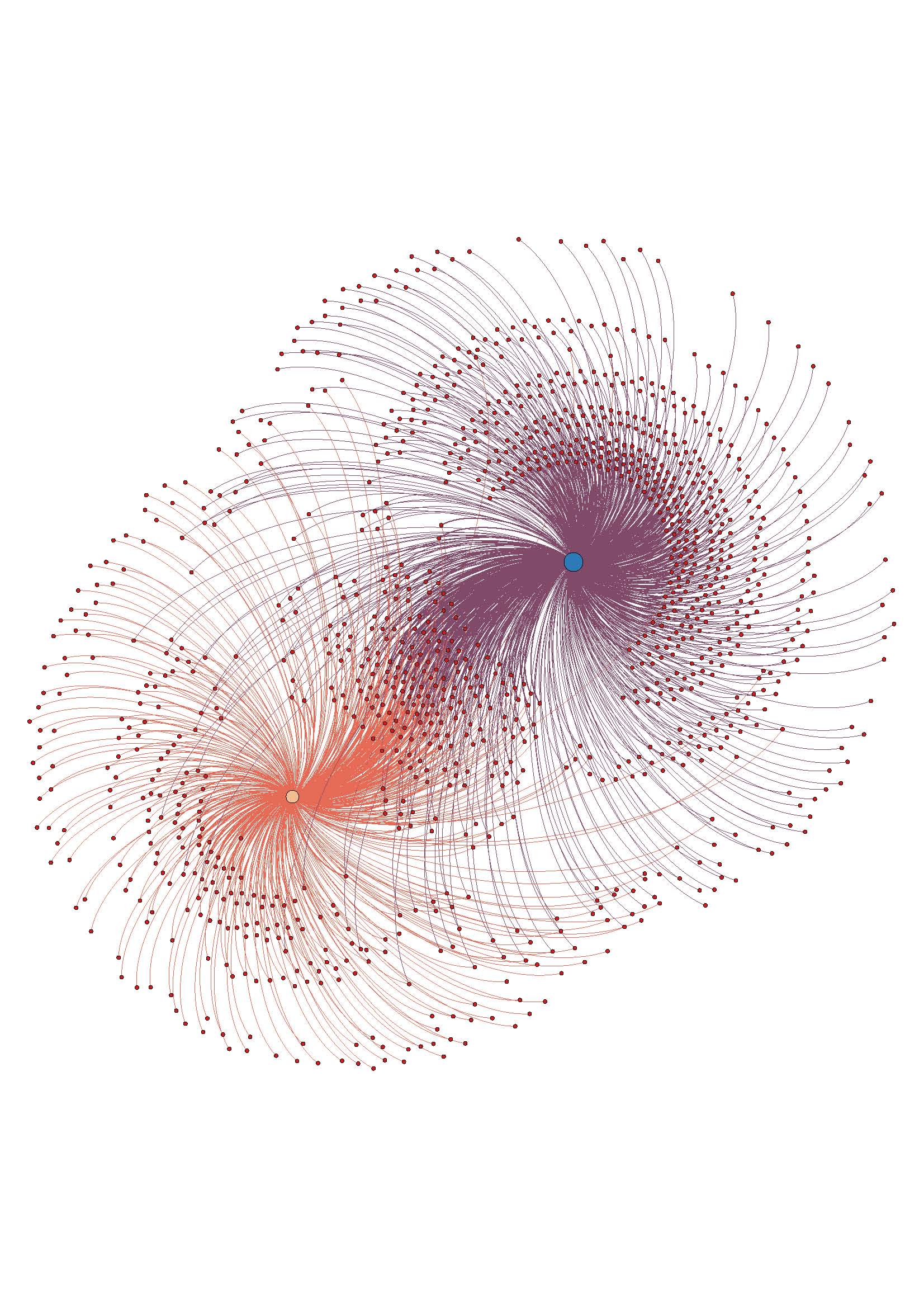
The troublesome process of coding and preparing the data for analysis done, it was time for the fun stuff. As with my last visualization, I used the steps from the basic tutorial to create a ForceAtlas layout graph. Here it is without labels:

w_I_u_2

The assigned weight to each relationship is shown in the distance from our individual node, and also in the thickness of the edge (line) that attaches the nodes. It can be hard to see without zooming in closely on the image, since with so many edges it is kind of noisy.

Overall, I like the visualization. It doesn’t offer any new information, but it accurately reflects the data I had. Once I had the trouble spots in the process worked out, it went pretty smoothly.

I am not sure if ForceAtlas is the best layout for this information. I will look into other layout options and play around with them, see if it looks better or worse.

I made an image with the nodes labeled, but it become too much to look at as a static image. To this end, I want to work on using Sigma (thanks to Mary Catherine for the tip!)  to make the graph interactive, which would enable easier viewing of the relationships and the node labels, especially the weights. This may be way beyond my current skill level, but I’m going to give it a go.

ETA: the above image is a jpeg, here is a PDF to download if you want to have better zoom options w_I_u_2

Finding Data: Preliminary Questions

Hello, all,

As promised, here’s a link to the “Finding Data” library guide on the Mina Rees Library site. Apologies if someone has posted it already!

http://libguides.gc.cuny.edu/findingdata

The guide was created by the wonderful Margaret Smith, an adjunct librarian at the GC Library who is teaching the workshops on data for social research. There’s one more–Wednesday, 6:30-8:30pm downstairs in the library in one of the computer labs–and I’m sure she’d be happy to have anyone swing by. Check out the Library’s blog for details.

Within this guide, the starting questions that Smith provides, in order to get you thinking of your dataset theoretically as well as practically, are very helpful–and I wish I had them years ago! Here are some highlights, taken directly from the guide (but you should really click through!):

HOW TO FIND DATA:

When searching for data, ask yourself these questions…

Who has an interest in collecting this data?

  • If federal/state/local agencies or non-governmental organizations, try locating their website and looking for a section on research or data.
  • If social science researchers, try searching ICPSR.

What literature has been written that might reference this data?

  • Search a library database or Google Scholar to find articles that may have used the data you’re looking for. Then, consult their bibliographies for the specific name of the data set and who collected it.

HOW TO CONSIDER USING IT:

Is the data…

  • From a reliable source? Who collected it and how?
  • Available to the public? Will I need to request permission to use it? Are there any terms of use? How do I cite the data?
  • In a format I can use for analysis or mapping? Will it require any file conversion or editing before I can use it?
  • Comparable to other data I’m using (if any)? What is the unit of analysis? What is the time scale and geography? Will I need to recode any variables?

And another thought that I really loved from her first workshop in this series:

Consider data as an argument.

Since data is social, what factors go into its production? What questions does the data ask? And how do the answers to these questions, as well as the questions above, affect the ways in which that dataset can shed light on your research questions?

All fantastic stuff–looking forward to seeing more of these data inquiries as they pop up on the blog!

(again, all bulleted text is from the “Finding Data” Lib Guide, by Meg Smith, Last Updated Oct. 15 2014. http://libguides.gc.cuny.edu/findingdata)

MC

Easy Exercises & PYTHON Manual

RE: Friday help session offered by the Fellows. Here are a few simple exercises I walked away with. These are super basic and not big-data, but if you’re just getting your feet wet, then at least you can start to “play” (for those of us who are nubies to this).

Internet Time Machine
Distance Machine

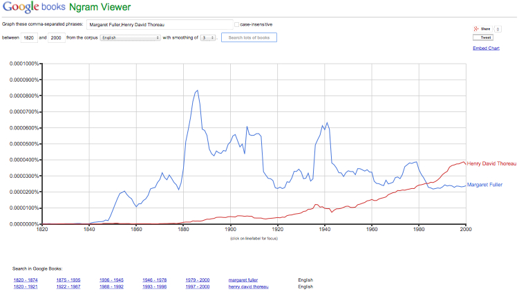
Go to this link: Google Ngram
Put in some words for things you want to compare.
Sample:
Ngram_Fuller_)ct_24

This article also explains how big-data can be practically applied.
How cellphones can predict where Ebola strikes [LINK]

Also attached is a booklet called “PYTHON for Kids” that was recommended. [Python for Kids – A Playful Introduction to Programming]

Hyper Focus – What To Do When Everything and Everyone Are Important All The Time?

Is there an answer to “what to do when everything and everyone are important all the time?” Truth be told, the brain will do what the brain has been designed to– reduce the information into manageable segments. Some stuff will stick. Some won’t.

Laura Klein’s YouTube presentation posted on the CUNY commons for the DH Praxis class offered insight into the use of maps and graphs throughout history. Her demonstrations focused on the powerful influencing capabilities of data visualization.

I simultaneously skipped around watching Lev Manovich present live at MoMA in between pauses to Klein’s video last night. Manovich suggested that digital photography is the new art form now employed by billions of people. He described it as “new, young, and sexy.”

Meanwhile, I spent the past weekend at the 2nd annual conference for the New York Academy of Medicine. The NYAM festival was celebrating the 500th birthday of the anatomist Andreas Vesalius. Early anatomical drawings, it could be argued, were also maps of sorts, charting the human body as early as the 1500s. Dr. Brandy Schillace gave a talk titled “Naissance Macabre: Birth, Death, and Female Anatomy.”

The highlights of Dr. Schillace’s presentation were renderings focused on the pregnant form. The renderings of chaste females were often poised next to potted plants symbolizing the container quality of the pregnant woman. As Laura Klein suggested in her video, the symbolism indicated makes suggestions about how to best view the role of mother in Western culture. She is a vessel.

The afternoon at NYAM concluded with a presentation featuring ProofX 3D anatomical printing, which fashioned a heart valve over the next four hours. The demo-guy gave me his card. Armed with two lectures, several books, and some practical experience I suddenly felt empowered enough to log onto GitHub.

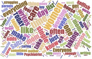
I plugged in a recent article on “Mothers Who Do It All.” Since I haven’t gotten into the programming end yet, I opted for the word cloud. Initially punching in 256 words from the article. I reduced them to 230 (so I could slightly control the visuals) and have uploaded the by-product here.

Word_Cloud_SmThe article cited wasn’t brilliant. It’s a rehash of the same old problem and doesn’t get to the point of possibly viewing women as intelligent procreative forces. Instead it’s a familiar subject from my days as an artist 20 years ago. How can women do it all, and make music too? (See MaMaPaLooZa). The word cloud isn’t particularly stunning either, but it represents a leap for in terms of the subject of “motherhood,” DH and how mapping might eventually lead me somewhere? (I couldn’t find anything of major consequence in my Google search).

Let me also conclude this blog by acknowledging that I recognize what a ‘soft’ subject motherhood is. To use Lev Manovich’s words, I’m not even sure it is very “sexy.” Even the word cloud looks “soft” evoking a “Hallmark Cards” visual. I know the subject doesn’t sound scientific or technical, and I’m not even sure what my angle is yet (although I have a few ideas). But as Laura Klein indicated in her presentation, while some cartographers, and data graph makers knew exactly what they were doing, others didn’t always have a clear concept at the onset.

If anyone finds any references to data, the digital humanities, and motherhood please send them my way. I’d be most interested. ~MJR