Category Archives: Fall 2014

Twitter and #Ferguson

Dear all,

In the aftermath of the Ferguson decision, and the much-discussed condemning of social media in McCulloch’s speech, we can see the high stakes of a lot of questions we’ve discussed in this class so far.

Perhaps as a way of opening the conversation, here’s a link that shows tweets on #Ferguson and the temporal “hot spots” that happened around key events. Particularly when live-reporting is occurring online, and I’ve seen a lot of news outlets get facts wrong, Twitter’s communicative power is really being harnessed.

http://reverb.guru/view/744067656528025963

-MC

Experiments with “Big Data” November Wrap Up

Hello Everyone –

I’ve been working on the “Big Data” project which has introduced me to a whole new language. Now its time to wrap it up so I can proceed with my final class projects for the semester.

I created a web presentation (which may be glitchy and take some time to load) but, hopefully you will not get discouraged. If it doesn’t load properly, write me a note, and I’ll see if I can present in a different format.

THANKS TO EVERYONE WHO HAS BEEN SO HELPFUL ALONG THE WAY – What a great and inspiring class. Happy Thanksgiving.  #DHpraxis14

Big_Data_Map


Tay Sway by the Numbers

DOES A POP STAR’S LEXICON WAX OR WANE WITH FAME?

What happens when you juxtapose the lyrics of Taylor’s self-titled debut album from 2006 with those from her album “1989”, the chart topping, million-copies-in-a-week latest album?

This is an extremely (valiant attempt at an) academic exploration of Taylor Swift’s first and latest albums.

A Quick Overview: The lyrics were pulled from the AZ Lyrics. The raw text files were cleaned using the free text editor TextWrangler for Mac. All punctuation, extra spacing, and special characters were removed. As a basic entry point to NLP, I have employed Voyant-Tools.org, the web-based reading and analysis environment for digital texts, to give some numeric values to pieces of the text. Best of all, it’s all compiled on it’s very own Commons site.

I analyze, visualize, explore, document, and set free the Tay Sway Corpus here:

https://taysway.commons.gc.cuny.edu/

All the data has been made live so you too can play with Taylor Swift lyrics in an academic setting.Taylor Swift Speak Now - Pittsburgh

Data Mining Project, Tessa & Min, Part II

To follow up on Min’s post about retrieving data from social media platforms using Apigee, I wanted to report back about the next step in our process–preparing the data for visualization.

We decided to dig in with Instagram and see what we could do with the data returned for images tagged with the word sprezzatura. Using the method described in Min’s post we were able to export data by converting JSON to CSV. However Apigee returns paginated results for Instagram, so we were dealing with individual data dumps for 20 images when the total number of images with this tag is over 60,000. By copying and pasting the “next_url” into the Request URL field on Apigee’s console we were able to move sequentially through the sets of data:

next url

We decided to repeat this process only ten times, since the 3,000 times it would have taken to capture the whole data set seemed excessive…

When we opened the CSV files in Excel we encountered another problem. The format of the data is dictated by the number of tags, comments, likes, etc., meaning that compiling the individual data dumps into one useful Excel file was tricky.

We compiled just the header information to try to make sense of it:

Screen Shot 2014-11-18 at 1.10.01 AM

The 5th row indicates a data dump that contained a video. As a result additional columns were added to account for the video data. At first we thought that cleaning up the data from the 10 data dumps would just be a matter of adjusting for extra columns and moving the matching columns into alignment, but as we dug deeper into our data we realized that that wouldn’t work:

Screen Shot 2014-11-18 at 1.05.30 AM

As you can see, some of the data dumps go from reporting tags to a column for “type” followed by location data, while others go directly into reporting comment data. The same data is available in each data dump, but inexplicably they are not all returned in the same order.

We looked into a few options for merging Excel spreadsheets based on column headers, but either the programs weren’t Mac-friendly or the merge seemed to do more harm than good. We decided to move ahead with cleaning up the data in a more or less manual way with good old fashioned copying and pasting. We wanted to look at location data on these images (perhaps #sprezzatura is still most commonly used in Italy or maybe it’s been specifically appropriated by the fashion community in NYC?), so we decided to harvest the data for latitude and longitude. We did this by filtering the columns for latitude in each data dump to return the images that had this data (only about 1/3 of the images had geotagging turned on). We also gathered the username, the link to the image, and the time the image was posted.

We made a quick map in Tableau, just to see our data realized:

Screen Shot 2014-11-18 at 1.27.34 AM

Next steps are to make a more meaningful visualization around this topic. We’d be interested to try ImagePlot to analyze the images themselves, but we haven’t explored a batch download of Instagram photos yet.

sonicafication of data?

Neil Harbisson


When I see “data visualization”, I always think about numbers and charts. We make the data become more understandable for people to read and easier for them to get the information we want to provide. During the weekend, I found a video from TED, and it made me think if we can have “data audiblization”.

The story is to use extra sensory by combining the idea of technology and human behavior to extend our sense when we see, feel, hear and even say. For Neil Harbisson, hearing is not a problem, it is seeing. He can see everything but colors. Neil is living in a black and white world, but he is an artist and painter. Instead of using eyes to distinguish and learn colors, he uses his ears.

For him, red is F, yellow is G, green is A…

Neil found he could not see color when he was 11. At the beginning, he refused to wear colors but he realized that it is hard to reject colors in everyday life. He went to art school and colors became mysteries and invisible elements he wanted to persist.

In 2003, he got an electronic eye. This thing is attached to his head, which is like an antenna loops over his head and attached to the end is a little camera. The little camera is what looks at and recognizes colors. A chip installed in the back of Neil’s head detects the frequency of colors and he hears colors through bone conduction.

When Neil goes to an art gallery, he hears the paintings like he goes to a concert. When he goes to a supermarket, he feels like he is in a nightclub.

His proceed of beauty is different from others: he hears the face. Someone looks beautiful but sounds terrible. Faces have sound portraits to him. Prince Charles “sounds” similar to Nicole Kidman when we compare their eyes. Two people who you probably never relate now have some sort of connections.

It is not just colors become sounds; sounds can be translated into colors in Neil’s mind. He can paint people’s voices. When music gets translated into colors, it will be easier to compare different artists. It is more visualizable to distinguish similar colors than to distinguish similar rhythms.

Mozart’s piece used many G, which is yellow. Justin Bieber’s songs have many E and G, which are pink and yellow. Artists share many similarities when they compose.

Justin Bieber's "Baby,"

Neil improved his devices to catch more colors than human eyes do. Now to him, a good day or bad day is based on different sounds.

The development of technologies and our daily life behaviors expand our database regarding humanities from traditional statistical numbers to even social network hashtags. Data interpretation also shifts from simple chars to fancy motional drop lines. Before this video, I never thought about to tranlsate human face into sounds. Now I’m thinking that professor Manvoich probably can add “sounds” as a component to his selfiecity project. Meanwhile, when sounds translate back to colors, I look at Justin Bieber’s song very differently now: they are pink.

it’s “BIG” data to me: data viz part 2

image 1: the final visualization (keep reading, tho)

Preface: the files related to my data visualization exploration can be located on my figshare project page: Digital Humanities Praxis 2014: Data Visualization Fileset.

In the beginning, I thought I had broken the Internet. My original file (of all the artists at the Tate Modern) in Gephi did nothing… my computer fan just spun ’round and ’round until I had for force quit and shut down*. Distraught — remember my beautiful data columns from the last post?! — I gave myself some time away from the project to collect my thoughts, and realized that in my haste to visualize some data! I had forgotten the basics.

Instead of re-inventing the wheel by creating separate gephi import files for nodes and edges I went to Table2Net and treated the data set as related citations, as I aimed to create a network after all. To make sure this would work I created a test file of partial data using only the entries for Joseph Beuys and Claes Oldenberg. I set the uploaded file to have 2 nodes: one for ‘artist’, the other for ‘yearMade’. The Table2Map file was then imported into gephi.

Screen Shot 2014-11-12 at 9.28.37 PM

Image 2: the first viz, using a partial data set file; a test.

I tinkered with the settings in gephi a bit — altering the weight of the edges/nodes and the color. I set the visualization as Fruchterman-Reingold and voila!, image 2:

With renewed confidence I tried the “BIG” data set again. Table2Net took a little bit longer to export this time. But eventually it worked and I went through the same workflow from the Beuys/Oldenberg set. In the end, I got image 3 below (which looks absolutely crazy):

Screen Shot 2014-11-12 at 9.34.07 PM

Image 3: OOPS, too much data, but I’m not giving up.


To image 3’s credit, watching the actual PDF load is amazing: it slowly opens (at least on my computer) and layers each part of the network, which eventually end up beneath the mass amounts of labels — artist name AND year — that make up the furry looking square blob pictured here. You can see the network layering process yourself by going to the figshare file set and downloading this file.

I then knew two things: little data and “BIG” data need to be treated differently. There were approximately 69,000 rows in the “BIG” data set, and only about 600 rows in the little data set. Remember, I weighted the nodes/edges for Image 2 so that thicker lines represent more connections, hence there not being 600 connecting lines shown.

Removing labels definitely had to happen next to make the visualization legible, but I wanted to make sure that the data was still representative of its source. To accomplish this, I used the map display ForceAtlas and ran it for about 30 seconds. As time passed, the map became more and more similar to my original small data set visualization — with central zones and connectors. Though this final image varies from the original visualization (image 2), the result (image 1) is more legible about itself.

Screen Shot 2014-11-12 at 9.52.56 PM

Image 4: Running ForceAtlas on what was originally image 3.

My major take-away: it’s super easy to misrepresent data, and documentation is important — to ensure that you can replicate yourself, that others can replicate you, and to ensure that the process isn’t just steps to accomplish a task. The result should be a bonus to the material you’re working with and informative to your audience.

I’m not quite sure what I’m saying yet about the Tate Modern. I’ll get there. Until then, take a look at where I started (if you haven’t already).

*I really need a new computer.

Joy Report – Data Tech [E]mmersion

It’s good to know your strengths.

I’m never going to be a data dude. Thanks to Stephen Real who turned me onto Lynda.com (forwarded from Matt), I watched several tutorials trying to recreate what Micki shared during her workshop on Thursday, Oct. 31st.

But, let me back up a moment. Since acknowledging that I’m probably never going to be a data-dude, it occurs to me that my particular strength is as a communicator. To that end, let me share the last two week’s adventures in tech. I have been to EVERY available workshop except the ones on Thursday evenings when I have a previously scheduled class.

This has amounted to six in-person workshops at GC, one FB page, one WordPress site, three online tutorials and an impulsive registration for a Feminist technology course at Barnard (thank you Kelly for referring the info).

Here is what the last month of data-tech-[E]mmersion have looked like:

  • Tuesday, September 30 – Digital Fellow’s Social Media & Academia: Creating Digital Research Communities Workshop, (Andrew G. MKinney & Laura Kane), Library GC
  • Friday, October 1 – I wrote a “Twitter” review for the workshop and shared it with my classmates in the DH Praxis 2014 blog site on the Commons.
  • I also tweaked the Mother Studies webpage on the Commons blog post-workshop
  • Friday, October 24 – Fellows consultation with Patrick Smyth who showed me Ngram, “Python for kids” workbook, and some other cool things like “Internet Time Machine”, and “Distance Machine.”
  • Saturday, October 26, blogged about my experience with Patrick, and Ngramed two of my other classes at GC to compare words and texts from a gender perspective; American Studies, and Sociology of Gender.
  • Art+Feminism Wiki Workshop GC

    Art+Feminism Wiki Workshop GC

    Monday, October 27 – Wiki Art + Feminism workshop GC – we learned some Wiki code and also found out that only 5% of Wiki contributors are women.

  • Tuesday, October 28 – WordPress Advanced level users, Library GC. This workshop really helped me see some of the advanced options available to edit my site on the commons. Although these workshops are also frustrating because often we aren’t actually able to try things in the class and its tough to remember everything once you get back to your desk. Workshops should have an additional help session, or follow up lab (or online resource attached to them)
  • Wednesday, October 29 – Data Mapping for social media, Library GC
  • Came home that night and built a FB page and blog site called “OurHealthStories.” Thought this might serve as a repository for the big data project and these notes from class. Too much for the DH Blog (Don’t wanna be a “Blog Hog”). I’ve combed through a lot of data sets at this point, and many of them are health related. My own health issues, the state of health care in America today, and recent stories like the one about the creator of the game “Operation” who can’t afford an operation really touched me, and made me want to take action.
  • Below is a list of the data sites I’ve investigated thus far. I was envisioning a project comparing midwife activity to OBGYN deliveries in America because there is a section of my thesis that would benefit from this. Wrote my advisor.

B-
I have to run a data project for my DH class.
Have you ever, or do you have data on this:
Compare midwife assisted birth to physician assisted birth in US, and data map it.
I want to see the measurable comparisons of how midwives practice relative to doctors. Please let me know if you have anything, also because I want to use it in my thesis paper.
_

She wrote back and advised against it:
“There is a TON of data on this, and it’s kinda complicated.  How are you defining midwife?  Nurse-Midwife in-hospital? all midwives?  all locations, birth centers, hospitals and homes?  How are you controlling for maternal status?  Just go take a quick look at the literature and you’ll see.  I would not encourage you to include this in the thesis — not in this kind of oversimplistic ‘docs’ vs ‘midwives’ way — as I say, WAY too complicated for that.”
__

I wrote a friend of mine who is a public health nurse at Hunter.
She wrote back:
“Here are some sources. Is it by state or national data you need to map? Do you know Google Scholar search? 
Here’s a link to a report published in 2012 re Midwifery Births 
Here’s a link to an article comparing births MD vesus CNM
National Vital Statistics Report  ***** best resource for raw data
CMS Hospital Compare
https://data.medicare.gov/data/hospital-compare
National Center for Health Statistics Vital Data
http://www.cdc.gov/nchs/data_access/Vitalstatsonline.htm
NYC Dept. of Health Data & Statistics http://www.nyc.gov/html/doh/html/data/data.shtml_”

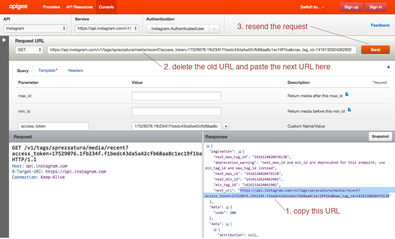
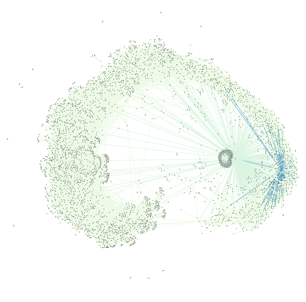
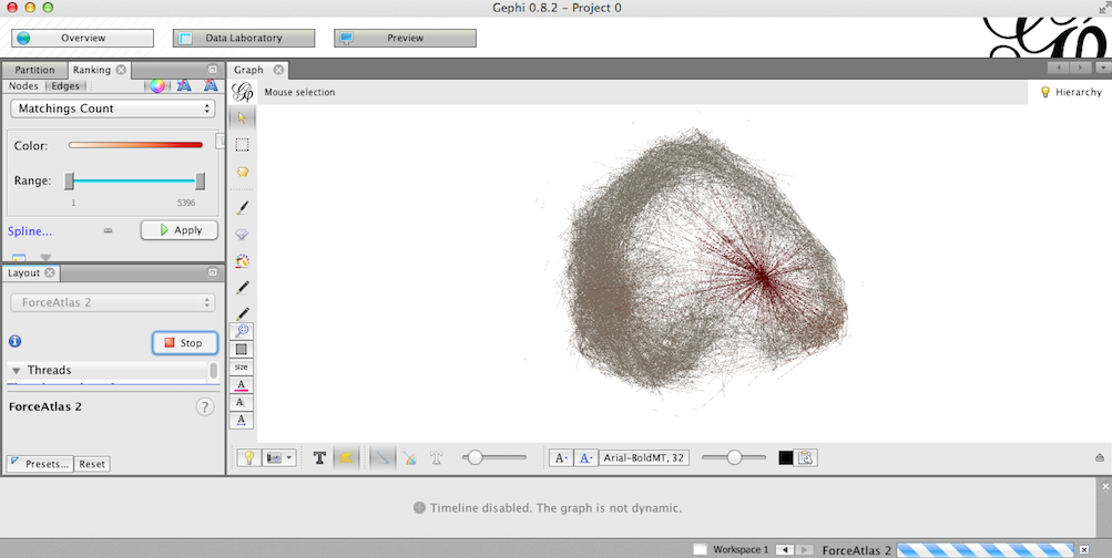
  • Thursday, October 30 – Data Visualization, (Micki Kaufman), Library GC; Impressive project and great demo. Again, I wish we could have actually tried to do some of the things Micki demoed.
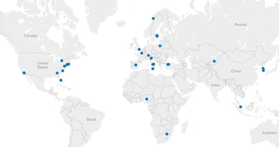
  • Friday, October 31 – Can’t attend the Fellows open hours this week or next week. Wrote Micki to see if she could meet with me at any point during next week for specific questions/answers? Began to export and clean a data set from last year’s academic MOM Conference, thinking it would be interesting to map the geographic locations attendees hailed from.
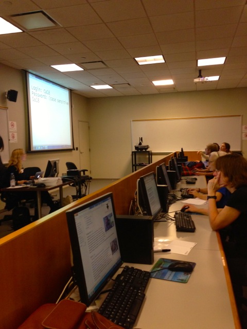
  • Saturday, November 1 – Began the day online taking tutorials. Stephen Real and I met before class on Thursday and he suggested a few things after we discussed how we could create a collaborative project. Today I’m watching Lynda.com videos, but for the tutorials that follow up on where Micki left off on excel documents, I work on a MAC and don’t have a left/right click mouse. So I can’t try a lot of the things they’re demoing. Going to try PDF conversion and scrapping now.
  • Thursday, Nov. 6 – Stephen Real and I met up. He and I “played” with some data cleaning stuff. He told me about his “Great Expectations” project. Sounds cool. Spoke with Chris Vitale generously shared some of his tech finds (which people have already been writing about here). Stayed late to talk research ideas with Stephen Brier.
  • Friday, Nov. 7 – Technology and Pedagogy Certificate Program at the Library. We talked wordpress, plug-ins, and sever technology.
  • Weekend, Nov. 8 – did some research on potential final projects. Explored DH in a Box. I have three ideas. Can’t decide which one to go with. Thinking about creating a survey monkey to ask classmates which idea they like best?

I signed up for “Technologies of Feminism” at Barnard. Starts November 18 and runs for 5 weeks. Here’s what it’s about. Feminism has always been interested in science and technology. Twitter feminists, transgender hormone therapy, and women in STEM are only more recent developments in the long entangled history of tech, science, and gender. And because feminism teaches that technology embodies societal values and that scientific knowledge is culturally situated, it is one of the best intellectual tools for disentangling that history. In this five-week course, we will revisit foundational texts in feminist science studies and contextualize current feminist issues. Hashtag activism and cyberfeminism, feminist coding language and feminized labor, and the eugenic past of reproductive medicine will be among our topics. Readings will include work by Donna Haraway, Maria Fernandez, Lisa Nakamura, Beatriz Preciado and more. Participants of all genders are welcome. No prior knowledge in feminist theory is required.

During the fall 2014 semester, courses similar to this one are taking place across North America in a feminist learning experiment called the Distributed Open Collaborative Course, organized by the international Feminist Technology Network (FemTechNet). As a node in this network, our class will open opportunities for collaboration in online feminist knowledge building—through organizing, content creation, Wikipedia editing, and other means. Together, we will discuss how these technologies might extend the knowledge created in our classroom to audiences and spaces beyond it.

Still haven’t pulled together a comprehensive plan amidst the massive choices available for the data project yet.

WHEW!

I’m en-JOY-ing the journey, but I’m not sure if I can pinpoint a location or product YET. Onward I suppose.

Journaling Data, Chapter 2

Statistics and R

I am pursuing two unrelated paths. The first of which is a collaborative path with Joy. She has identified some interesting birth statistics. The file we started with was a PDF downloaded from the CDC (I believe). I used a website called zamzar.com to convert the PDF to a text file. The text file was a pretty big mess, because it included a lot of text in addition to the tabular data that we are interested in.

Following techniques that Micki demonstrated in her Data Visualization Workshop, I used Text Wrangler to cut out a single table and gradually clean it up. I eliminated commas in numeric fields, and extra spaces. I inserted line feeds etc. until I had a pretty good tab-delimited text file, which imported very cleanly into Excel, where I did some additional cleaning and saved the table as a CSV file that would work well in R. The table reads into R very cleanly so that we can perform simple statistics on it such median, min and max.

 Text Analysis

My other data path is working with text, specifically, Dickens’ “Great Expectations”. I have used no fewer than three different tools to open some windows onto the book First a loaded a text file version of the book into Antconc, “…a freeware tool for carrying out corpus linguistics research and data-driven learning.” I was able to generate word counts and examine word clusters by frequency. The tool is very basic so until I had a more specific target to search, I set Antconc aside.

At Chris’s suggestion I turned to a website called Voyant-tools.org, which quickly creates a word cloud of your text/corpus. What it does nicely is provide the ability to apply a list of stop words, which eliminates many common frequently used words, such as ‘the’ and ‘to’. Using Voyant, I was able to very quickly create a word cloud and zero in on some interesting items.

Screenshot 2014-11-09 10.19.59

The most frequently mentioned character is Joe (in fact, Joe is the most frequent word) and not Pip or Miss Havisham. That discovery sent me back to Antconc to understand the contexts in which Joe appears . Other words that loom large in the word cloud and will require further investigation are ‘come’ & ‘went’ as pair, ‘hand’ and ‘hands’, ‘little’ and ‘looked’/looking’.

Lastly, I have run the text through the Mallet topic modeler and while don’t know what to make of it yet, the top ten topics proposed by Mallet make fascinating reading, don’t they?

  1. miss havisham found left day set bed making low love
  2. made wemmick head great night life light part day dark
  3. mr pip jaggers pocket mrs young heard wopsle coming question
  4. boy knew herbert dear moment side air began hair father
  5. time long face home felt give manner half replied person
  6. back thought house make ll pumblechook herbert thing told days
  7. joe don mind place table door returned chair hope black
  8. hand put estella eyes asked stood gentleman sir heart london
  9. good round hands room fire gave times turned money case
  10. man looked biddy sister brought held provis sat aged child

At this point the exploration needs to be fueled by some more pointed questions that need answering. That is what will drive the research. Up until now it has been the tools that have been leading the way as I discover what they can do and what buttons to push to make them do it.


Dataset Project: 80s Horror Movies (Part 1)

Hi All,

So this is the first part of my dataset project. During Halloween, after a couple hours of binge eating fun-sized candy bars and marathoning various scary movies, I got the idea to use horror films as a dataset for this class, given my personal and semi-scholarly interests in the genre. Obviously, this deviates from my research on early modern literature, but I am not new to using horror films as the focus of other academic research.

Movie poster of Friday the 13th (1980), courtesy of IMBD.

Movie poster of Friday the 13th (1980), courtesy of IMBD.

With that half-baked idea in mind, I set out to narrow my focus a little to get a central theme for the data that wasn’t just the genre itself. I decided to exclusively use films made in the 1980s, a decade for horror films that was especially prolific. Many of these horror films, such as They Live and The Stuff, served as thinly veiled political commentary against an increase in enthusiastic republican politics and capitalism. Wes Craven, popular horror director, explained in the horror movie documentary Nightmares in Red, White, and Blue that he “wanted to do something about Reganism…The crowd was ‘kill a commie for Christ and let’s get those commies and kill them’ something I grew up laughing at in Dr. Strange Love. Now here it was again. It returned and with this massive enthusiasm behind it.” Even as some horror movies served as seemingly progressive political narratives, the genre was also at the peak of slasher films in this decade, a subgenre that has been especially criticized for its violent misogyny, a theme that Wes Craven also participated in with movies like Last House on the Left and A Nightmare on Elm Street.

A screenshot of my dataset collected in Excel.

A screenshot of my dataset collected in Excel.

After narrowing my focus, I started collecting my dataset, using Wikipedia’s horror movie list (separated by decade) and IMBD respectively. I ended up with 610 movie entries, a small dataset but totally usable in my opinion. I catalogued the title, date, director, and country of origin for each film, hoping to utilize this information.

Now, before I continue with this project I face a couple of predicaments with where I want to take this project. I would really love to catalogue the instances of violent misogyny, as subjective as that may be, and perhaps utilize a digital tool/platform that would showcase repeat offenders by year, director, and country of origin. The problem is, there are over 600 movie entries, not all of which I’ve seen or remember intricate details of, so cataloguing those instances or themes of violent misogyny would be difficult, subjectivity aside. I suppose I could rely on synopses and critic reviews, but I’m not sure if that would provide the best results.

The other problem I’m running into is finding a graphing tool that will be able to showcase the dataset for the particular variables I’m interested in (i.e. cataloguing themes of violent misogyny by date, director, and country.) I am leaning towards Gephi since I’ve been playing around with it lately, but I’m definitely open to any other suggestions, as well.

Where do the ‘others’ fit in?

I’m writing this amidst a whirl of thoughts and tracks. Kathleen Fitzpatrick’s views on authorship and the status of private scholarship are impinging on my decision to write to a paper for the final assignment. On one hand, I am glad I read her while battling the dataset project, on the other, she is making me think where my final paper fits in the evolving landscape of scholarship. I am suddenly not satisfied to leave the paper to seclusion. And I am beginning to see the wisdom of having a blog and our instructors’ encouragement of documenting our ‘play’ with datasets. Even as blogs give ‘voice’, it also seems that the essential output remains writing, which, contrary to my decision to write a paper, I’m not entirely comfortable with. I’m still wondering why thoughts presented in writing alone qualify as scholarship; can’t a painting or music do the same? I know there are brave folk who’ve battled this, Nick Sousanis and his dissertation, written and drawn entirely in comic book format, comes to mind. But none of that is considered mainstream. It seems that  exchange and communication can expand when ‘intermedia’ becomes a reality, moving beyond the notion of ‘interdiscipline’? In the light of DH being a challenger of notions, how ‘other’ forms of expression can be included in scholarship is a thought to ponder.

For further reading on unusual dissertation forms, I invite you to browse through the following

http://www.hastac.org/blogs/cathy-davidson/2014/08/28/what-dissertation-new-models-methods-media

http://www.spinweaveandcut.blogspot.com/