My inspiration of this project became from Neil Harbssion, who could not see colors. His world is black and white, but now he is an artist. Harbssion describes him as a cyborg. Dangling over his forehead is an antenna that curves up and over from the back is his skull. The device, which he calls “eyeborg”, helps him connect him and the color by detect the light frequencies of color hues and translate it into sound frequencies.
Harbission’s artwork burs the boundaries between sight and sound. He can listen to color, and also see sounds.
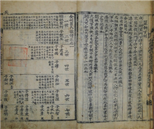
Here is the how Harbssion sees Biber’s Baby and Beethoven’s Fur Elise.
These made me wonder if normal people without an eyeborg could also participate into this fun with the help of software technology.
We have many phone games that are able to transform the tones, beats, and melody into colors, such as Cosmic DJ, Synesthetic, InSong, which means there is a technology to establish my assumption.
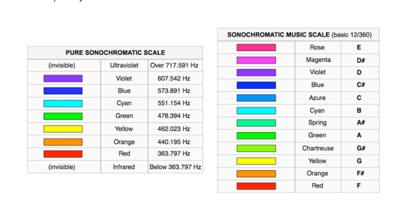
I found Harbssion’s match sheet between sounds and colors from his cyborg company and hope if there is someway I can match the color and sound frequency myself.
In the beginning when I asked around my friend, nobody seemed have this kind of experience. They said the assumption sounds doable, but they do not how to do it. Finally I reached my friend’s friend, who is an artist with CS skills, she said:
“His (Neil Harbssion’s) mapping of tone to color is actually really complex, and he uses frequency to detect the nuances of colors, which is a very laborious and intense process. If you want to do it from a scientific approach of parsing frequency to color, it is not an easy process and you won’t be able to finish in time.”
However, she said, I can also fake it by assigning the color with very basic tone.
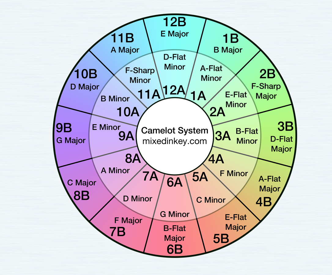
I tried several music software and finally came up with one called Mixed in Key 6.
This is a DJ software that simplifies a DJ technique called harmonic mixing. It analyzes MP3 files and determines the musical key of every file.
The basic key of each song from Mixed in Key is showing as a specific number with letter, such as 12B as E major.
My datasets includes, Billboard Hot 100 from 2014 as representation of Western pop music, Melon top 100 from 2014 as representation of Korean pop music, Li Yundi’s Tokyo Concert as representation of classical music, and the sound tracks from Jersey Boys as representation of the Broadway music. By using Mixed in Key 6, I can generate the basic key into letter and match back to basic key in musical notes.
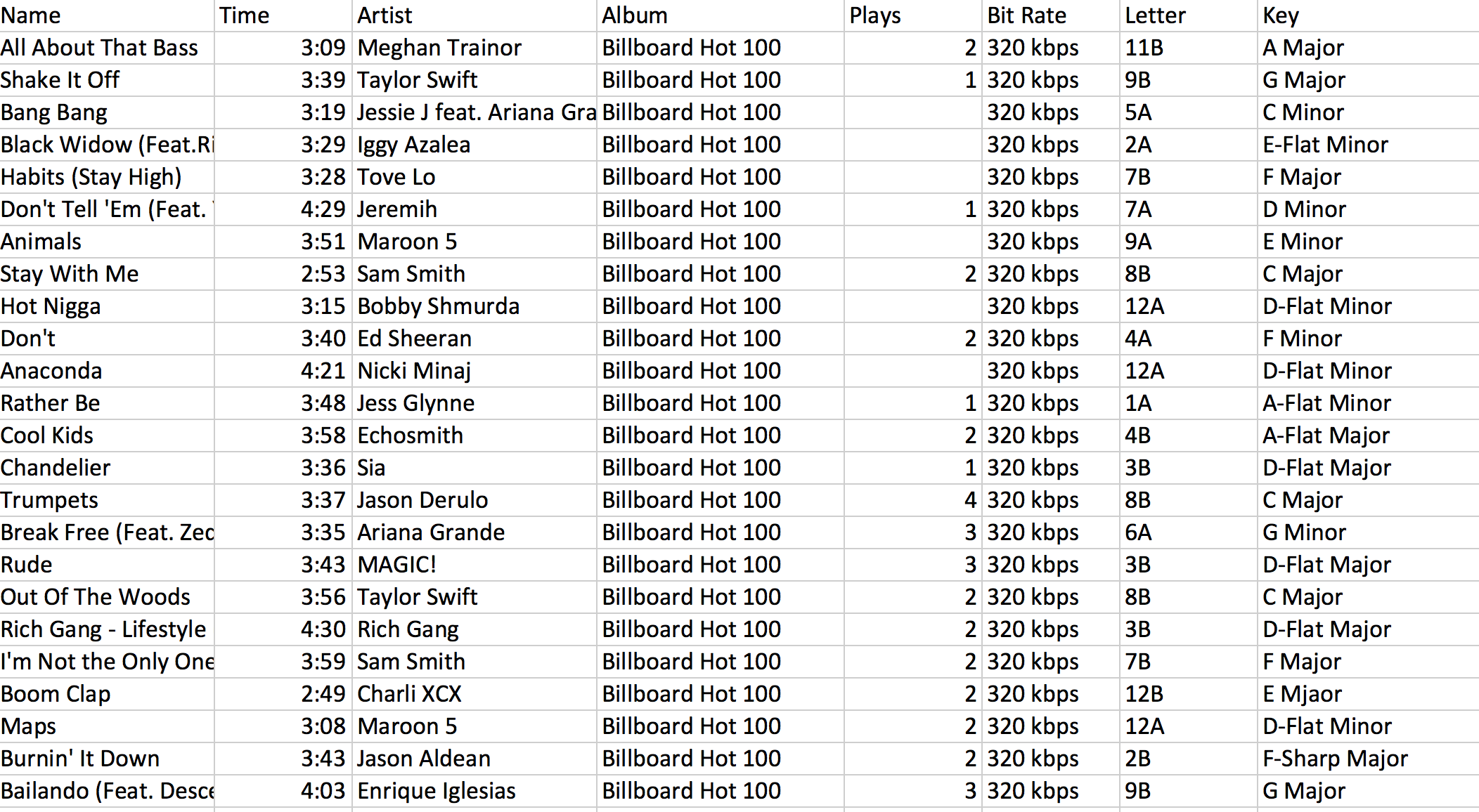
After getting all the basic keys of my music, I use the tableau Public to generate the date into columns and pies.
If we distribute the number of songs with specific notes, we can see that the 4 groups of music have their own “favorable” notes.
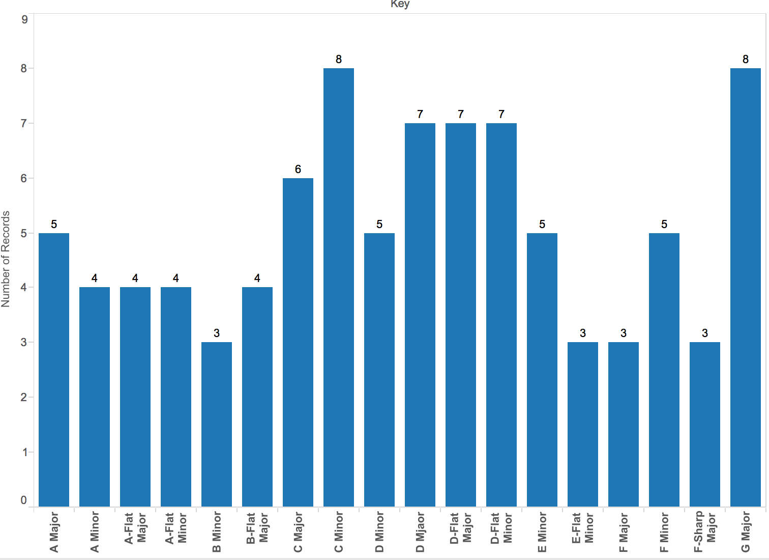

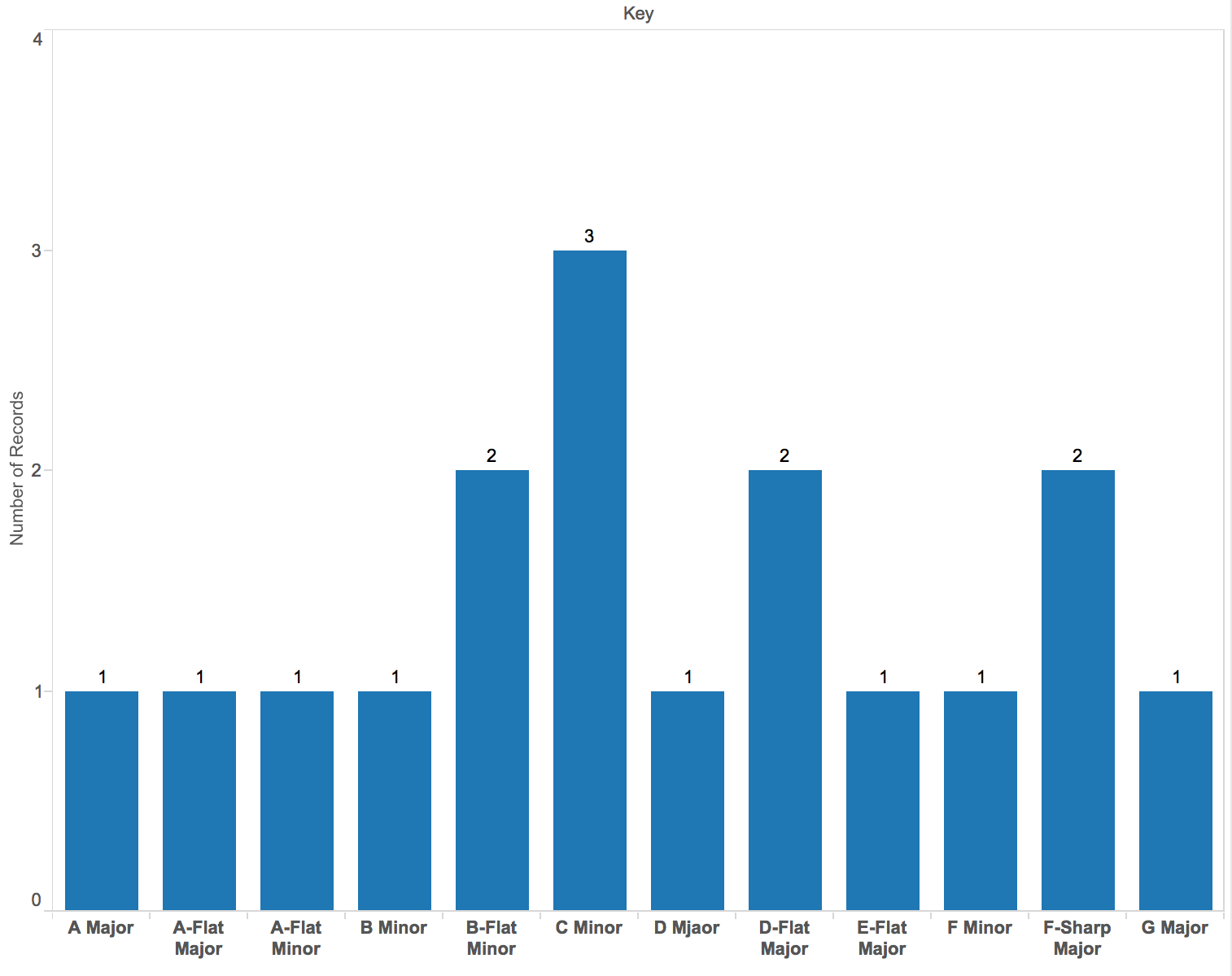
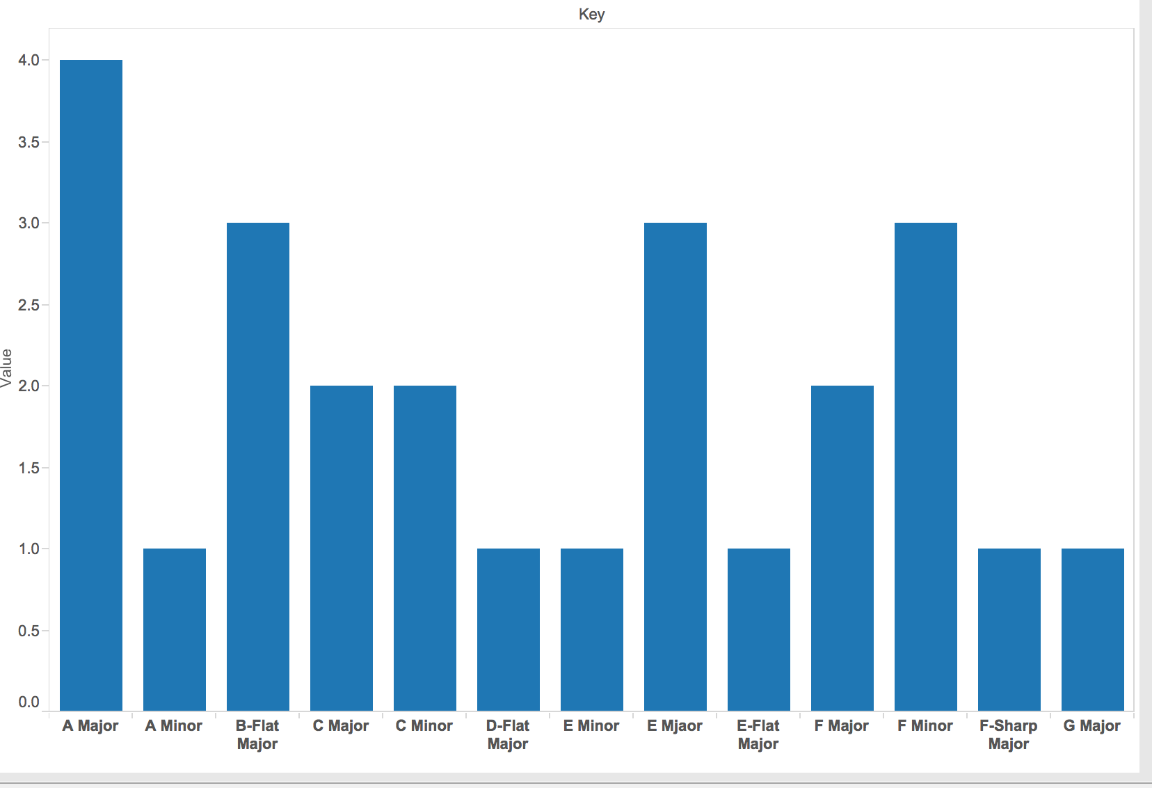
(from left to right: billboard, korean, classical, and jersey boy )
For billboard, it will be C minor, D major, D flat Major, D flat minor, and G major.
For Korean music, it will be A minor.
For classical music, it will be C minor and some B-flat minor, D flat, and F sharp major.
For Broadway music, it will be A major, B-flat major, E major, and F minor.
We can have a simple conclusion that note C and A seems apparent more frequent than others.
In the beginning, I used specific color to draw the pie; the color distribution looks very complex and uneven.
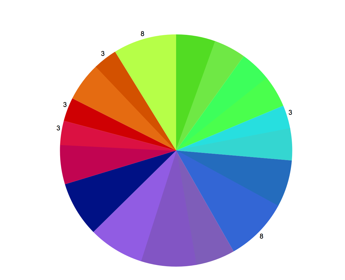
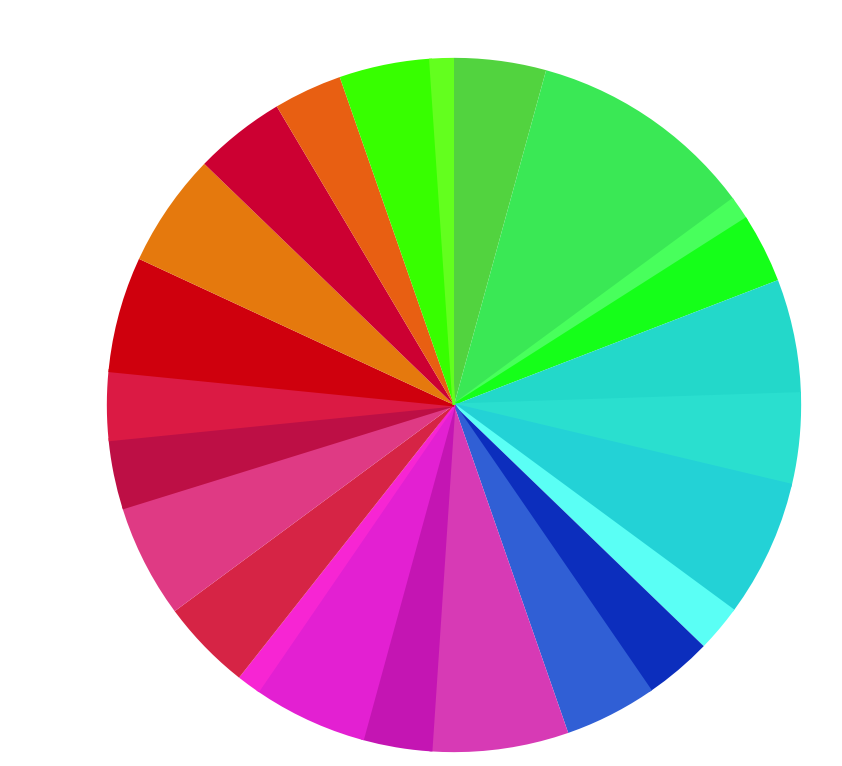
Then I started thinking that the match of Harbssion’s mapping has many color in similar tones, and it may be because the color has similar hue tone also reflect to the keys that sound similar for people to hear.
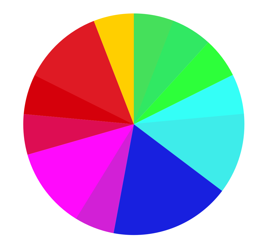
I modified the pies and use the same shade of the color to indicate keys also share similar hues from the map. The distributions look much better now. (from left to right: billboard, korean, classical, and jersey boy )

Looking at the second color pie, it seems all four groups have more even distribution in music tones. And because some color is more brighter, it looks more obvious, such as the orange, representing F#. There is no trend showing that people will be more in favor of one color tone. However, by looking at the pie, we can see that classical music use more F than other genres, and broadway music uses more F#. Theses four genres share similar distribution of note A (green) and D (magenta). And classical music may have more common with broadway music.
There are some limitations of this data project:
- Mixed in Key 6 is not a software with high accuracy to determine the basic key of a music
- It may be to broad or rough to only look at the basic key of a music and may mislead the interpretation of a song.
- Whether the dataset is representative enough
To determine whether is a real trend of music that people like to hear, further research of this project is, indeed, needed.
And it will be on my project proposal.