Greetings, fellow digitalists,
*warning: long read*
I am so impressed with everyone’s projects! I feel like I blinked on this blog, and all of a sudden everything started happening! I’ve tried to go back and comment on all your work so far–let me know if I’ve missed anything. Once again, truly grateful for your inspiring work.
Now that it’s my turn: I’d like to share a project that I’ve been working on for the past year or so. I’ll break it down into two blog posts–one where I discuss the first part, and the other that requests your assistance for the part I’m still working on.
A year ago, I received funding from Columbia Libraries Digital Centers Internship Program to work in their Digital Social Sciences Center on a digital project of my own choosing. I’ve always gravitated towards the medieval North Atlantic, particularly with anything dark, brooding, and scattered with thorns and eths (these fabulous letters didn’t make it from Old English and Old Norse into our modern alphabet: Þ, þ are thorn, and Ð, ð are eth). Driven by my research interests in the spatiality of imaginative reading environments and their potential lived analogues, I set out to create a map of the Icelandic outlaw sagas that could account for their geospatial and narrative dimensions.
Since you all have been so wonderfully transparent in your documentation of your process, to do so discursively for a moment: the neat little sentence that ends the above paragraph has been almost a year in the making! The process of creating this digital project was messy, and it was a constant quest to revise, clarify, research, and streamline. You can read more about this process here and here and here, to see the gear shifts, epic flubs, and general messiness this project entails.
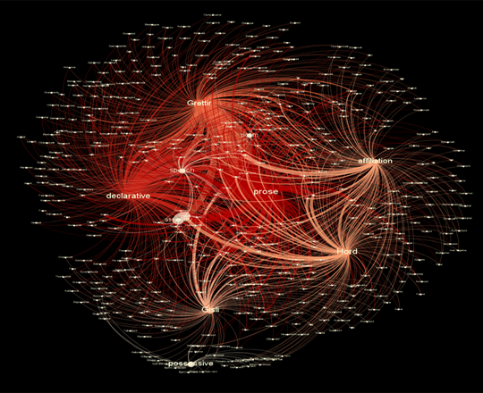
But, to keep with this theme of documentation as a means of controlling data’s chaotic properties, I’ve decided to thematically break down this blog post into elements of the project’s documentation. Since we’ve already had some excellent posts on Gephi and data visualization, I’ll only briefly cover that part of my project towards the end–look for more details on that part two in another blog post, like I mention above.
As a final, brief preface: some of these sections have been borrowed from my actual codebook that I submitted in completion of this project this past summer, and some parts are from an article draft I’m writing on this topic–but the bulk of what you’ll read below are my class-specific thoughts on data work and my process. You’ll see the section in header font, and the explanation below. Ready?
Introduction to the Dataset
The intention of this project was to collect data on place name in literature in order to visualize and analyze it from a geographic as well as literary perspective. I digitized and encoded three of the Icelandic Sagas, or Íslendingasögur, related to outlaws from the thirteenth and fourteenth centuries, titled Grettis saga (Grettir’s Saga), Gísla saga Súrssonar (Gisli’s Saga), and Hardar Saga og Hölmverja (The Saga of Hord and the People of Holm). I then collected geospatial data through internet sources (rather than fieldwork, although this would be a valuable future component) at the Data Service of the Digital Social Sciences Center of Columbia Libraries, during the timeframe of September 17th, 2013, to June 14th, 2014. Additionally, as part of my documentation of this data set, I had to record all of the hardware, software, and Javascript libraries I used–this, along with the mention of the date, will allow my research to be reproduced and verified.
Data Sources
Part of the reason I wanted to work with medieval texts is their open-source status; stories from the Íslendingasögur are not under copyright in their original Old Norse or in most 18th and 19th century translations and many are available online. However, since this project’s time span was only a year, I didn’t want to spend time laboriously translating Old Norse when the place names I was extracting from the sagas would be almost identical in translation. With this in mind, I used the most recent and definitive English translations of the sagas to encode place name mentions, and cross-referenced place names with the original Old Norse when searching for their geospatial data (The Complete Sagas of Icelanders, including 49 Tales. ed. Viðar Hreinsson. Reykjavík: Leifur Eiríksson Pub., 1997).
Universe
When I encountered this section of my documentation (not as a data scientist, but as a student of literature), it took me a while to consider what it meant. I’ll be using the concept of “data’s universe,” or the scope of the data sample, as the fulcrum for many of the theoretical questions that have accompanied this project, so prepare yourself to dive into some discipline-specific prose!
On the one hand, the universe of the data is the literary world of the Icelandic Sagas, a body of literature from the 13th and 14th centuries in medieval Iceland. Over the centuries, they have been transmuted from manuscript form, to transcription, to translation in print, and finally to digital documents—the latter of which has been used in this project as sole textual reference. Given the manifold nature of their material textual presence—and indeed, the manuscript variations and variety of textual editions of each saga—we cannot pinpoint the literary universe to a particular stage of materiality, since to privilege one form would exclude another. Seemingly, my data universe would be the imaginative and conceptual world of the sagas as seen in their status as literary works.
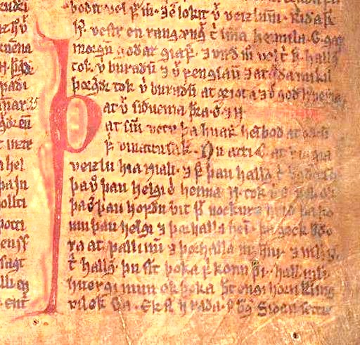
A manuscript image from Njáls saga in the Möðruvallabók (AM 132 folio 13r) circa 1350, via Wikipedia
However, this does not account for the geospatial element of this project, or the potential real connections between lived experience in the geographic spaces that the sagas depict. Shouldn’t the data universe accommodate Iceland’s geography, too? The act of treating literary spaces geographically, however, is a little fraught: in this project, I had to negotiate specifically the idea that mapping the sagas is at all possible, from a literary perspective. In the latter half of the twentieth century, scholars considered the sagas as primarily literary texts, full of suspicious monsters and other non-veracities, and from this perspective could not possibly be historical. Thus, the idea of mapping the sagas would have been irrelevant according to this logic, since seemingly factual inconsistencies undermined the historical, and thus geographic, possibilities of the sagas at every interpretive turn.
However, interdisciplinary efforts have been increasingly challenging this dismissive assumption. Everything from studies on pollen that confirm the environmental difficulties described in the sagas, to computational studies that suggest the social patterns represented in the Icelandic sagas are in fact remarkably similar quantitatively to genuine relationships suggest that the sagas are concerned with the environment and geography that surrounded their literary production.
But even if we can create a map of these sagas, how can we counter the critiques of mapping that it promotes an artificial “flattening” of place, removing the complexity of ideas by stripping them down to geospatial points? Our course text, Hypercities, speaks to this challenge by proposing the creation of “deep maps” that account for temporal, cultural, and emotional dimensions that inform the production of space. I wanted to preserve the idea of the “deep map” in my geospatial project on the Icelandic Sagas, so in a classic etymological DH move (shout out to our founding father Busa, as ever), I attempted to find out more about where the idea of “deep mapping” might have predated Hypercities, which only came out this year yet represents a far earlier concept.
I traced the term “deep mapping” back to William Least Heat-Moon, who coined the phrase in the title of his book, PrairyErth (A Deep Map) to indicate the “detailed describing of place that can only occur in narrative” (Mendelson, Donna. 1999. “‘Transparent Overlay Maps’: Layers of Place Knowledge in Human Geography and Ecocriticism.” Interdisciplinary Literary Studies 1:1. p. 81). According to this definition, “deep maps” occur primarily in narrative, creating depictions on places that may be mapped on a geographic grid that can never truly account for the density of experience that occurs in these sites. Heat-Moon’s use of the phrase, however, does not preclude earlier representations of the concept; the use of narratives that explore particular geographies is as old as the technology of writing. In fact, according to Heat-Moon’s conception of deep mapping, we might consider the medieval Icelandic sagas a deep map in their detailed portrayal of places, landscape, and the environment in post-settlement Iceland. Often occurring around the locus of a regional few farmsteads, the Sagas describe minute aspects of daily Icelandic life, including staking claim to beached whales as driftage rights, traveling to Althing (now Thingvellir) for annual law symposiums, and traversing valleys on horseback to seek out supernatural foes for battle. Adhering to a narrative form not seen again until the rise of the novel in the 18th century, the Íslendingasögur are a unique medieval exempla for Heat-Moon’s concept of deep mapping and the resulting geographic complexity that results from narrative. Thus, a ‘deep map’ may not only include a narrative, such as in the sagas’ plots, but potentially also a geographic map for the superimposition of knowledge upon it–allowing these layers of meaning to build and generate new meaning.
To tighten the data universe a little more: specifically within the sagas, I have chosen the outlaw-themed sagas for their shared thematic investment in place names and geography. Given that much of the center of Iceland today consists of glaciers and wasteland, outlaws had precious few options for survival once pushed to the margins of their society. Thus, geographic aspects of place name seem to be just as essential to the narrative of sagas as their more literary qualities—such as how they are used in sentences, or what place names are used to obscure or reveal.

Map of Iceland, by Isaac de La Peyrère, Amsterdam, 1715. via Cornell University Library, Icelandica Collection
In many ways, the question of “universe” for my data is the crux of my research question itself: how do we account for the different intersections of universes—both imaginative and literary, as well as geographic and historical—within our unit of analysis?
Unit of Analysis
If we dissect the element that allows geospatial and literary forms to interact, we arrive at place name. Place names are a natural place for this site of tension between literary and geographic place, since they exist in the one shared medium of these two modes of representation: language. In their linguistic as well as geographic connotations, place names function as the main site of connection between geographic and narrative depictions of space, and it is upon this argument that this project uses place name as its unit of analysis.
Methodology
Alright, now that we’re out of the figurative woods, on to the data itself. Here are the steps I used to create a geospatial map with metadata for these saga place names.
Data Collection, Place Names:
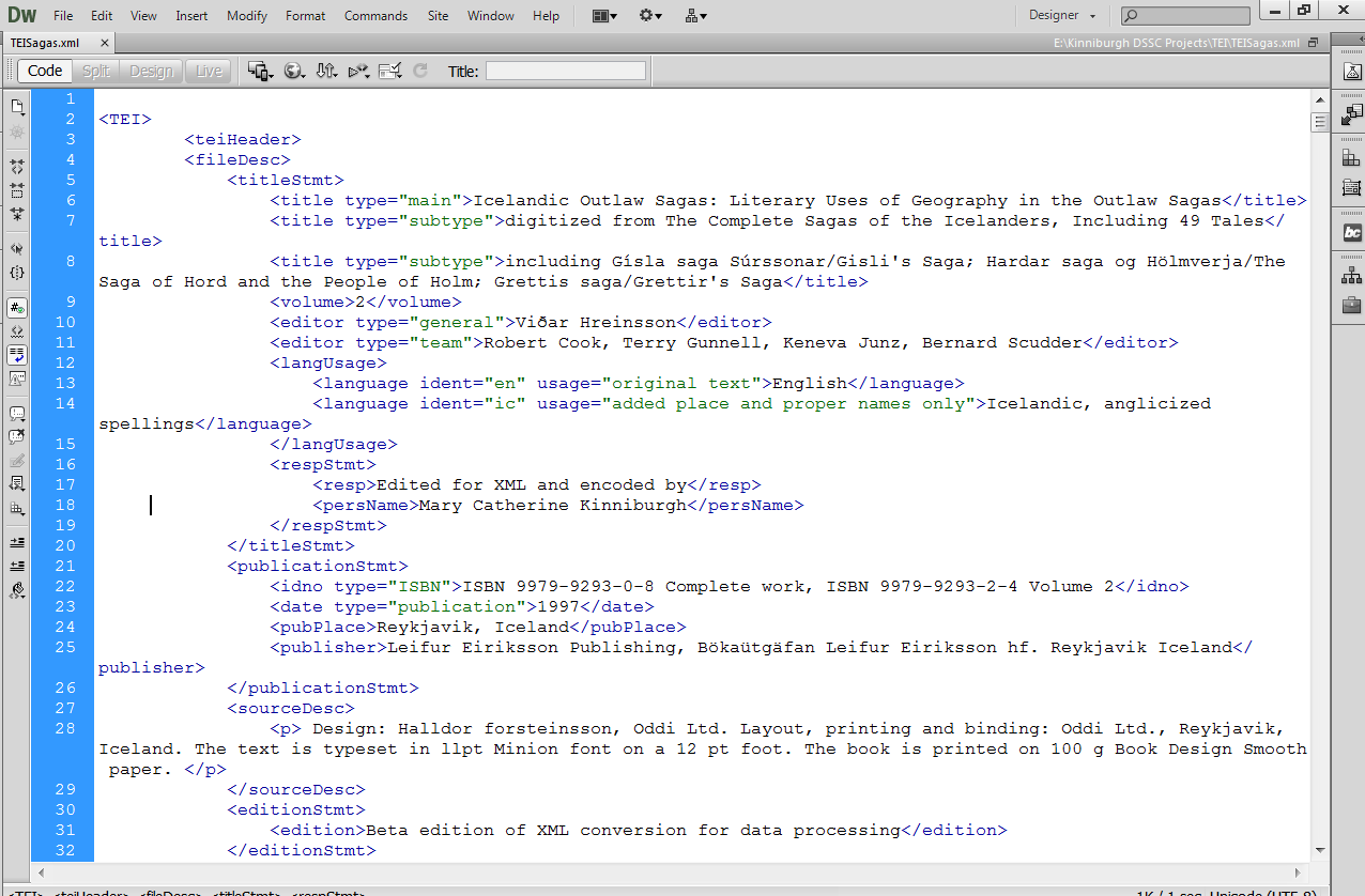
The print text was scanned and digitized using ABBYY FineReader 11.0, which performs Optical Character Recognition to ensure PDFs are readable (or “optional character recognition, as I like to say) and converted to an XML file. I then used the flexible coding format of the XML to hand-encode place name mentions using TEI protocol and a custom schema. In the XML file, names were cleaned from OCR and standardized according to Anglicized spellings to ensure searchability across the data, and for look-up in search engines such as Google–this saved a step in data clean-up once I’d transformed the XML into a CSV.
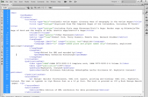
Here’s the TEI header of the XML document–note that it’s nested tags, just like HTML.
Data Extraction / Cleanup
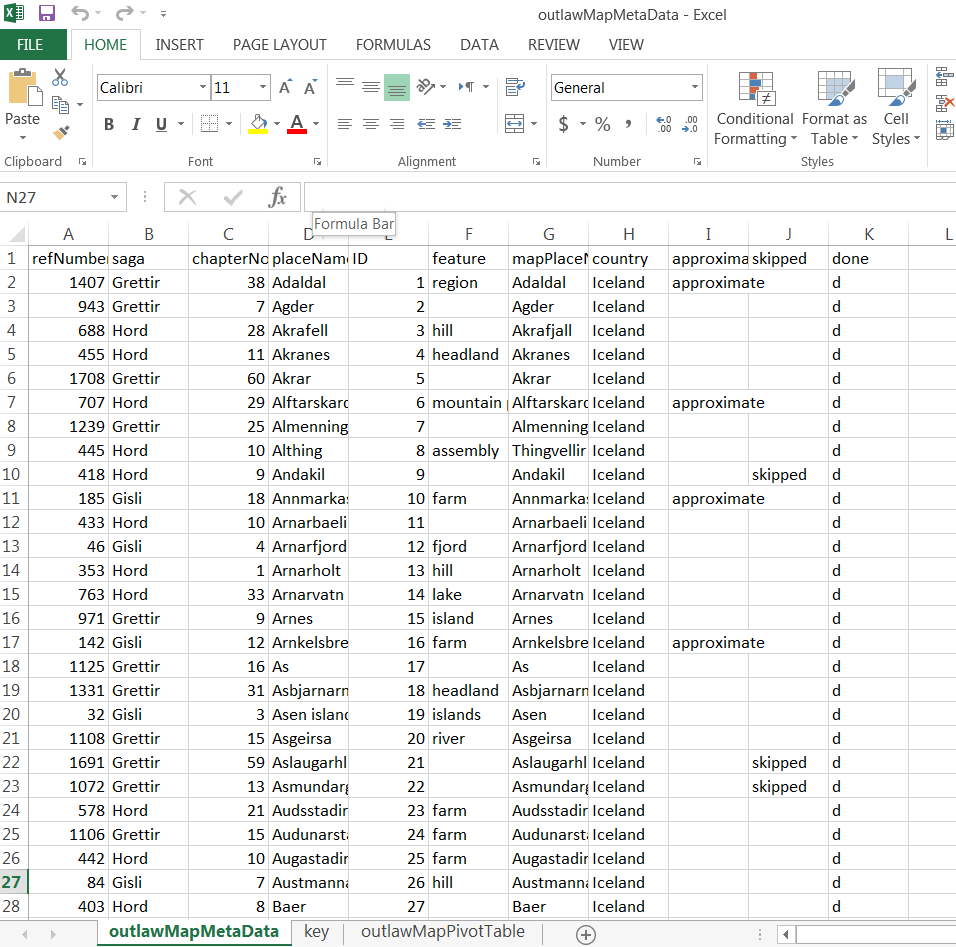
In order to extract data, the XML document was saved as a CSV. Literally, “File > “Save As.” This is a huge benefit of using flexible mark-up like XML, as opposed to annotation software that can be difficult to extract data from, such as NVivo, which I wrote about here on Columbia University Library’s blog in a description of my methodology. In the original raw, uncleaned file, columns represented encoding variables, and rows represented the encoded text. I cleaned the data to eliminate column redundancies and extraneous blank spaces, as well as to preserve the following variables: place name, chapter and saga of place name, type of place name usage, and place name presence in poetry, prose, or speech. I also re-checked my spelling here, too–next time, no hand-encoding!

Here’s the CSV file after I cleaned it up (it was a mess at first!)
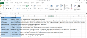
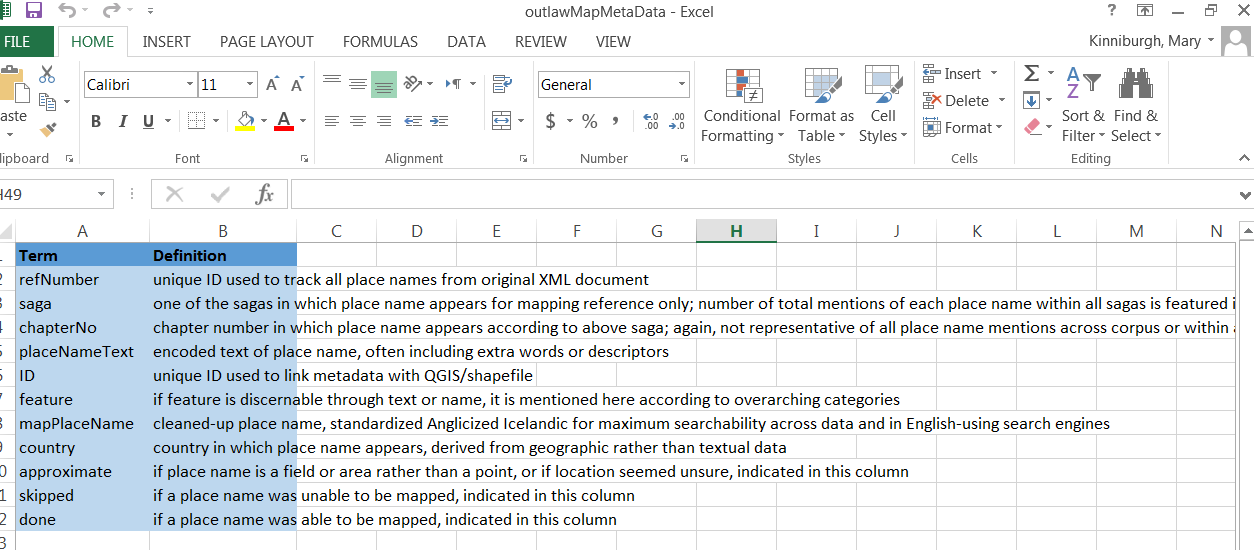
I saved individual CSVs, but also kept related info in an Excel document. One sheet, featured here, was a key to all the variables of my columns, so anyone could decipher my data.
Resulting Metadata:
Once extracted, I geocoded place names using the open-source soft- ware Quantitative Geographic Information Systems (QGIS), which is remarkable similar to ArcGIS except FREE, and was able to accommodate some of those special Icelandic characters I discussed earlier. The resulting geospatial file is called a shapefile, and QGIS allows you to link the shapefile (containing your geospatial data) with a CSV (which contains your metadata). This feature allowed me to link my geocoded points to their corresponding metadata (the CSV file that I’d created earlier, which had place name, its respective saga, all that good stuff) with a unique ID number.
Data Visualization, or THE BIG REVEAL
While QGIS is a powerful and very accessible software, it’s not the most user-friendly. It takes a little time to learn, and I certainly did not expect everyone who might want to see my data would also want to learn new software! To that end, I used the JavaScript library Leaflet to create an interactive map online. You can check it out here–notice there’s a sidebar that lets you filter information on what type of geographic feature the place name comprises, and pop-ups appear when you click on a place name so you can see how many times it occurs within the three outlaw sagas. Here’s one for country mentions, too.
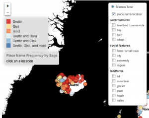
Click on this image to get to the link and interact with the map.
Takeaways
As the process of this documentation highlights, I feel that working with data is most labor-intensive when it comes to positioning the argument you want your data to make. Of course, actually creating the data by encoding texts and geocoding takes a while too, but so much of the labor in data sets in the humanities is intellectual and theoretical. I think this is a huge strength in bringing humanities scholars towards digital methodologies: the techniques that we use to contextualize very complex systems like literature, fashion, history, motherhood, Taylor Swift (trying to get some class shout-outs in here!) all have a LOT to add to the treatment of data in this digital age.
Thank you for taking the time to read this–and please be sure to let me know if you have any questions, or if I can help you in mapping in any way!
In the meantime, stay tuned for another brief blog post, where I’ll solicit your help for the next stage of this project: visualizing the imaginative components of place name as a corollary to this geographic map.