#skillset Chris V (@CVDH4)

Here are some key skillsets I can bring to each role.

  • Project Management: Trello and Google Apps are my best friends. Task management, team building, and communication are the guts of what I would bring as project manager. I have professional working experience in the other three positions and know how to create interdepartmental dialogues (namely getting Dev Operations to play nicely with Ad Sales Reps, Editorial, and Marketing.)
  • Developer: This interests me a great deal. I have a basic understanding of Python, Javascript, PHP. I am more proficient in HTML/CSS than anything (Tip of the hat to the days of building custom MySpace pages.) This does however seem like the role that I will learn the most. I want more hands on development experience. It is a stop learning and start creating mentality that drives me here.
  • Design/UX: This is probably my strongest area of experience. I work as a graphic designer and have been involved in many web/mobile design projects. I have a working proficiency with most things made by Adobe including Illustrator, InDesign, Adobe DPS, After Effects, Edge Animate, Edge Code, Dreamweaver, Muse, and Inspect CC. If I was to take on designer I would focus my research on better understanding user interaction, prototyping, and front end development.
  • Outreach: Brand is everything. (I fear working in marketing has ruined me for life.)

I currently work at Queens College in the Center for Teaching and Learning as program assistant as well as a Digital Fellow for the Writing Across the Curriculum Department. That means I have a pool of learning resources that we can tap into, a place to have meetings, and a full media lab at our disposal.

#skillset @Julia Pollack

#skillset @Julia Pollack

Hi Friends!

Project Management: I am good at leading meetings, but I would prefer to be a great group member rather than the project manager. (I would love to help the group manager with presentations, I am a great public speaker)**

Outreach: I am a terrible speller, sooooooo someone else should tweet. But, I can make pretty pics to help with outreach materials. **

Developer: I am learning Some codes and I would like to push myself closer to this identity. I took an R class with Prof Manovich. I have hashed around with some visual tools. I would love to play around with Java. As I am reading people’s #skillset posts it seems like everyone feels a similar trepidation with the term developer. If I wear the label I would love some team buddies to work with. If I wear a different label I will be there with the developer side by side because this is a part of my academic identity I wish to focus on and develop.***

Designer: A am good at Photoshop and InDesign. I can edit video’s, and audio. I am proficient at a variety of web publishing platforms wordpress etc.. Also, I like visuals I find that I build visual models before I do anything else in a creative project. I feel as if I teach UX in library Info sessions, I am regularly leading workshops while asking students about usability and interface design.****

Other: Lookin up articles, encouraging others, problem solving, eating snacks, makin cat memes.

#skillset @LiamSweeney

Hi All, great to see everyone last week! Thoughts on how I could contribute to a project below.

Project Management: In my day job I do a lot of this. Am currently managing two surveys, one to measure the diversity of museum employees in North America and the other requesting data from academic libraries to measure Amazon’s market share of University Press print books. I’m getting okay at juggling.

Outreach: Also jives with my day job, particularly a project I’m on as a sustainability consultant for an open access journal (PPJ) starting out of Penn State/Michigan State’s Matrix, where I’m working to identify partners to help grow the project. I’m also eager to explore CUNY’s infrastructure, and relationship with NYPL, to identify different homes for various kinds of work (it is so vast!).

Developer: I don’t have much experience but am eager to learn, especially because it would be a departure from the daily grind. I’ve completed HTML/CSS and JavaScript code academy courses, some python, and have played around in R a bit. I’m into hunting down the answers on GitHub and Stack Overflow.

Designer: I have played around with the basics here- building a personal site and using the basics of Photoshop. But I don’t have any real training.

#skillset@SteveReal

I tried to think about what I would bring to each of the roles. Here is my #skillset:

Project Management: I have 30 years of experience managing software development projects. This is such an obviously good fit, that I think I would prefer a role that is new to me and forces me to learn. I would gladly help out in the project management capacity.

Developer: I am a “baby” Python programmer, which is to say that I know the basics, but have little experience. I know a little R and have old experience (can you say COBOL?) developing code. I am quite tenacious at problem solving and learning new technology and have a pretty broad background at the conceptual level. I would enjoy this role.

Design/UX: In my career, I have quite a bit of experience in this area as it pertains to software usability. I have seen a project fail when it met all the requirements, but was hard to use. I am not a graphically talented person, so making a project “look beautiful” is not something I would be good at. I would be glad to play this role focusing on “ease of use”.

Outreach: I have limited ability to use social media. I am a Twitter and Facebook dabbler. I am dubious that this would be the best use of my labor.

#Skillset @jojokarlin

Hey #RealWorld #DHPraxis14,

I thought I’d at least start a post (to be edited should the need arise).

#Skillset I offer you:

  1. coordinating/interfacing with people (I like people)
  2. multimodal production experience (I’m an actress, but have worked in most aspects of theatrical production — stage management, direction, music, tech, design — so am pretty comfortable combining different forms/formats to create a unified product).
  3. editing (I like grammar and punctuation (parentheticals especially)). This skill comes with a general love of/attention to details.
  4. positive attitude — enthusiasm and pragmatism — I am impatient to dive in, but patient with failure. I am critical without being judgmental.
  5. creativity (#ironicemptyspace)
  6. cookie baking (I am not above baked good bribery).

See you Tuesday.

-Jojo

Yay II

http://www.decontextualize.com/


textual cohesion—the methods and strategies that language speakers employ to make the units of the text (lines, sentences, stanzas, paragraphs, etc.) come together as a whole.

Yay

http://0x0a.li/en/

The Digital has doubled the text. It is writing and action. Text can be read and executed. In the Digital, text is thought and deed at the same time.


Merry White Christmas~~

Dear Digitalists,

I have to say, this course is absolutely one the most fascinating courses I have ever taken (and I’m finishing my PhD—so I’ve probably taken the greatest number of courses here!). And I feel lucky to have met you all—you were such an inspiring group! Also a big round of applause to our two amazing professors—thank you for masterminding this seminar (a year ago I believe?); your pedagogical conceptions and curriculum designs are truly visionary.

Christmas is only a few days away, and I thought of posting something fun and Christmasy that is also related to my final project “Production of Desire, Consumption of Pleasure, and Creation of National Identity: Broadway Musicals as Cartography of US Sociocultural Values, 1920s-2010s.” In that spirit, why not run a data analysis of White Christmas, the Broadway musical adapted from a movie musical by Irving Berlin? It is by no means my favorite musical; in fact it is a pretty cheesy saccharine piece (with its own adorable moments). But so what? Christmas is all about eating candies and having some damn feel-good fun! So here we go:

Christmas_dvd_white_christmas_irving_berlin

What I’d like to see is which words stand out as topics/key words in this musical. Having been told that Mallet is best at handling topic modelling, I spent one afternoon teaching myself how to use Mallet.

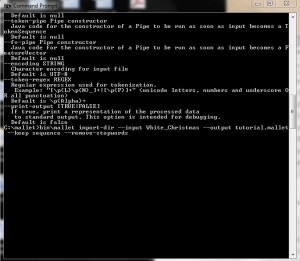
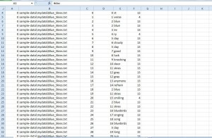
I start by installing both Mallet and Java developer’s kit. Then I pull the data (all the lyrics of the 18 songs in White Christmas) into one folder under Mallet, so it’s ready to be imported. I run Mallet using the Command Line and type in commands such as “bin\mallet import-dir –help” to test it. Then I import the data and command the Mallet to create a file called “tutorial.mallet.”

1

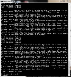
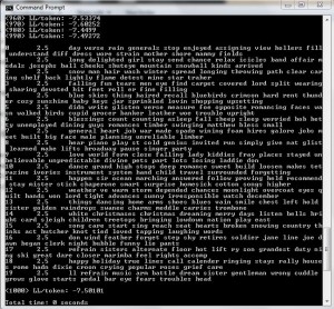
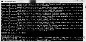
Then Mallet does its job and picks out the key words:

3

4

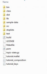
I make another command to open this file, and by typing in this command “bin\mallet train-topics –input tutorial.mallet –num-topics 20 –output-state topic-state.gz –output-topic-keys tutorial_keys.txt –output-doc-topics tutorial_compostion.txt” I ask the Mallet to find 20 topics, and it generates 3 documents:
1. Topic-state.gz
2. Tutorial composition
3. Tutorial keys

5

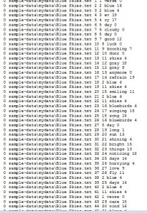
The first one is a compressed file that outputs every word in the corpus of my input and the topic it belongs to. And here is what it looks like after extraction:

7

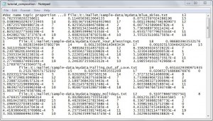
The second one is the breakdown, by percentage, of each topic within each original text file.

0

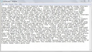
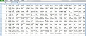
The third file shows what the top key words are for each topic.

00

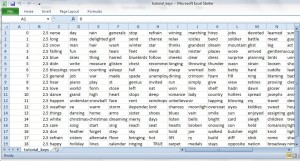
I clean up the data, and the result looks like this:

6

10

Now since Mallet is known for generating a slightly different result each time, I have to try it at least twice. In my second try, I use “optimize-interval” to lead to better results.

9

What this does is it indicates the weight of that topic! (Under item 8, “0.04778” is the “weight” of the topic “white,” followed by key words such as “bells” “card” “snow” and “sleigh.”)

11

This topic-modelling process sounds really simple, but it in fact takes quite some time to familiarize with. This is a try-out example of one musical; for a larger corpus of musicals, Mallet’s power should be more evident.

As for the musical data analysis of my project, I’m thinking of combining Schenkerian analysis with automating chord progression using idiomatic analysis. It is a musicological approach rather than audio signal processing. However, I’m not shutting down the latter option, since it might turn out to be more comprehensible to the general public—our eventual target audience. Also a shout-out, musicians in the group (I know there are several), come talk with me!

Merry Christmas everyone! (Looking at these key words makes my mouth covet sweetness; now where is my Twix?! …. nom nom…)

~Sissi

Final Wendy Davis Work

I have been working on this Wendy Davis data for a long time, but realized I had not caught you guys up to speed with it in a while. Here is what I have been doing for the past month with the data.

First, I found the data, thanks to the amazing Kelly Blanchat, who discovered it in a database at the University of North Texas.

Phase #1: JSON to CSV

Then, after I agonized over what to do with JSON files for a really long time. I found a reader for them called Sublime Text, but had trouble pasting that data accurately into a spreadsheet. Then, when I found out how to do that, I had to figure out how to make the data nice and neat, getting rid of all the punctuation that wasn’t needed in the file I would be using for Gephi. I did some of this by hand, and then found a site called Json-to-CSV that would do some of this for you. At first, this program seemed great, but then I realized that my whole file was too big to fit. The progress bar was forever stuck about an inch away from the end, but would not finish. I began to think about cutting down the data somehow, but couldn’t figure out how I would get a representative sample. Furthermore, because (as I figured out pretty quickly) JSON data do not have all the information fields predictably in the same place every time (like the way they show up in Excel) I could not do the data set in pieces, because the program could very well put the fields in different places every time, if it was working with what it considered to be more than one set of data. What I ended up doing was upgrading to their pro edition, which was like $5. In the end, however, I realized that it was the browser that was the problem. It would stall every time I tried to load the data, even though the program itself could technically handle the extra memory. In the end, I pasted the JSON data into several different spreadsheet files. Then, I cut out the irrelevant data leaving only the tweet, hashtag, and location, and pasted them all into the same spreadsheet to get ready for Gephi. Then I finally got a useful CSV.

Phase #2: Gephi

After that, I began the long haul of learning how to use Gephi. I imported my data files, which were constructed to model the relationships between the central node “I Stand with Wendy” and every other hashtag that was used in the dataset. As there weren’t that many other hashtags that were used anywhere near as frequently, it really didn’t make sense to me to model the relationships among these other hashtags. Though Margaret, the librarian who ran the library’s Analyzing Data workshop demonstrated Gephi for us briefly, I hadn’t really played around with it before. It took me a while to figure out how to do anything, because I am a very tactile learner. I kind of have to do things to understand them, and cannot get much from reading instructions, though watching how-to videos sometimes helps. At any rate, it took me a while. The hardest thing to figure out was that there didn’t seem to be any way to restore the graph to its original look after you changed the format. Also, I kept zooming in or out, and sometimes, even when I would center on the graph and zoom back out or in again, I couldn’t find the graph again.

Phase #3: The Great Fuck-Up

After a while, though, I got  something that looked pretty great to me, though because I saved it as a PDF (I didn’t yet know how to work the screen shot feature), it doesn’t look quite as great to me as it did at the time. The big developments at this stage were the decision to use force atlas, mostly because it looked best, and the decision to color code the nodes. I made the nodes blue and the edges red, creating a visualization that looked morbidly but aptly considering the subject like blood oozing, or like Republican nodes shooting from a Democratic center, simulating the geography of Texas itself.

I had taken off the labels to make the visualization clearer, and then decided to put them back on. That was when I noticed something strange. The only node that was substantially bigger than the rest (but smaller than #IStandwithWendy), was #StanleyCup. I thought it was strange that a bunch of abortion rights activists would also go crazy for the Stanley Cup, but I wasn’t discounting the possibility yet. I went back and looked at my original file, and found that the hashtag had only been used once, and my blood ran cold. Apparently, when making the edges file, I had left out the hashtag “American,” probably seeing how similar it was to “America” and thinking I already had it, therefore misaligning the edge weights, putting #StanleyCup one field further up where #StandwithWendy (the imperative as opposed to the declarative) should have been.

Eventually, I was able to laugh about this, but at the time I was pretty pissed off. There probably was a way to make these files through Gephi rather than putting in the weights and assigning the nodes numbers myself that would have precluded me from making such a mistake. I really am the kind of person who has to make mistakes to learn, though. And I learned a lot that day.

Phase #4: Something Kind of Pretty and Not Wrong

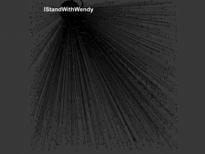
After a few more hours of work, I had something that looked a lot better (and was actually accurate this time to boot). Learning how to make the size of the nodes correlate to how many times each one was used really helped make the graph both more meaningful and visually appealing. Learning how to play around with the label font size also helped a lot, making the words correlate to node size as well, and playing around with the size so I could make as many labels as possible visible while still not having so many that viewers couldn’t read them. And I learned how to use the screen shot function, so I could take a decent picture of it. Finally, though I just had to take the labels off because you still couldn’t see anything. For your information, though, some of the most frequently tweeted hashtags (other than “Istandwithwendy”) were “txlege,” “texlege,” “sb5” (the name of the bill), and “standwithwendy.”  Unfortunately, the screen shot function does not do color, or if it doesn’t I couldn’t figure it out. Here it is:
screenshot_Wendy 2

I wasn’t entirely happy with this visualization, because I am not sure it really shows very much. It shows that “IStandwithWendy” is the most frequently used hashtag, and shows that, other than that, most hashtags weren’t used that often (except for the few I just mentioned). It doesn’t show some of the interesting nuances of the dataset, like the fact that some pro-life people were tweeting “IStandwithWendy” sarcastically, and some people were tweeting “IStandwithWendy” as in the restaurant as a joke (albeit one in pretty poor taste).


Phase #5: Tableau Public Pie Chart

Because of this drawback, I decided to make a pie chart on Tableau Public that would at least show the relative frequencies of some of the hashtags a little more clearly. I was having a bit of trouble with their export function, so I just took a screenshot, which doesn’t allow you to interact with the graph like you would have bee able to. Here it is:
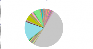
 

Pie Chart 3

I really want to continue with this project and do the geographic map of tweets that I wanted to        do originally. Thanks, everyone for reading, and for all of the ways in which you have helped me learn DH skills this semester! Have a great holiday!